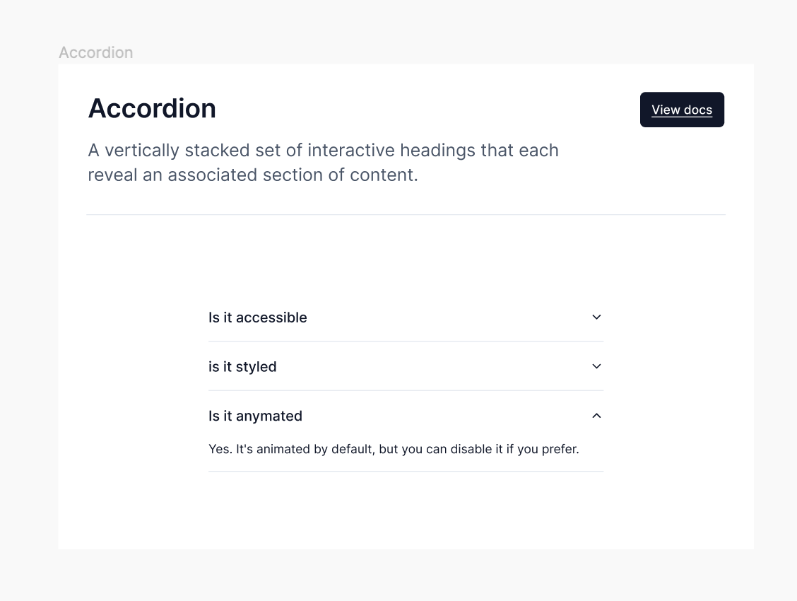
Accordion
A vertically stacked set of interactive headings that each reveal an associated section of content.
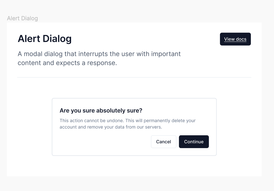
Alert Dialog
A modal dialog that interrupts the user with important content and expects a response.
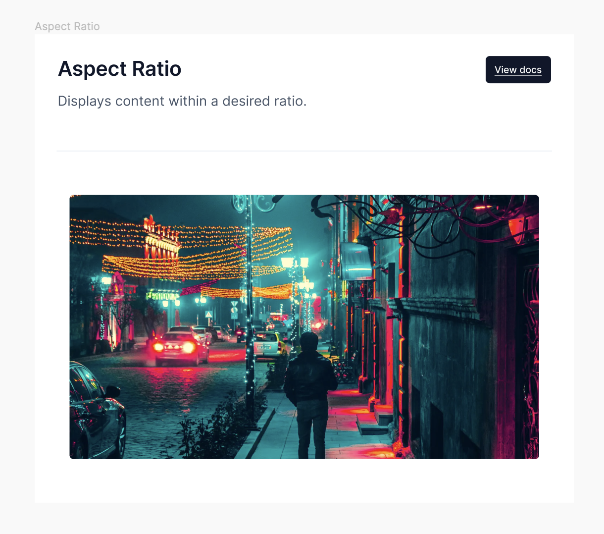
Aspect Ratio
Displays content within a desired ratio.
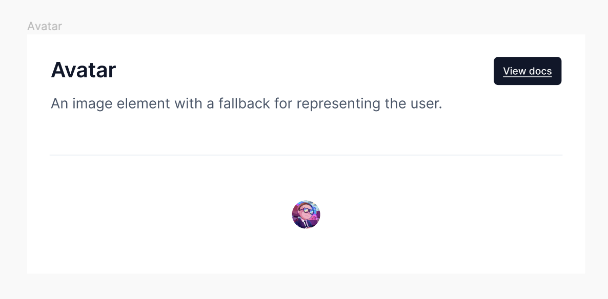
Avatar
An image element with a fallback for representing the user.
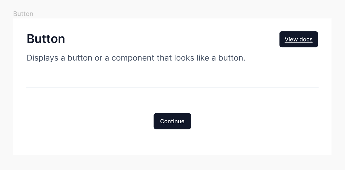
Button
Displays a button or a component that looks like a button.
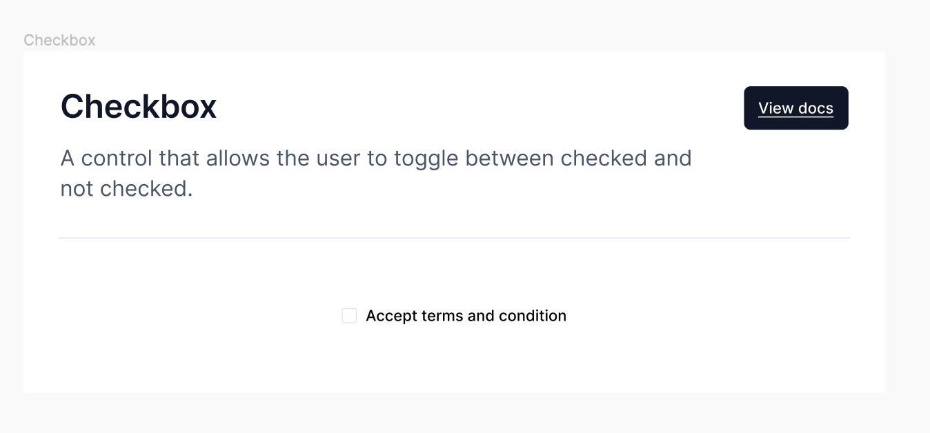
Checkbox
A control that allows the user to toggle between checked and not checked.
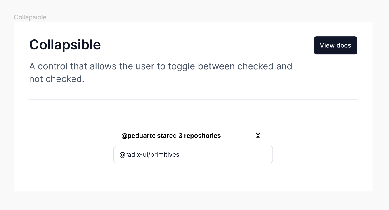
Collapsible
A control that allows the user to toggle between checked and not checked.
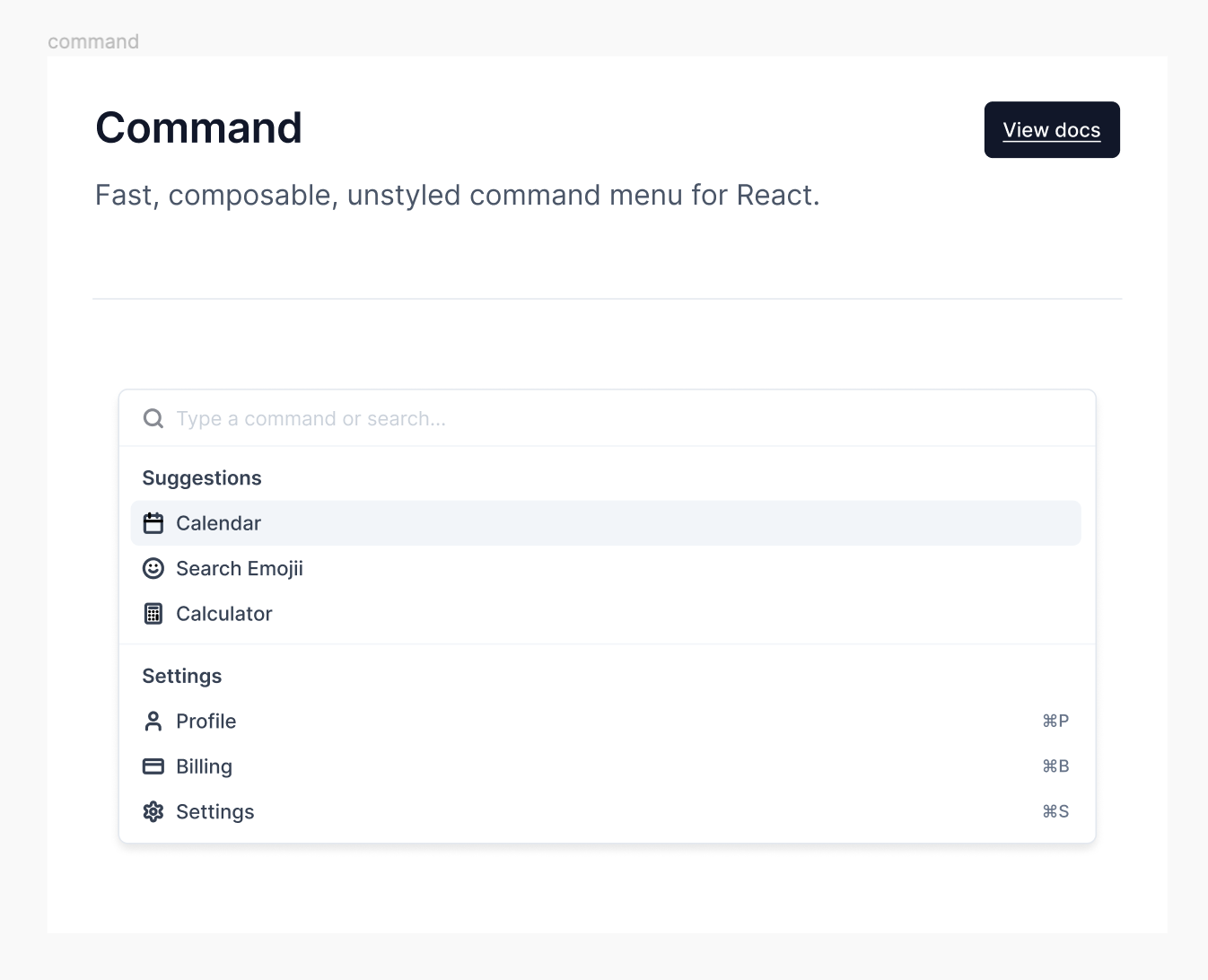
Command
Fast, composable, unstyled command menu for React.
Context Menu
Displays a menu to the user — such as a set of actions or functions — triggered by a button.

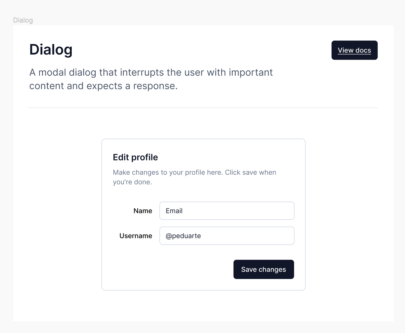
Dialog
A modal dialog that interrupts the user with important content and expects a response.
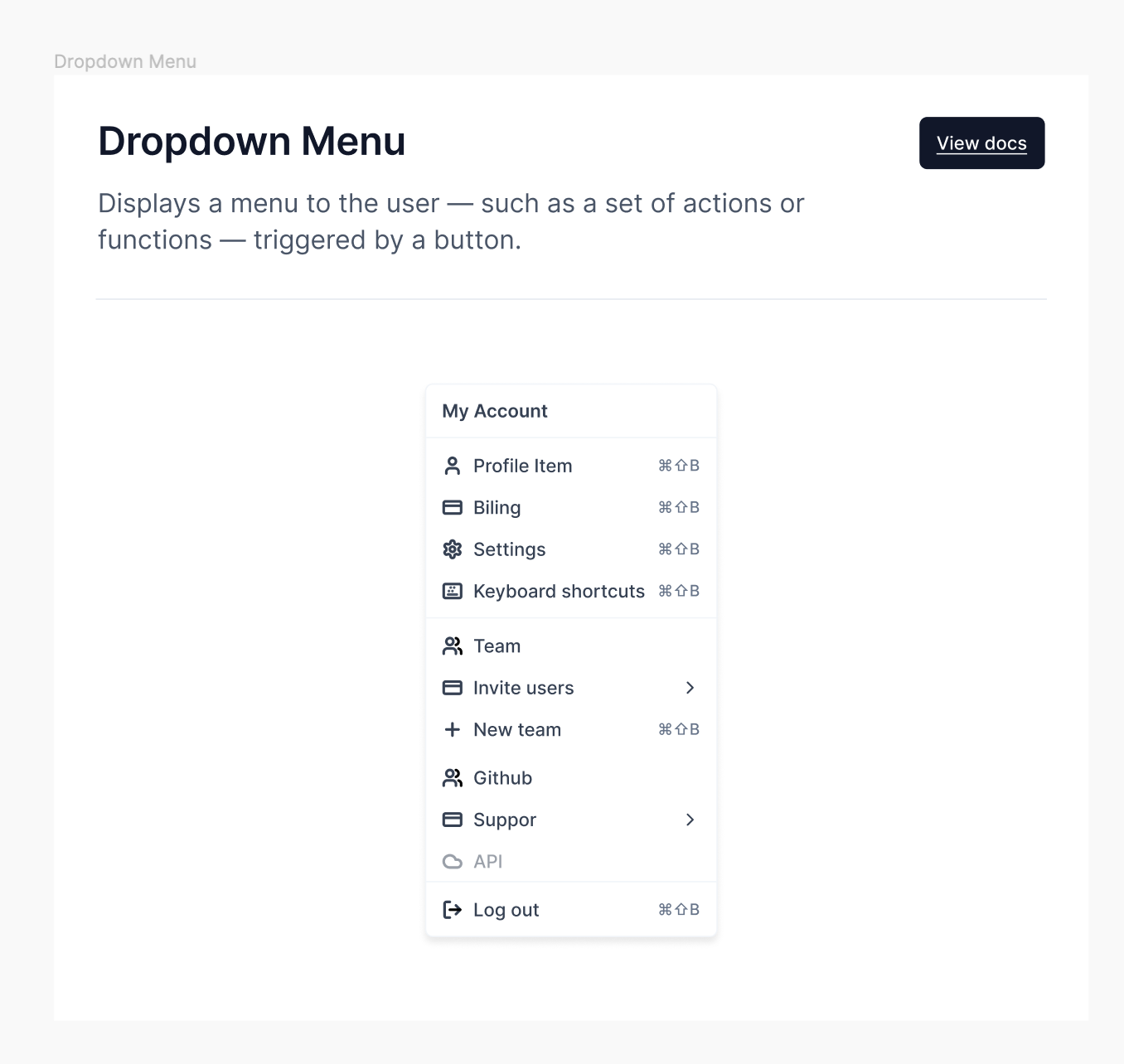
Dropdown Menu
Displays a menu to the user — such as a set of actions or functions — triggered by a button.
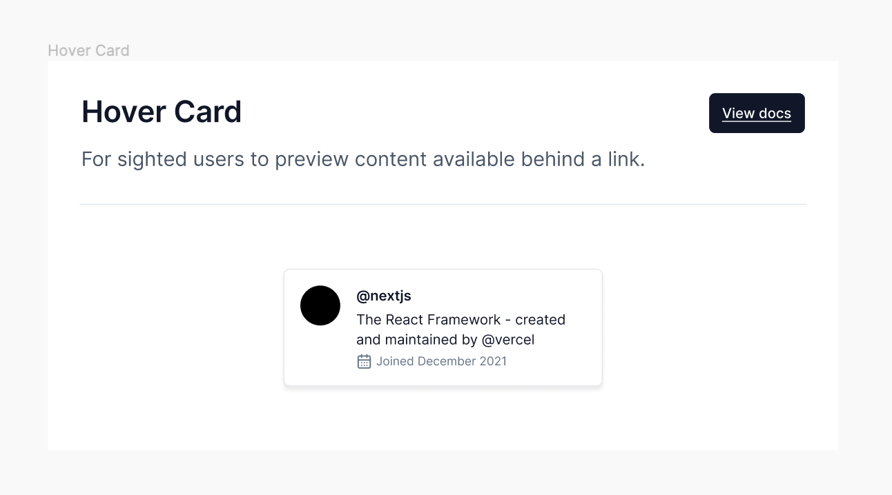
Hover Card
For sighted users to preview content available behind a link.
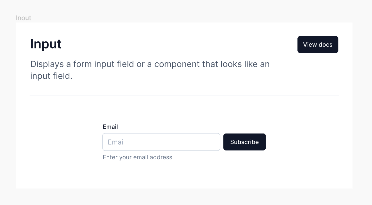
Inout
Displays a form input field or a component that looks like an input field.
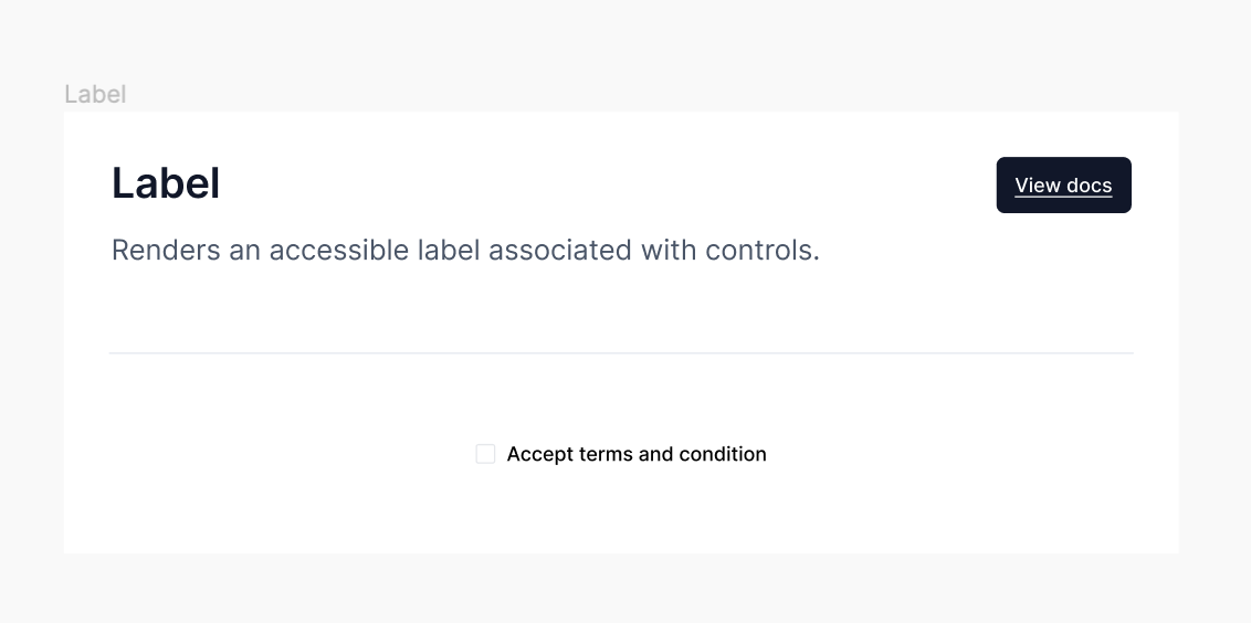
Label
Renders an accessible label associated with controls.
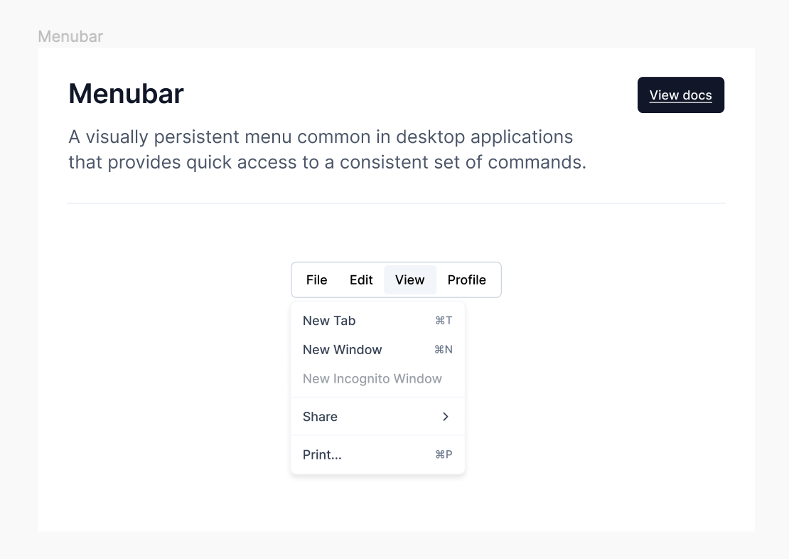
Menubar
A visually persistent menu common in desktop applications that provides quick access to a consistent set of commands.
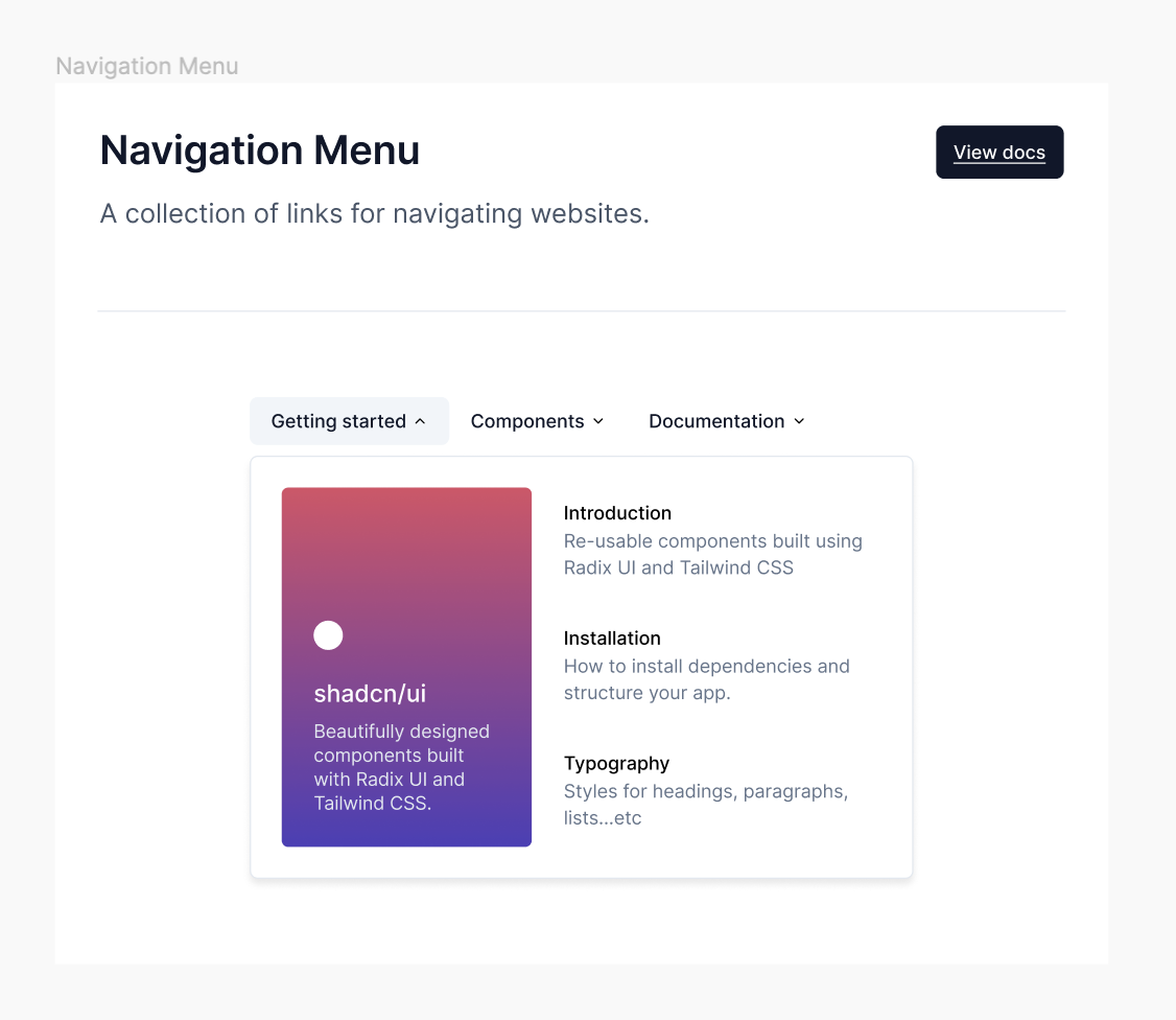
Navigation Menu
A collection of links for navigating websites.
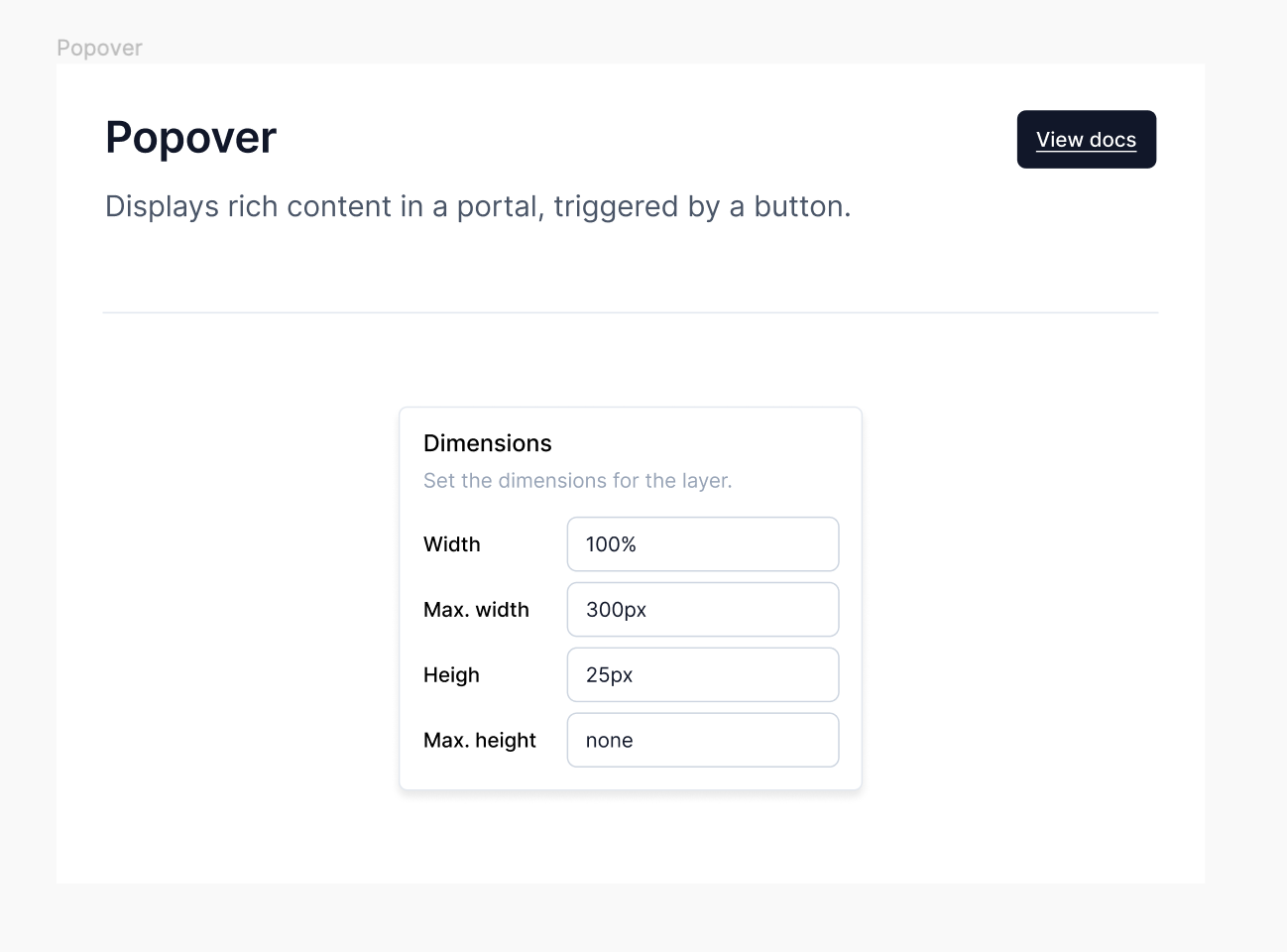
Popover
Displays rich content in a portal, triggered by a button.
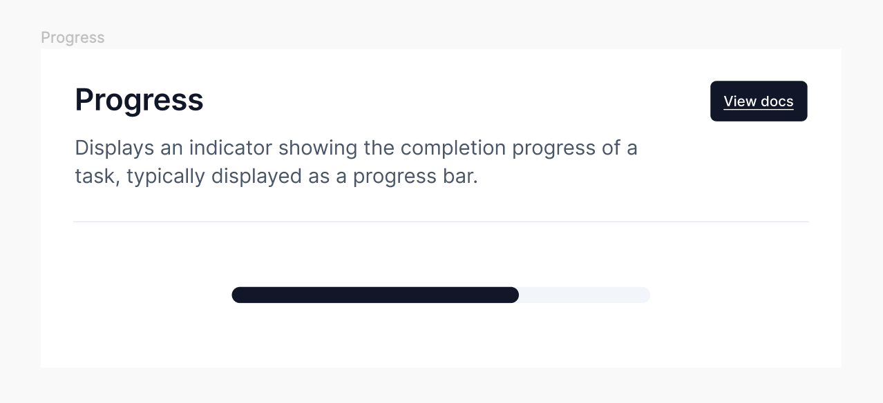
Progress
Displays an indicator showing the completion progress of a task, typically displayed as a progress bar.
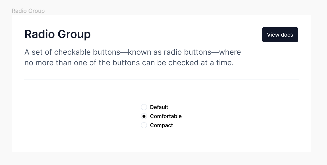
Radio Group
A set of checkable buttons—known as radio buttons—where no more than one of the buttons can be checked at a time.
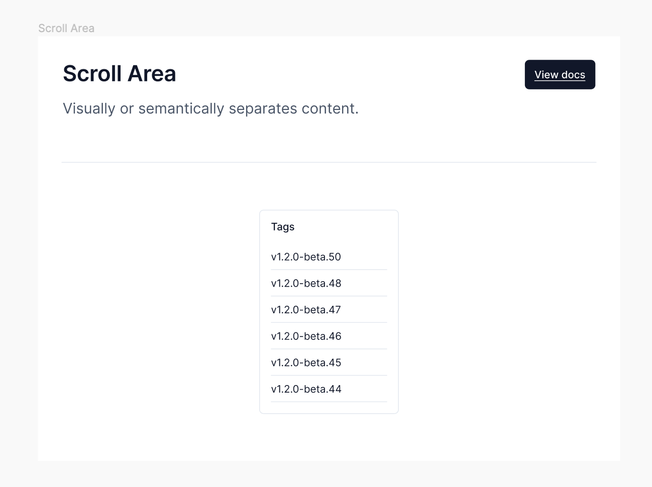
Scroll Area
Visually or semantically separates content.
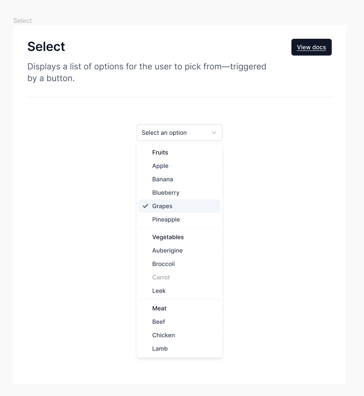
Select
Displays a list of options for the user to pick from—triggered by a button.
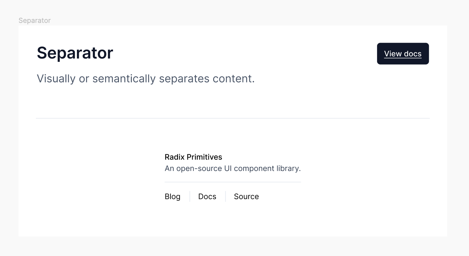
Separator
Visually or semantically separates content.
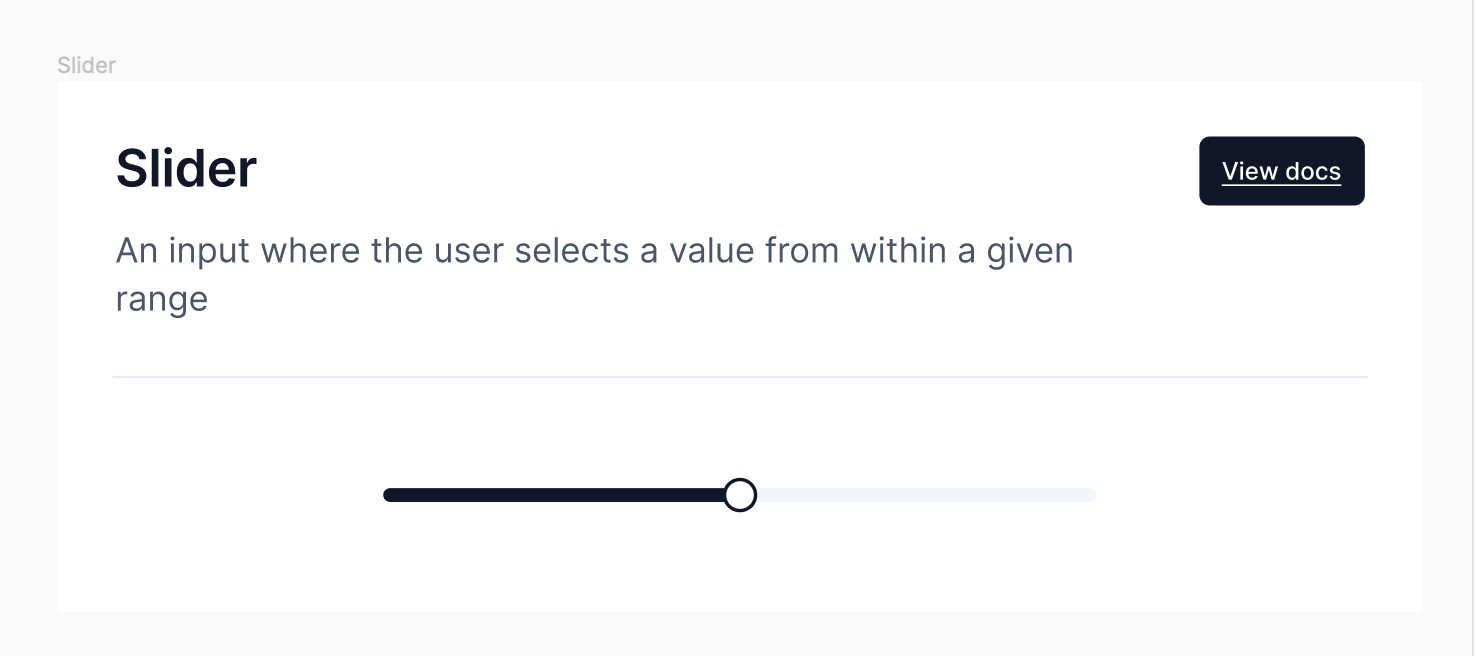
Slider
An input where the user selects a value from within a given range
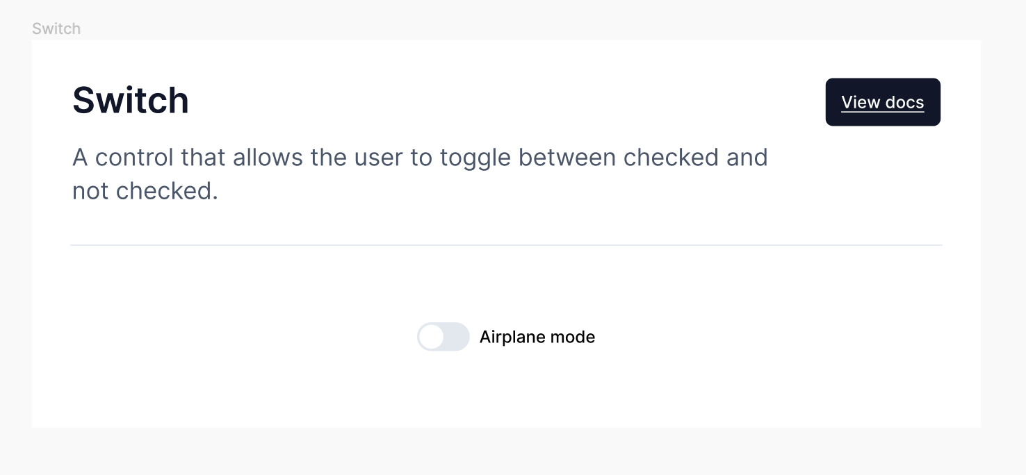
Switch
A control that allows the user to toggle between checked and not checked.
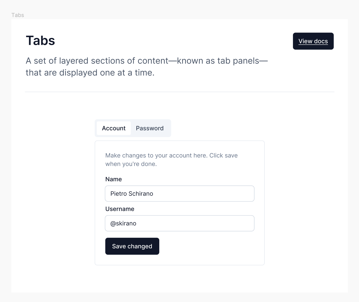
Tabs
A set of layered sections of content—known as tab panels—that are displayed one at a time.
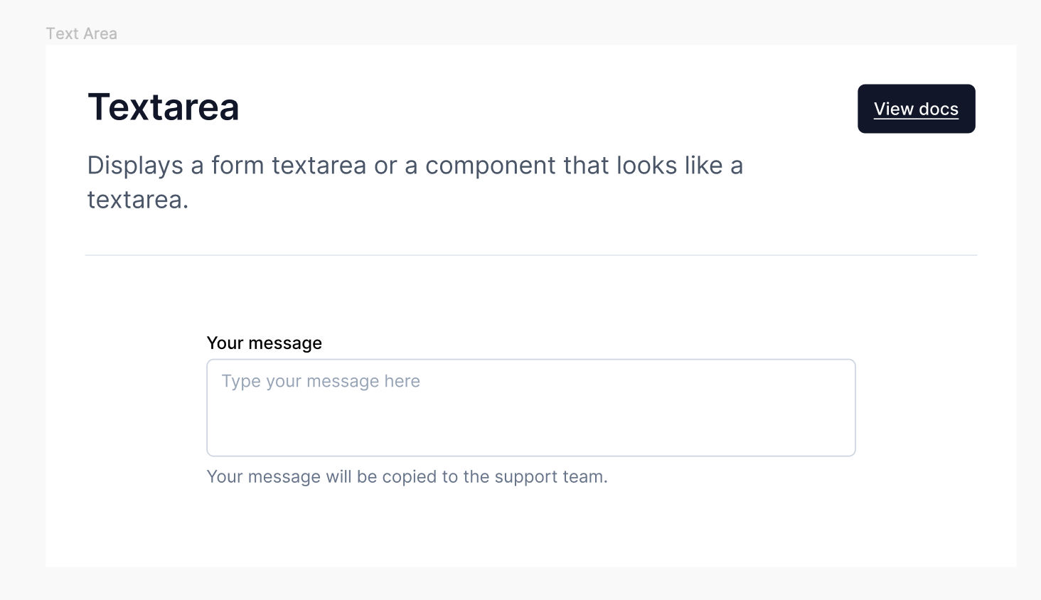
Textarea
Displays a form textarea or a component that looks like a textarea.