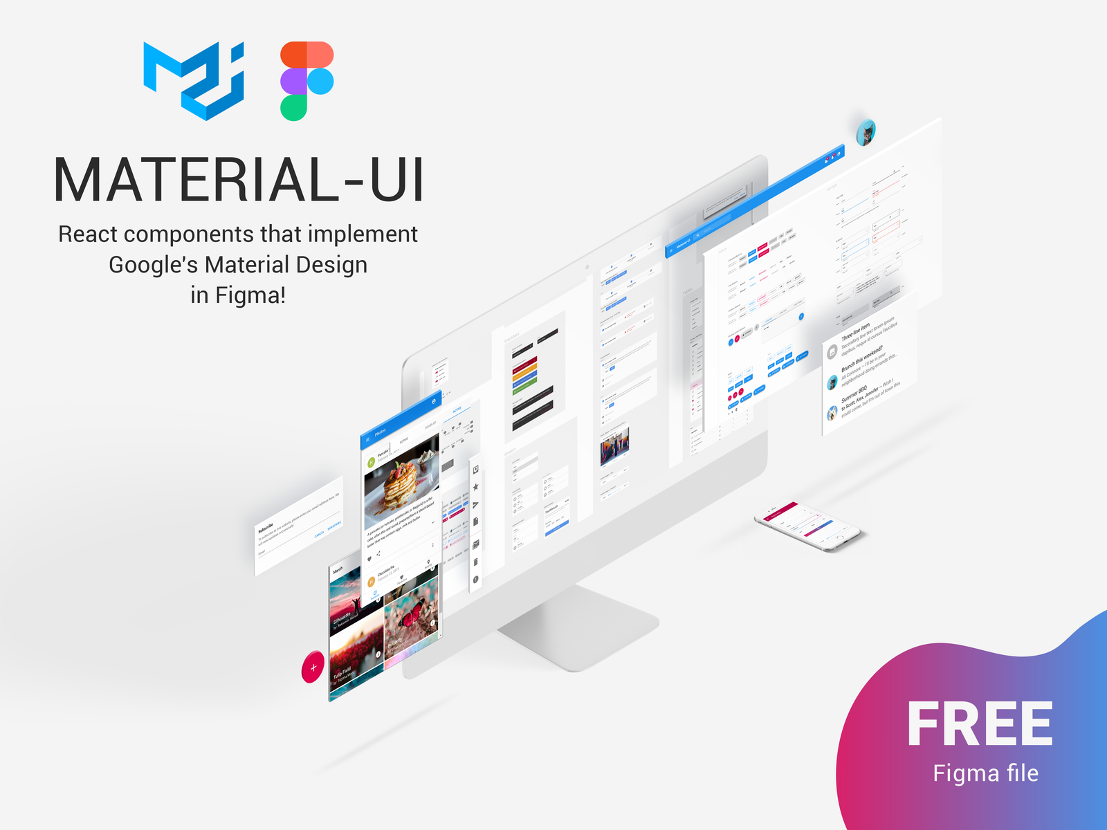
Created a Figma UI Kit that is fully compatible with React Material-UI library. If your design is planned to use together with this library then you clearly need our Kit. It will allow to save your time and also have a smooth collaboration with frontend developers.
The Figma Community file (ID: 912837788133317724) is a Material UI design system and component library for Figma, created and shared by community contributors. It is intended to help designers build consistent, scalable interfaces based on Material Design principles.
Key features:
- A comprehensive collection of reusable UI components, such as buttons, cards, inputs, forms, and navigation elements
- Built as part of a design system, ensuring consistency in colors, typography, spacing, and layout
- Designed to align with Material UI (MUI) standards, making it especially useful for projects that also use MUI in development
- Includes structured styles and tokens that support efficient design workflows and easier handoff to developers
Purpose:
This file is meant to:
- Help designers quickly create modern, consistent user interfaces
- Provide a ready-to-use component library for web and app design
- Bridge the gap between design and development, especially when working with Material UI frameworks
Additional notes:
- As a community file, it is created by independent contributors rather than officially by Figma, so support or updates may vary
- Similar resources are often used as learning tools or starting points for building custom design systems
👉 Overall, this Figma file is a powerful starting point for designers who want to work with Material Design and reusable UI components in a structured way.