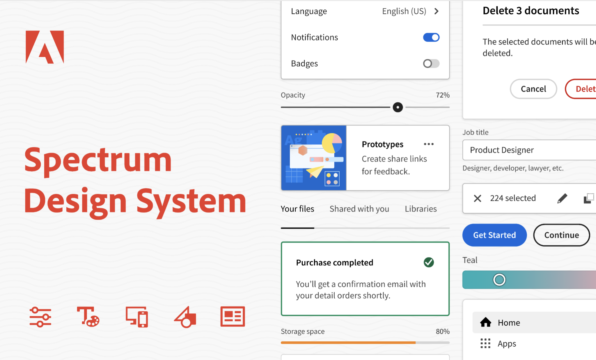
The Adobe Spectrum Design Guidelines provide designers with a comprehensive design system that includes a wide range of components, themes, and platform scales. This system is designed to streamline the design process and ensure consistency across different design projects.
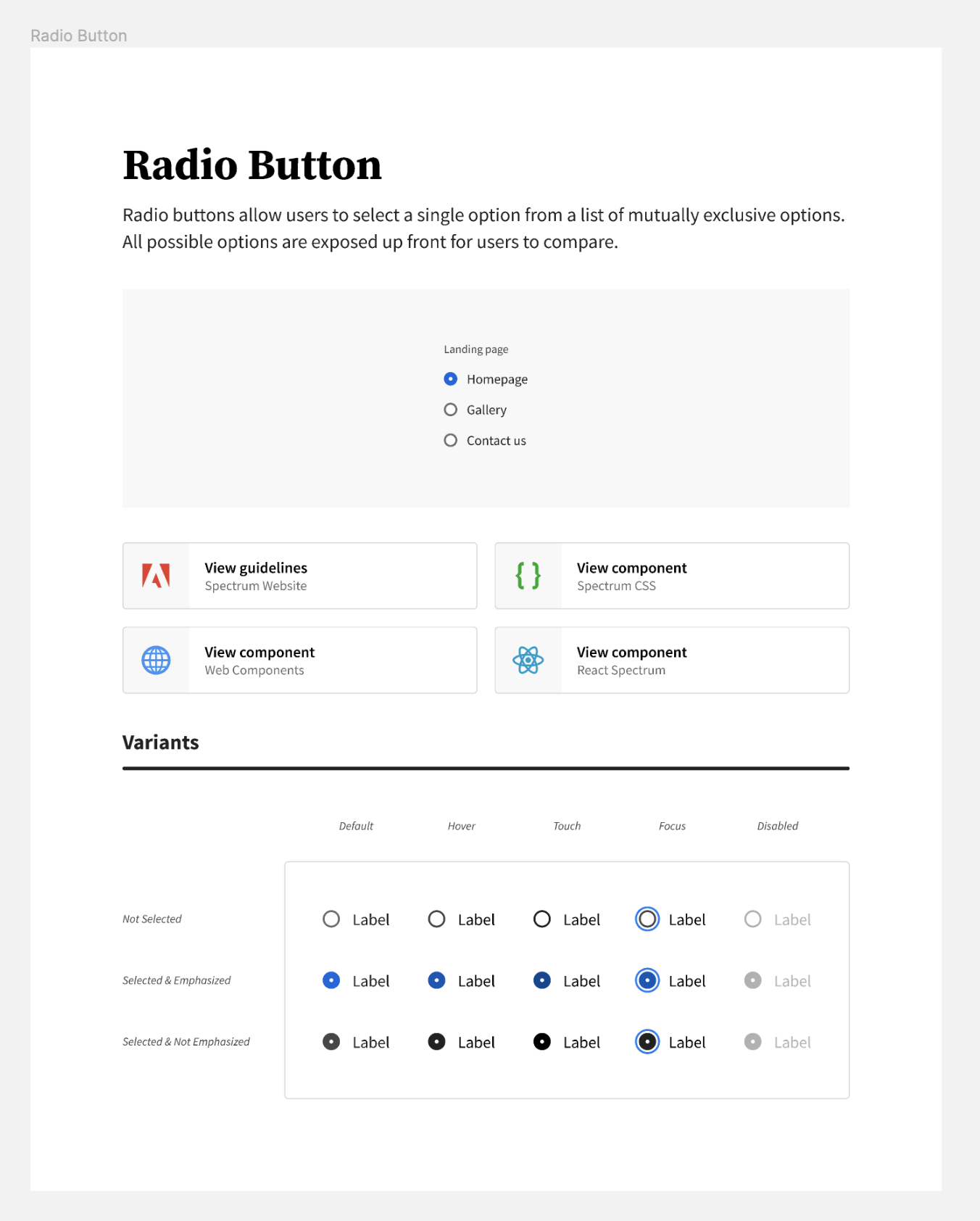
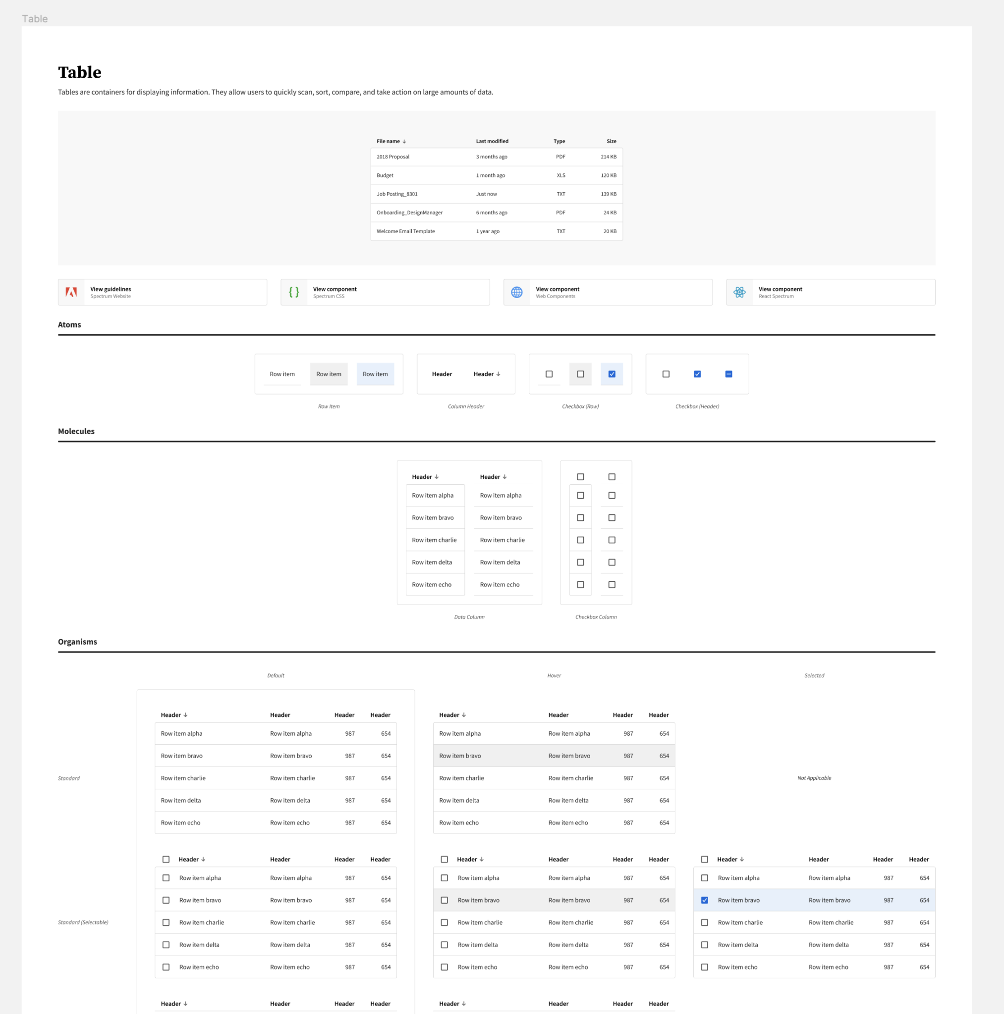
The system includes a variety of components such as action buttons, menus, data visualizations, and inputs. These components can be easily customized and used in different designs, saving time and effort for designers.
The platform scales included in the system are desktop and mobile. This ensures that designers can create designs that are optimized for different platforms, and that the design elements and components are appropriately sized and positioned.
Overall, the Adobe Spectrum Design Guidelines provide designers with a powerful design system that can help them create visually appealing and user-friendly designs that meet their clients’ needs.
Themes such as light, dark, darkest, and wireframe are also included in the system. These themes provide designers with different options for the visual appearance of their designs, depending on the context and purpose of the design.
Customizations are also possible with this design system, thanks to the use of advanced component authoring features such as auto layout, variants, and nested instances. These customizations can be easily made using the controls in the right sidebar, which provide a clear understanding of what can be changed and how to make the changes.
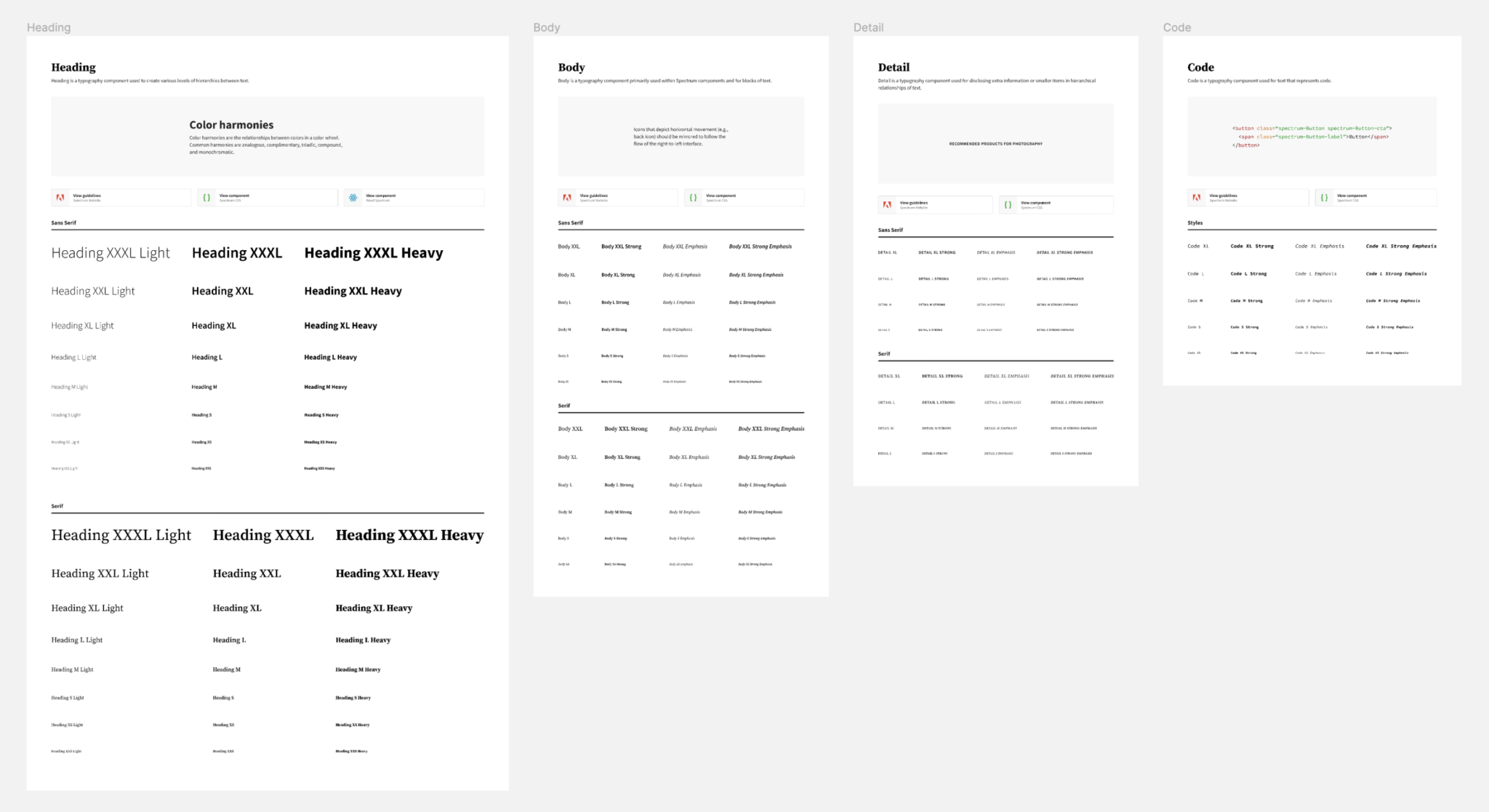
Desktop Typography
Mobile Typography

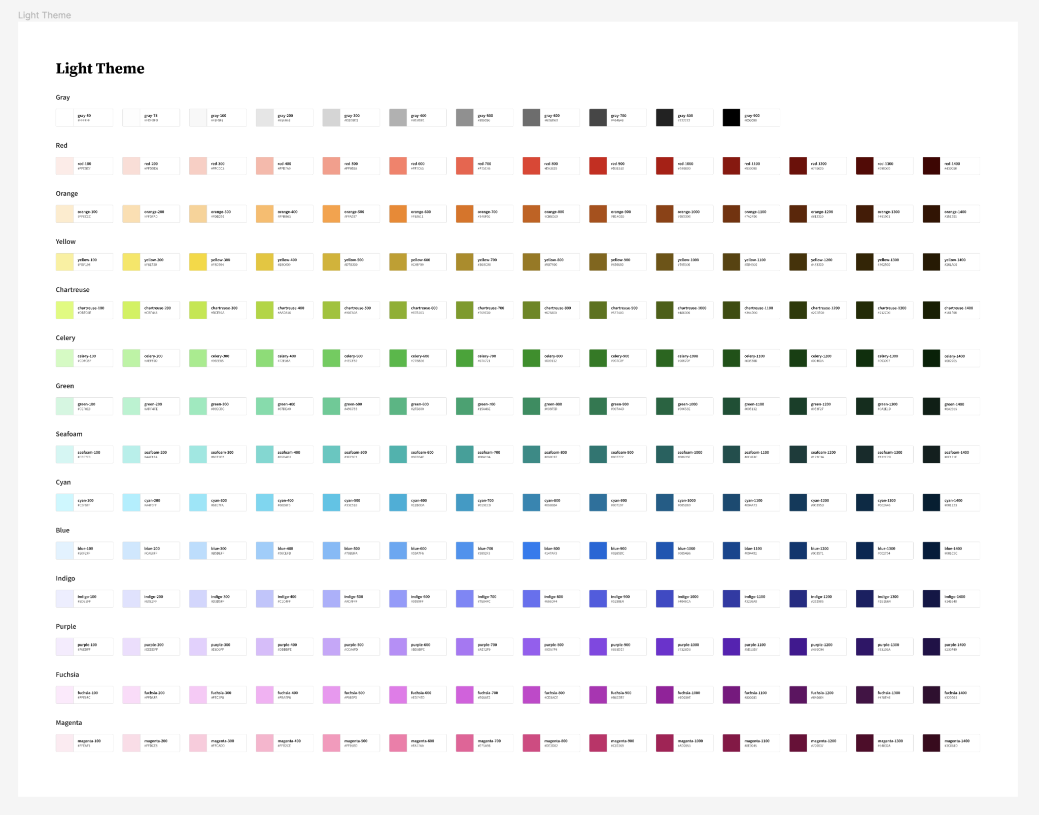
Color Styles


Icons

Application Frame

Data Visualization

Feedback

Inputs