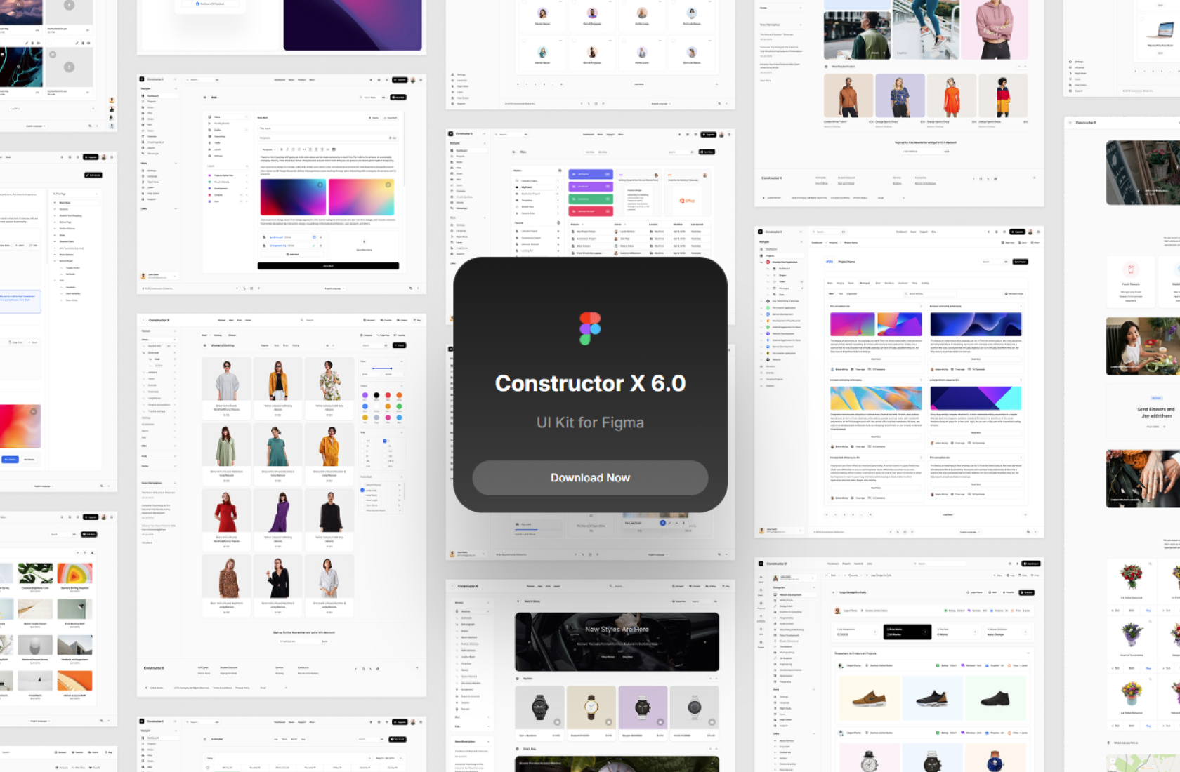
Atom is a user interface design system that is based on Atomic Design principles. It is a powerful tool that can take your design workflow in Figma to the next level, making it more efficient and effective. Whether you’re a seasoned designer or just starting out, Atom can help you create stunning user interfaces with ease.
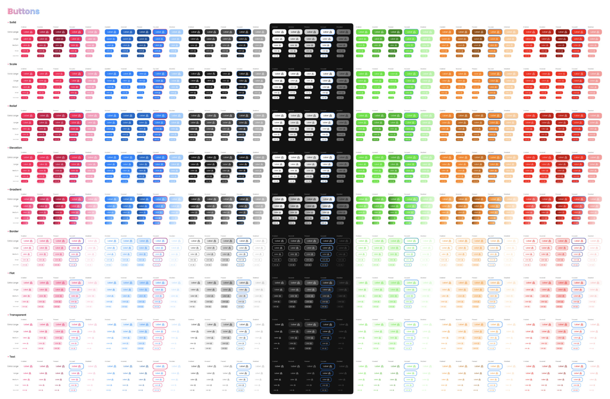
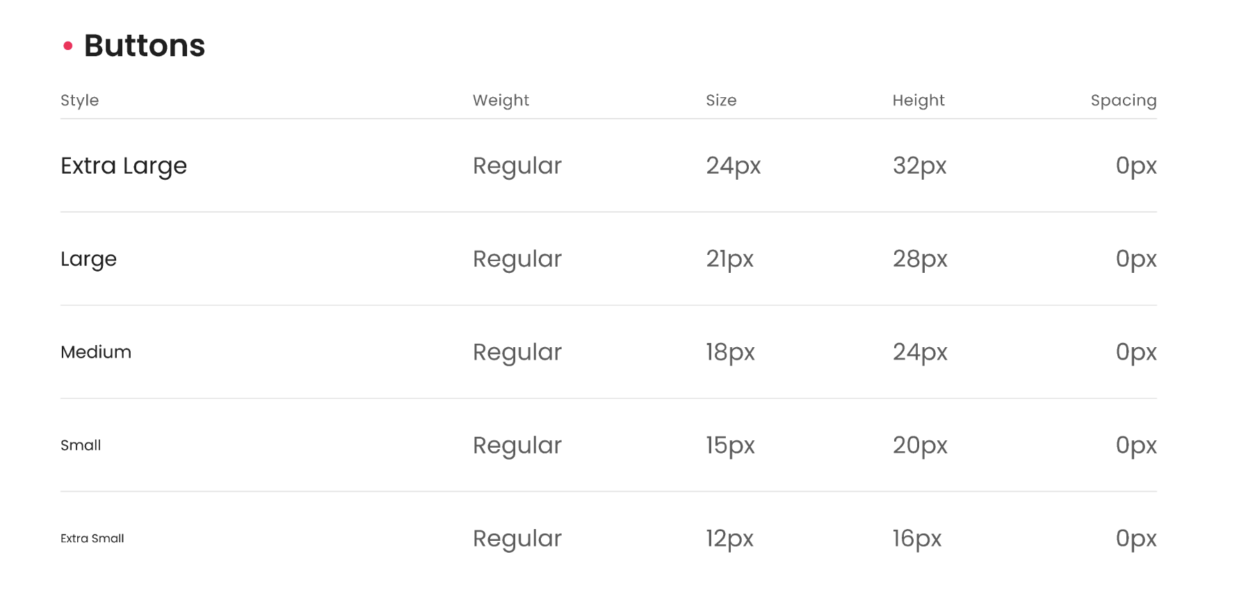
Buttons in Design System
Buttons are an essential element of any user interface, and they play a crucial role in guiding users through a design. In a design system, buttons are one of the most important components, as they are often used repeatedly throughout an interface.
Design systems include a set of predefined buttons with consistent styles, sizes, and interactions. By establishing a standard set of buttons, designers can ensure that the user interface is cohesive and easy to use, regardless of the specific page or section.
When designing buttons in a design system, it’s important to consider their purpose and context. For example, a primary button may have a more prominent color and be used for the most important calls to action, while a secondary button may have a less prominent color and be used for less important actions.
In addition to their visual appearance, buttons in a design system also need to have consistent behaviors and interactions. This includes things like hover and active states, as well as their behavior when clicked or tapped.
Overall, buttons are a critical component of a design system, and their consistency and functionality play a significant role in the overall user experience. By establishing a standard set of buttons and interactions, designers can create intuitive and cohesive user interfaces that are both easy to use and visually appealing.
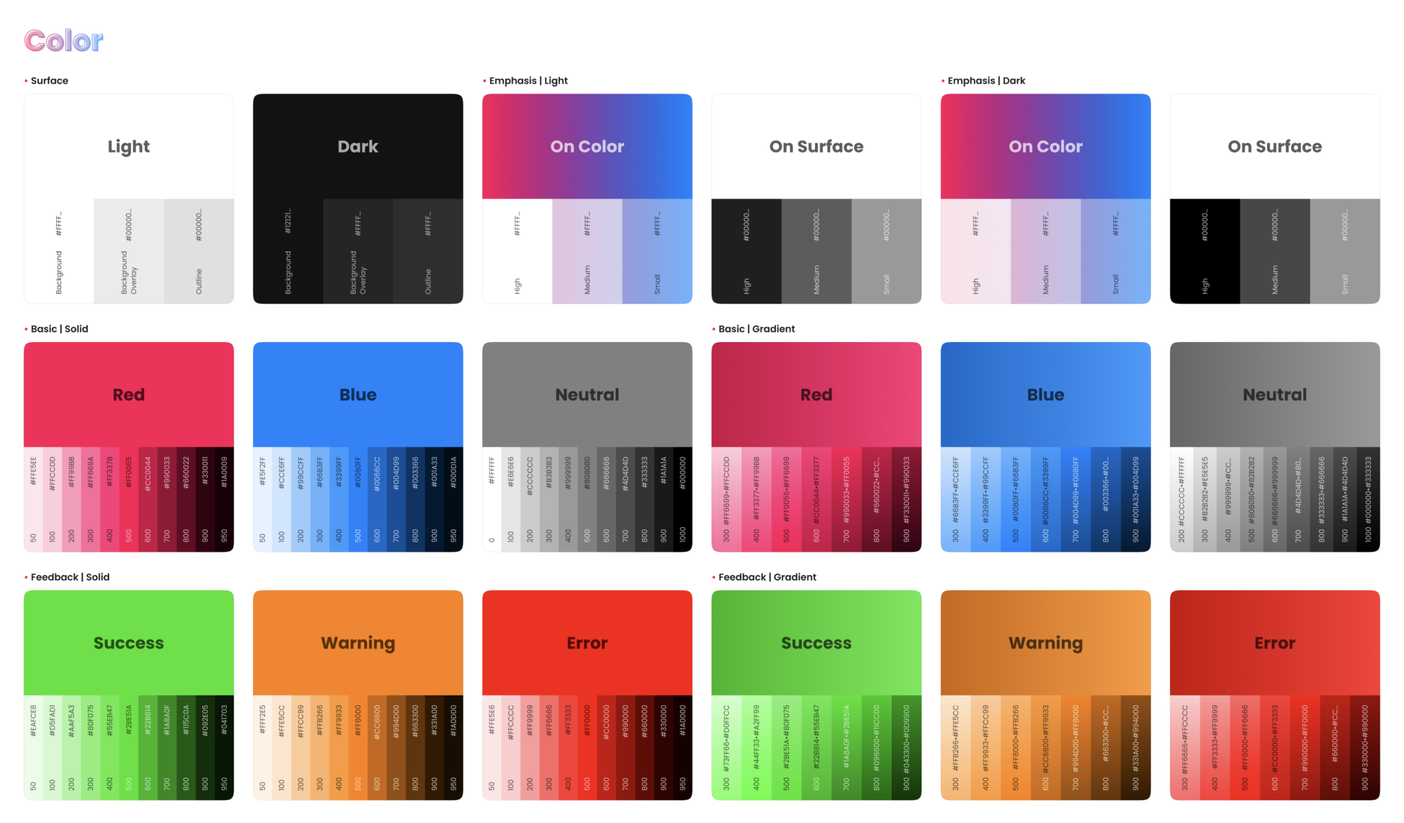
Colors in Design System
Colors are a fundamental component of any design system, as they play a critical role in establishing a brand’s identity and creating a cohesive visual experience. In a design system, colors are typically defined in a color palette, which includes a set of predefined colors that are used consistently throughout the interface.
A well-designed color palette considers both the visual aesthetics of the colors and their functional purpose within the interface. For example, a primary color may be used for prominent elements like buttons and headlines, while secondary colors may be used for less important elements like backgrounds or icons.
In addition to their visual appearance, colors in a design system also need to have consistent usage and implementation. This includes things like their hex values, RGB values, and accessibility contrast ratios.
Maintaining a consistent color palette is essential for creating a cohesive and recognizable brand identity, and it also helps to ensure that the interface is both visually appealing and easy to use. By defining a set of standard colors and guidelines for their usage, designers can create a harmonious and user-friendly design system that enhances the overall user experience.
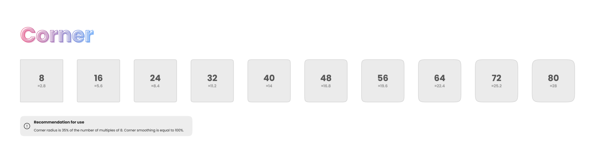
Corner in Design System
In a design system, corners refer to the shape of the edges of interface elements such as buttons, cards, and containers. Defining consistent corner styles can help create a cohesive visual experience and enhance the overall design aesthetic.
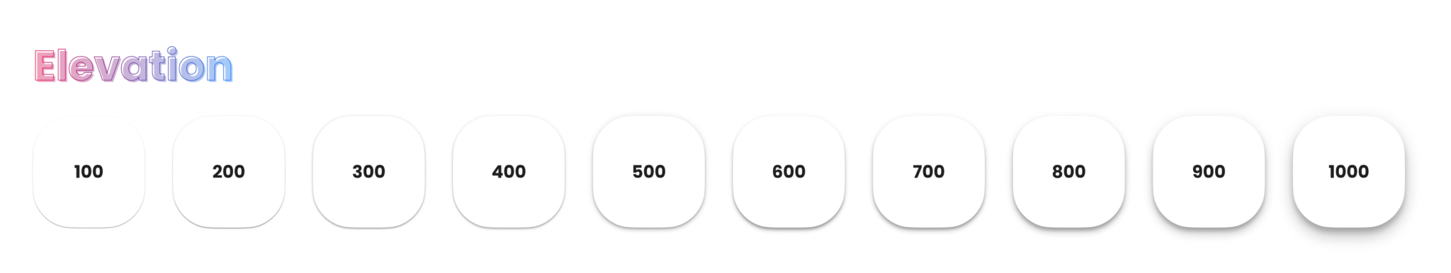
Elevation in Design System
In a design system, elevation refers to the visual depth and shadow effects used to create a sense of hierarchy and organization within the interface. Defining consistent elevation styles can help create a cohesive visual experience and enhance the overall usability of the design.
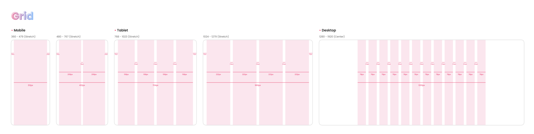
Grid in Design System
In a design system, the grid is a fundamental component that provides structure and organization to the interface layout. A well-designed grid ensures consistency and balance throughout the design, making it easier for users to navigate and interact with the interface.
The grid is essentially a system of intersecting horizontal and vertical lines that create a series of columns and rows. These columns and rows provide a framework for the placement of interface elements like text, images, and buttons.
Designers can define a set of standard grid guidelines within the design system, including things like the number of columns, the width of each column, and the spacing between columns and rows. These guidelines can help ensure that the interface is consistent across different pages and sections.
One of the key benefits of using a grid within a design system is that it enables responsive design. By defining a flexible grid that can adjust to different screen sizes and device types, designers can create interfaces that are optimized for a wide range of user experiences.
Additionally, using a grid within a design system can help speed up the design process. With a set of predefined guidelines and standards, designers can quickly create layouts and place interface elements in a consistent and efficient manner.
Overall, the grid is a critical component of a design system, providing structure and organization to the interface layout. By defining a standard set of grid guidelines, designers can create cohesive, balanced, and responsive interfaces that enhance the overall user experience.
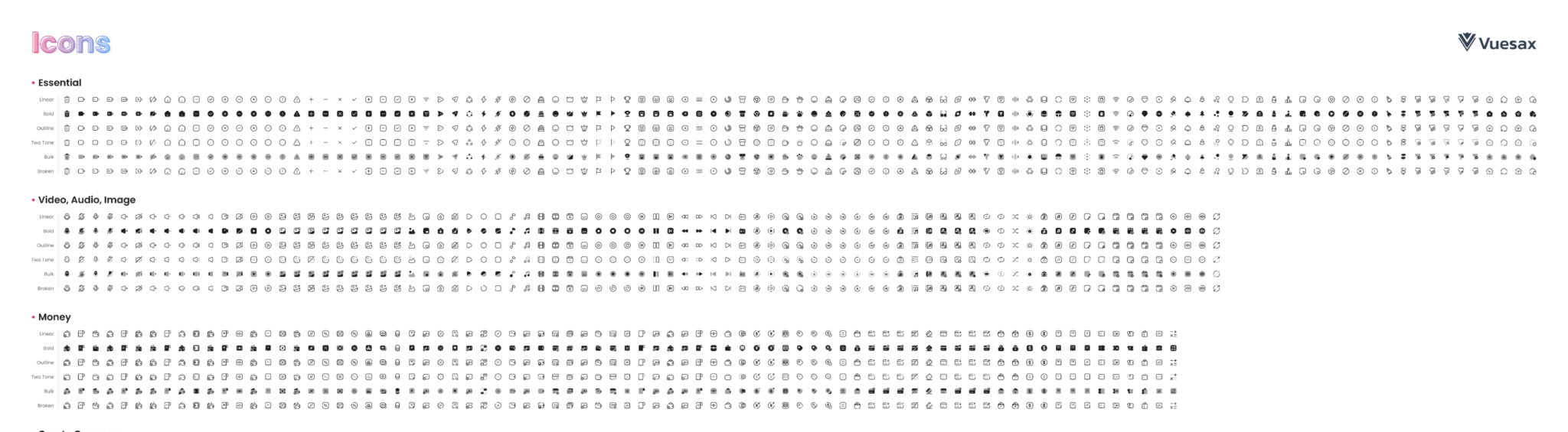
Icons in Design System
cons are a key component of any design system, providing users with visual cues and aiding in the navigation and comprehension of the interface. A well-designed icon system ensures that icons are consistent in appearance, meaning, and usage throughout the interface.
Icons can be created in a variety of ways, such as through custom illustration or from existing icon libraries. It’s important to define a consistent icon style within the design system, including things like shape, stroke width, and color palette. This helps to ensure that icons are easily recognizable and maintain a cohesive visual style.
In addition to visual consistency, it’s important to consider the functional purpose of icons within the interface. This includes defining standard icon usage guidelines, such as which icons should be used for specific actions or functions.
By defining a set of standard icons and usage guidelines, designers can create an intuitive and easily navigable interface that enhances the overall user experience. Additionally, a well-designed icon system can help to streamline the design process and speed up the creation of new interface elements.
Overall, icons are a crucial component of a design system, providing users with visual cues and aiding in navigation and comprehension of the interface. By defining a consistent icon style and usage guidelines, designers can create a cohesive and intuitive interface that enhances the overall usability and user experience.
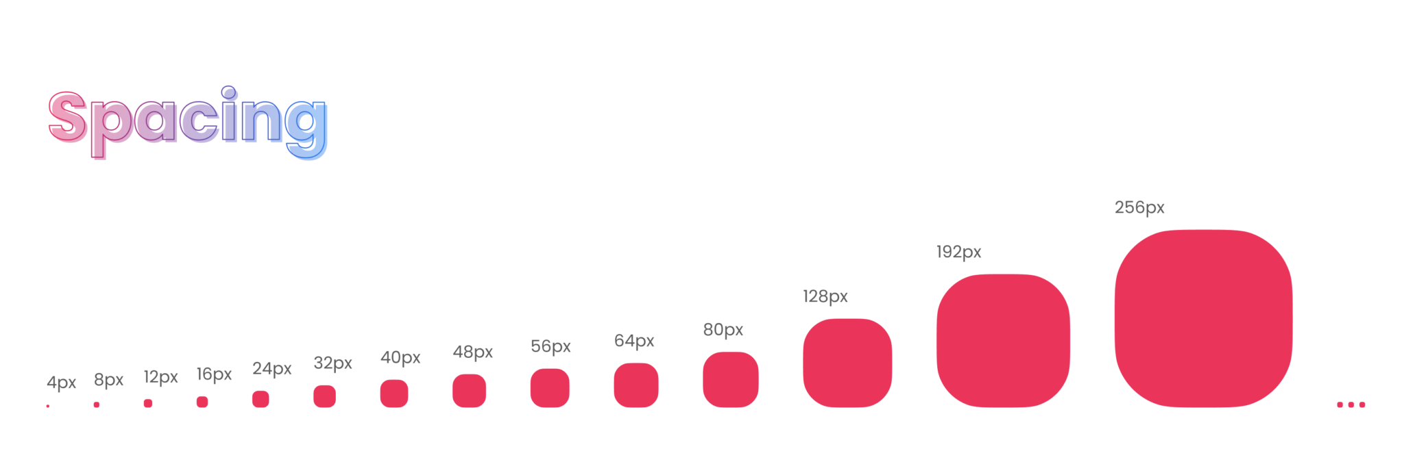
Spacing in Design System
Spacing is a critical element of a design system that can impact the overall usability and visual appeal of an interface. Proper spacing creates a clear hierarchy of content and visual elements, making it easier for users to navigate and understand the interface.
A well-designed spacing system should include consistent spacing between elements, including margins, padding, and line heights. These spaces should be defined according to a set of standards and guidelines, ensuring that they are consistent across all components of the interface.
Spacing also impacts the overall balance and visual appeal of the design. The spacing between elements can create a sense of rhythm and flow, making the interface more visually engaging and easier to navigate. This requires a careful balance between negative and positive space, as well as an understanding of how users will interact with the interface.
One important consideration when designing a spacing system is scalability. The spacing between elements should be flexible enough to accommodate different screen sizes and resolutions without impacting the overall visual balance of the design.
In summary, spacing is a critical element of any design system. It impacts the overall usability and visual appeal of the interface, and should be defined according to a set of consistent standards and guidelines. By creating a well-designed spacing system, designers can create an intuitive and visually engaging interface that enhances the overall user experience.
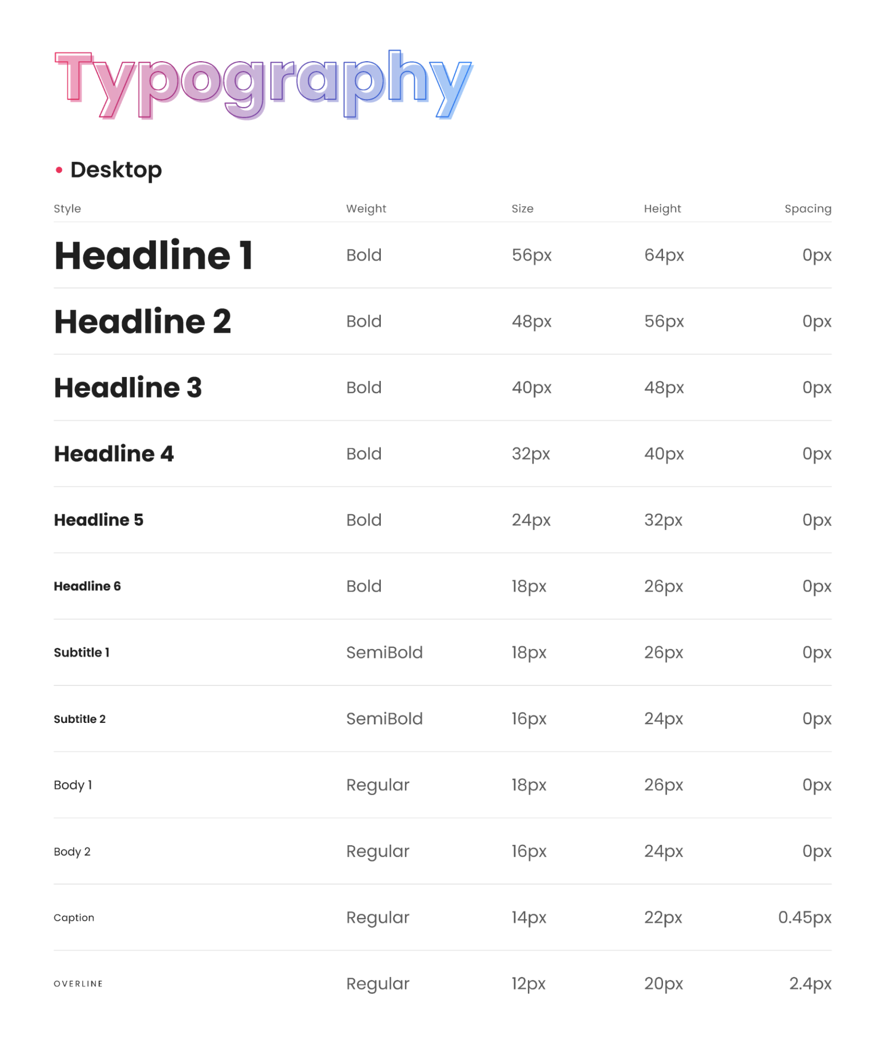
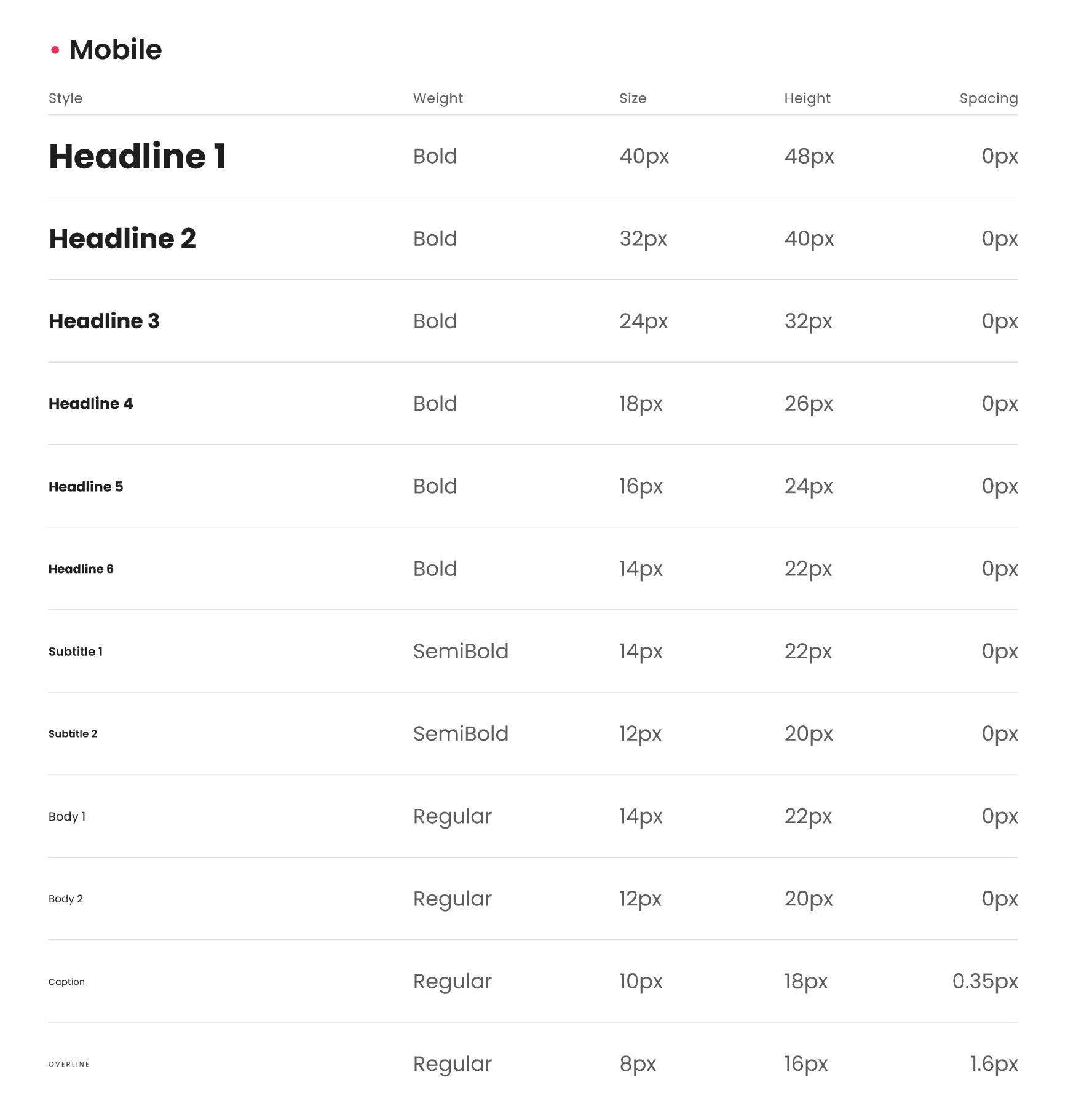
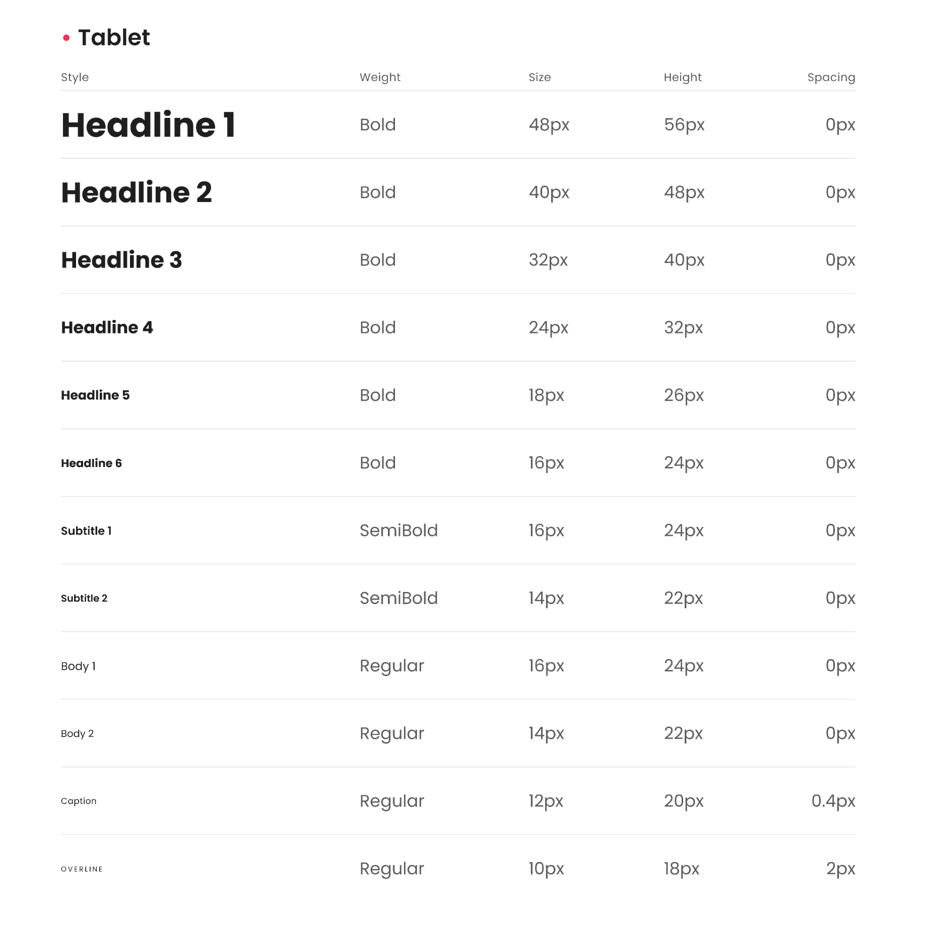
Typography in Design System
Typography is a key element of a design system that can significantly impact the overall readability and visual appeal of an interface. Consistent typography creates a cohesive visual language and hierarchy, making it easier for users to navigate and understand the interface.
A well-designed typography system should include consistent font styles, sizes, and weights, as well as guidelines for line spacing and typography hierarchy. By establishing a set of standards and guidelines, designers can create a consistent visual language that is easy to understand and navigate.
When designing a typography system, it’s important to consider accessibility. This includes ensuring that fonts are easily readable and distinguishable, even for users with visual impairments. Designers should also consider the impact of font size and spacing on legibility, as well as the use of alternative text for screen readers.
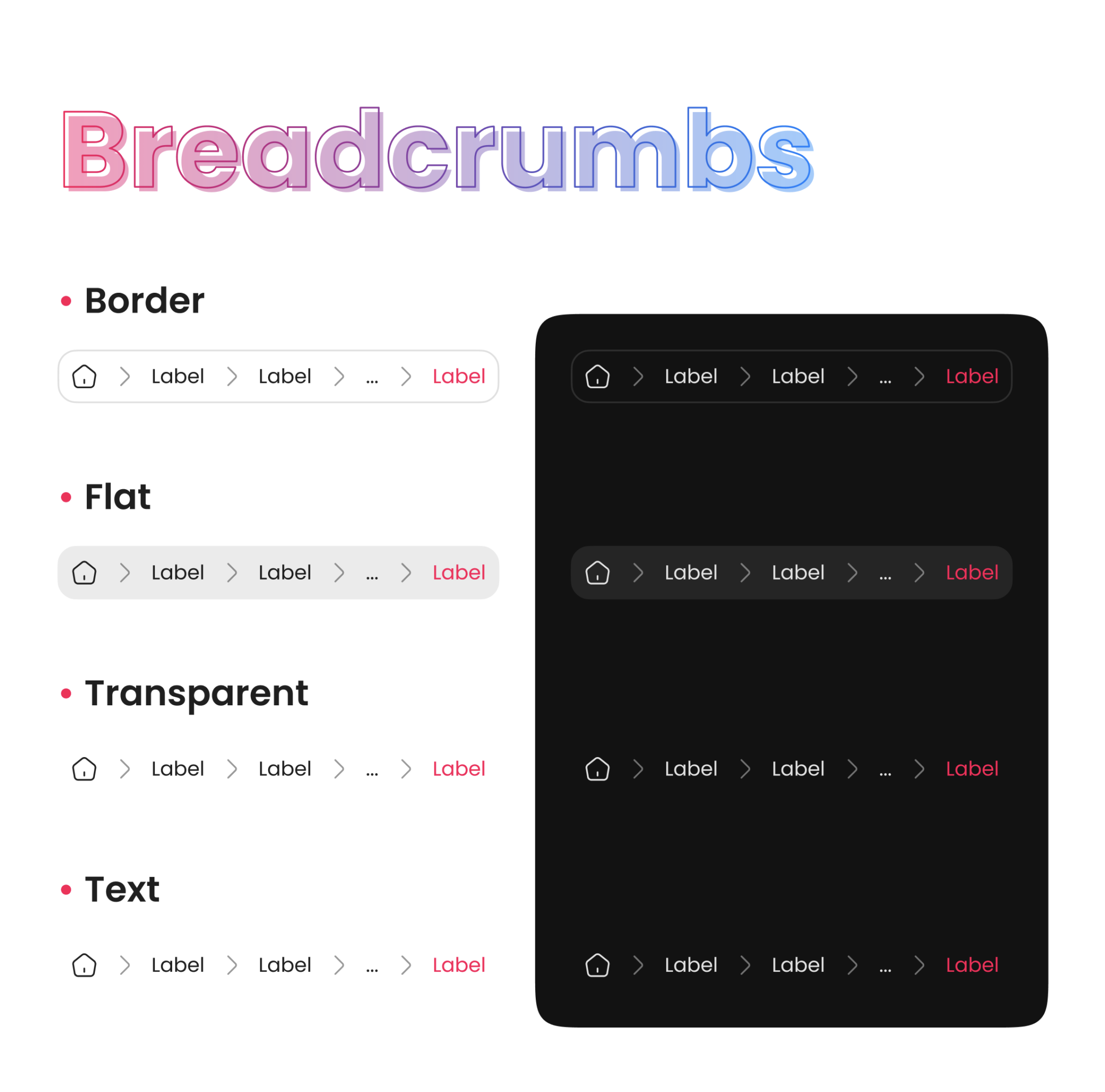
Breadcrumbs in Design System
Breadcrumbs are a navigation aid that allows users to easily track their location within an interface. They typically appear near the top of the page and display the path that the user has taken to arrive at the current page.
In a design system, breadcrumbs should be consistent in their placement, style, and behavior across all pages and interfaces. This helps to ensure that users can easily understand and navigate the interface, even if they are new to the site or app.
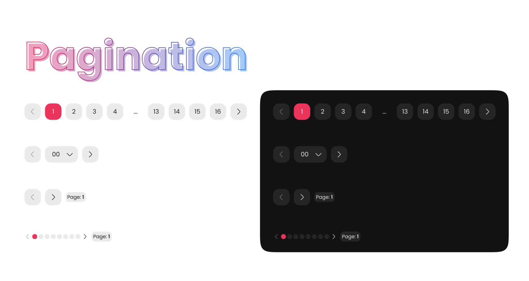
Pagination in Design System
Pagination is a common design pattern used in digital products to break up long lists of content into smaller, more manageable chunks. In a design system, pagination is an important component to consider as it affects the user’s navigation and interaction with the interface. The design system should define consistent styles, layout, and behavior for pagination across all products and platforms to ensure a cohesive user experience.
When designing pagination, it’s essential to consider the size and complexity of the content. For example, if there are only a few pages of content, a simple “next” and “previous” button may suffice. However, for more extensive content, a numbered pagination with links to individual pages may be necessary.
In addition to functionality, the design system should consider the visual design of pagination. The placement, size, color, and typography of pagination elements should be consistent throughout the product. Additionally, the design system should provide guidelines for how pagination should interact with other UI elements such as search bars, filters, and sorting options.
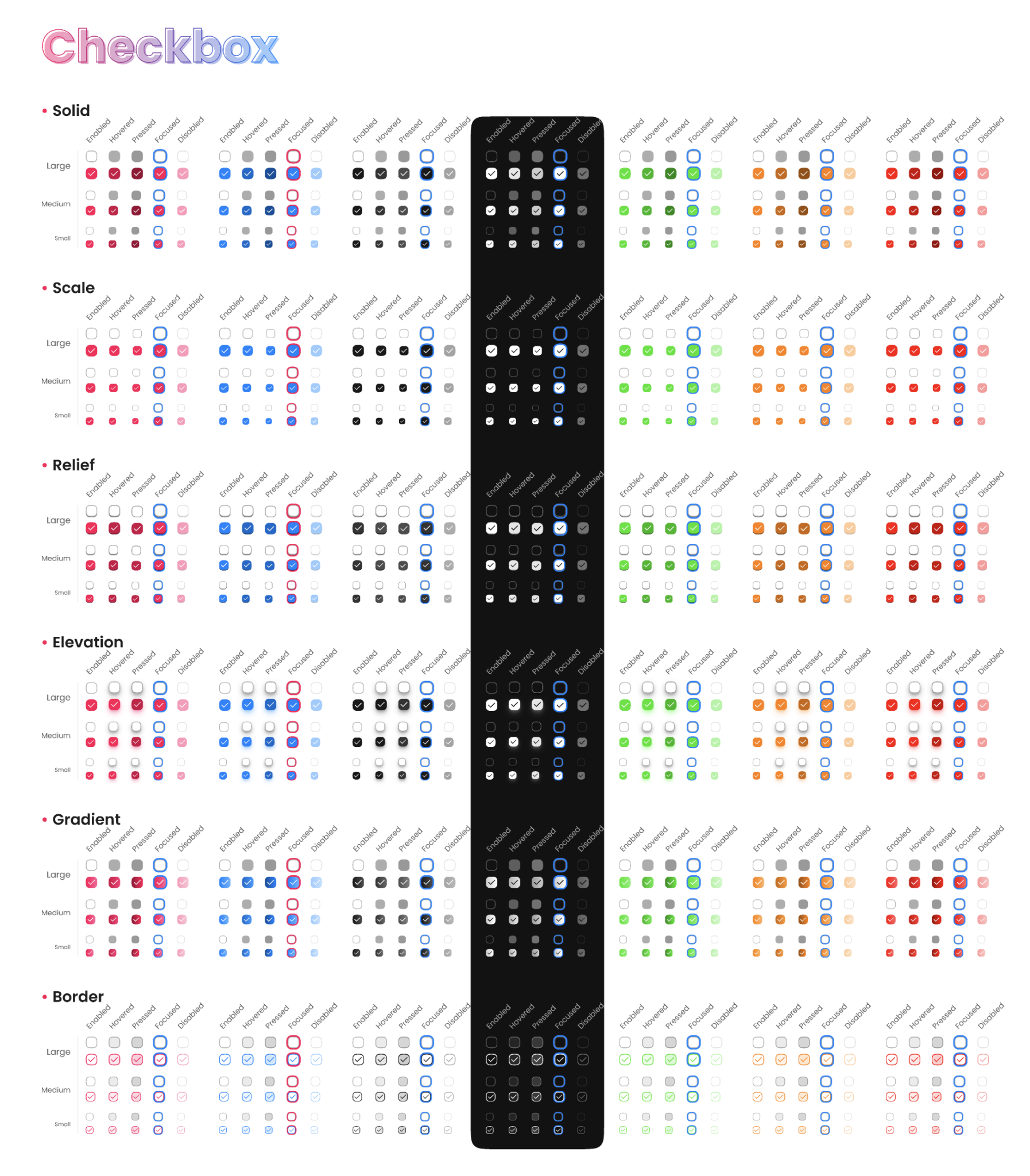
Checkbox in Design System
Checkboxes are a common user interface component used in digital products to allow users to select one or more options from a list. In a design system, checkboxes should be designed to be consistent and intuitive across all products and platforms.
When designing checkboxes, it’s important to consider the purpose and context of the component. For example, checkboxes can be used for selecting multiple items, filtering content, or accepting terms and conditions. The design system should define consistent styles and behaviors for each use case to ensure a cohesive user experience.
The design system should also consider the visual design of checkboxes. The size, color, and shape of the checkbox should be consistent with the overall design system. Additionally, the design system should provide guidelines for the spacing and layout of checkboxes, as well as how they interact with other UI components such as labels, buttons, and forms.
Furthermore, the design system should consider the accessibility of checkboxes. The component should be designed to be accessible to all users, including those with disabilities. This includes ensuring that the checkbox is easily identifiable, labeled clearly, and can be operated using various input methods such as keyboard or mouse.
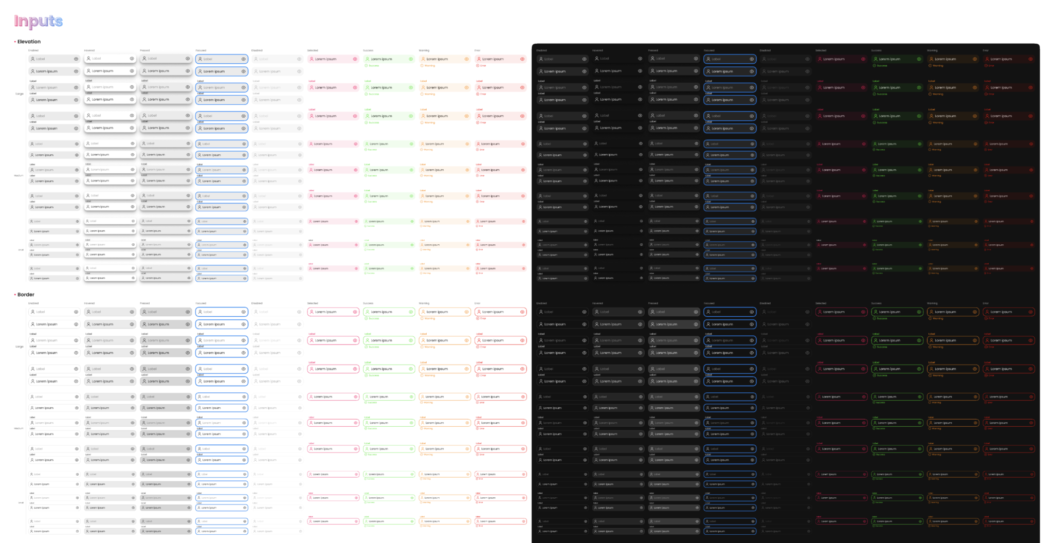
Inputs in Design System
Inputs are a fundamental component of user interfaces in digital products, allowing users to enter data and interact with the system. In a design system, inputs should be designed to be consistent and intuitive across all products and platforms.
When designing inputs, it’s important to consider the purpose and context of the component. For example, inputs can be used for entering text, numbers, dates, or selecting options from a dropdown list. The design system should define consistent styles and behaviors for each use case to ensure a cohesive user experience.
The design system should also consider the visual design of inputs. The size, color, and typography of the input should be consistent with the overall design system. Additionally, the design system should provide guidelines for the spacing and layout of inputs, as well as how they interact with other UI components such as labels, buttons, and forms.
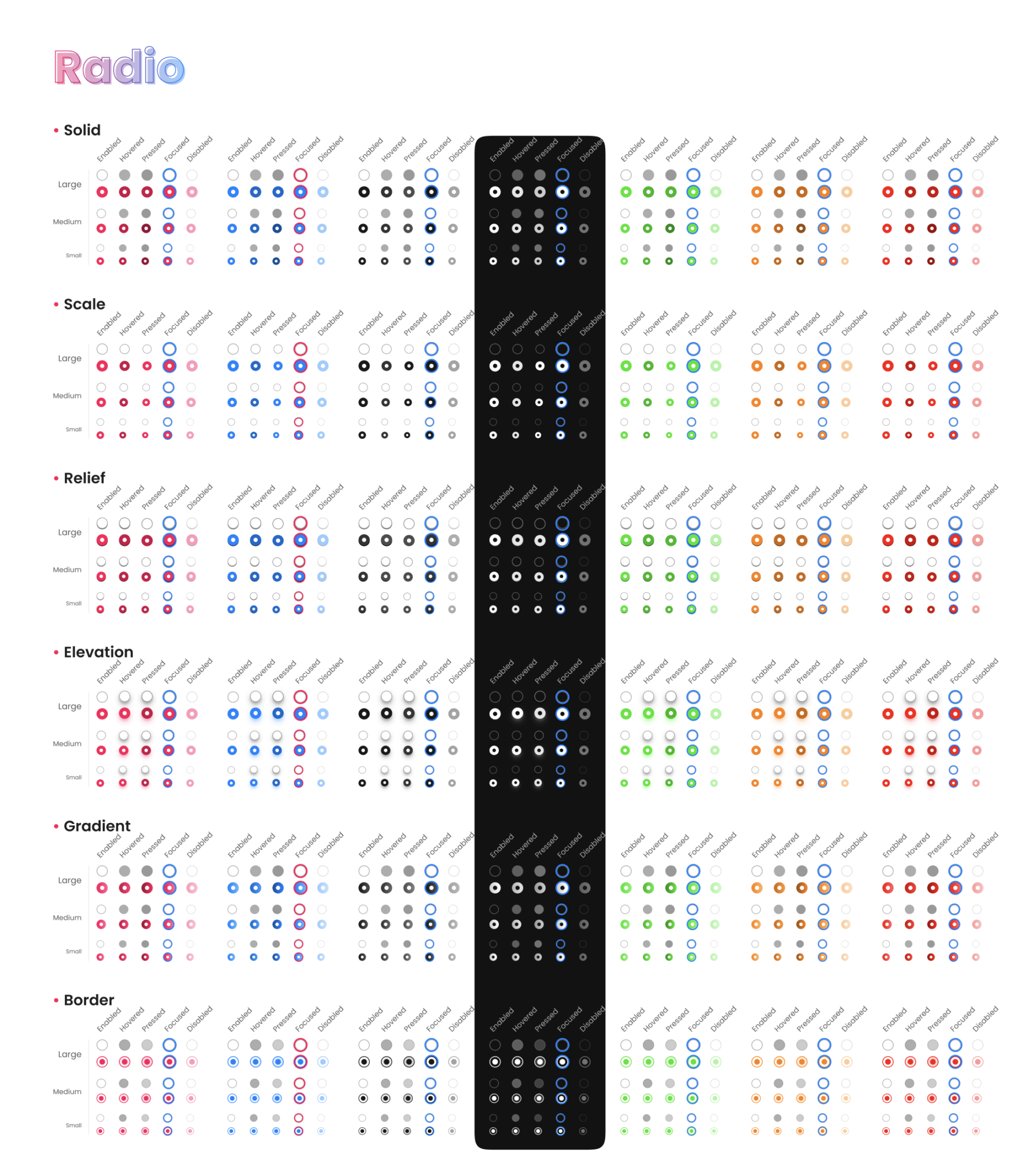
Radio in Design System
Radio buttons are a common user interface component used in digital products to allow users to select one option from a list. In a design system, radio buttons should be designed to be consistent and intuitive across all products and platforms.
When designing radio buttons, it’s important to consider the purpose and context of the component. For example, radio buttons can be used for selecting a single option from a list of mutually exclusive options. The design system should define consistent styles and behaviors for this use case to ensure a cohesive user experience.
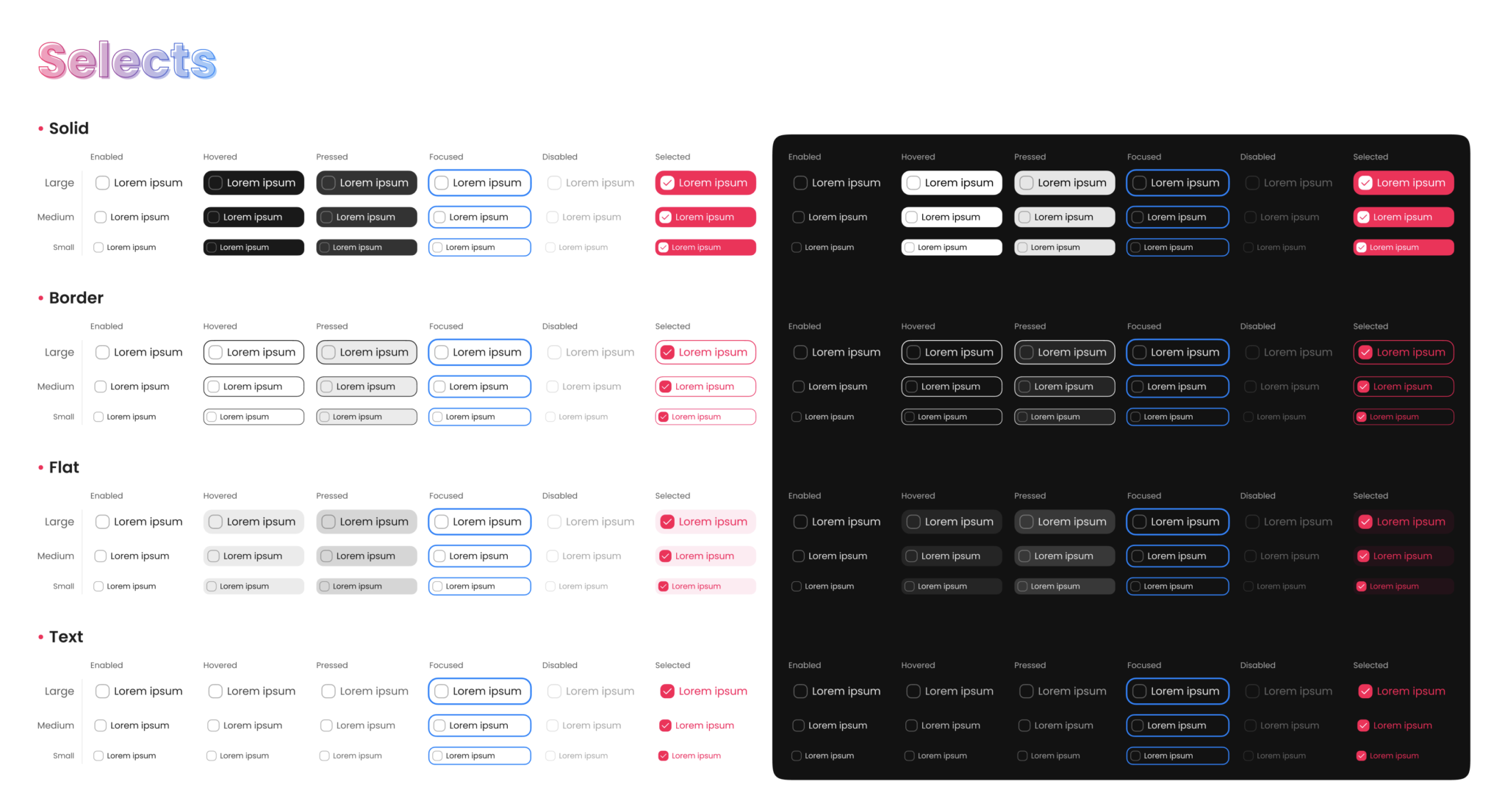
Selects in Design System
Selects are a common user interface component used in digital products to allow users to select an option from a dropdown list. In a design system, selects should be designed to be consistent and intuitive across all products and platforms.
When designing selects, it’s important to consider the purpose and context of the component. For example, selects can be used for selecting a single option from a list, or for selecting multiple options with the use of checkboxes. The design system should define consistent styles and behaviors for each use case to ensure a cohesive user experience.
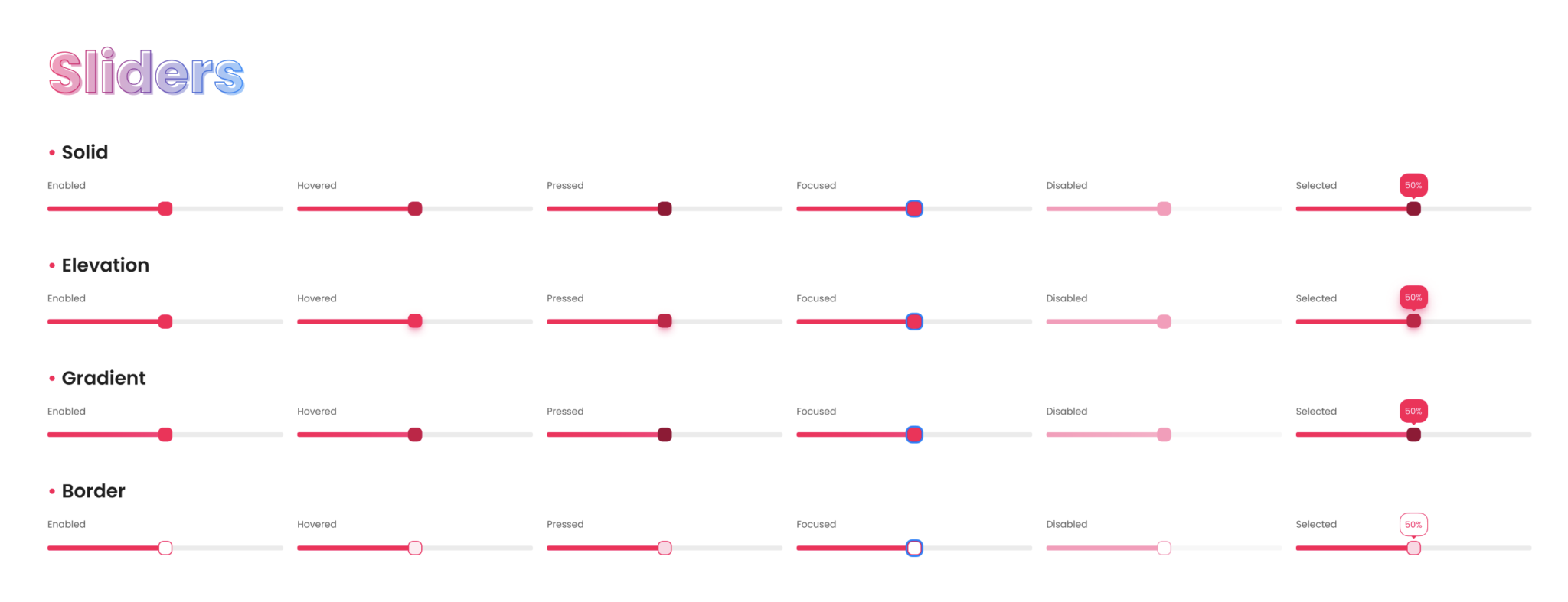
Sliders in Design System
Sliders are a popular user interface component used in digital products to allow users to adjust values within a range. In a design system, sliders should be designed to be consistent and intuitive across all products and platforms.
When designing sliders, it’s important to consider the purpose and context of the component. For example, sliders can be used for adjusting values such as volume, brightness, or temperature. The design system should define consistent styles and behaviors for each use case to ensure a cohesive user experience.
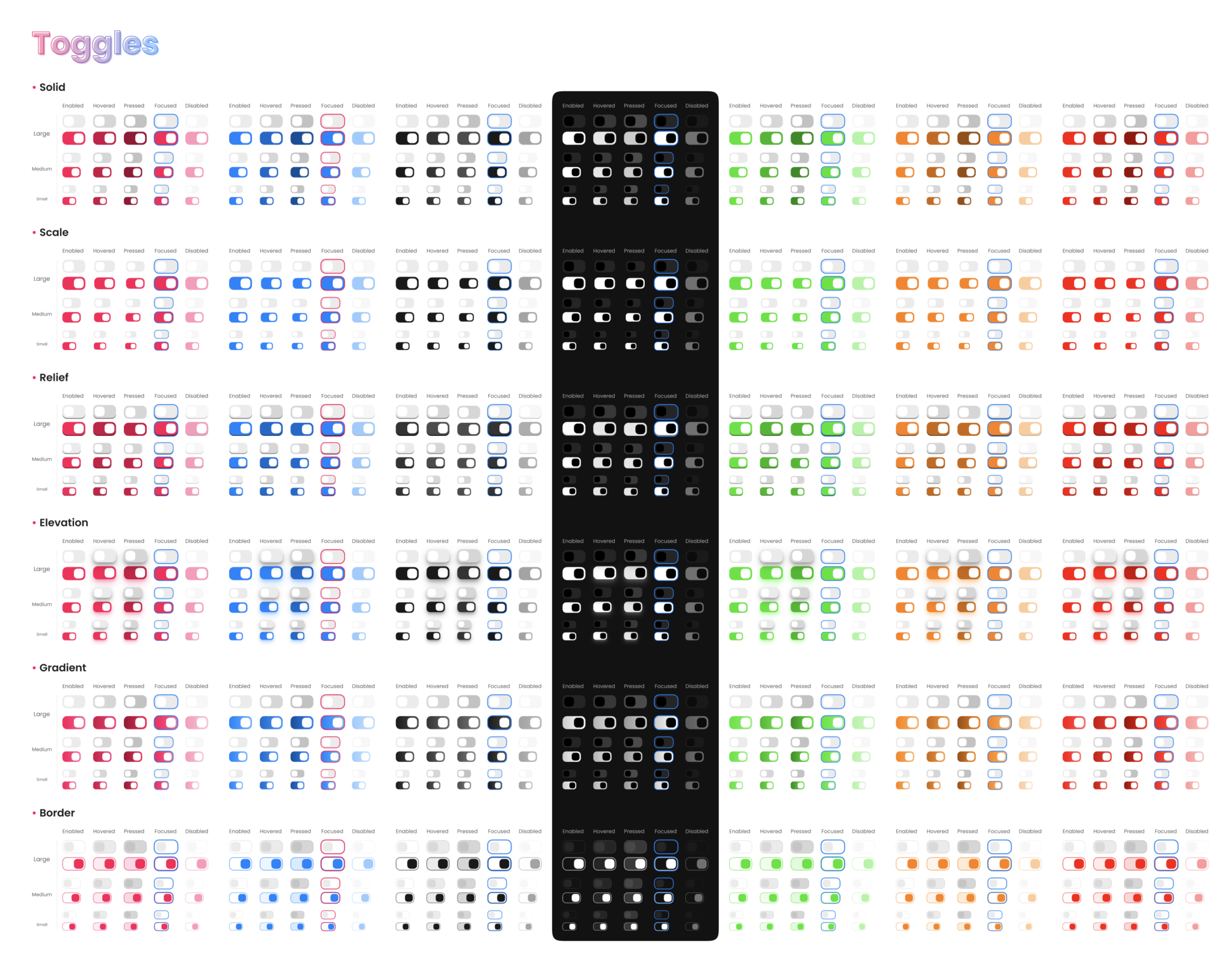
Toggles in Design System
Toggles are a user interface component used in digital products to allow users to switch between two states, such as on/off or enabled/disabled. In a design system, toggles should be designed to be consistent and intuitive across all products and platforms.
When designing toggles, it’s important to consider the purpose and context of the component. The design system should define consistent styles and behaviors for each use case to ensure a cohesive user experience.
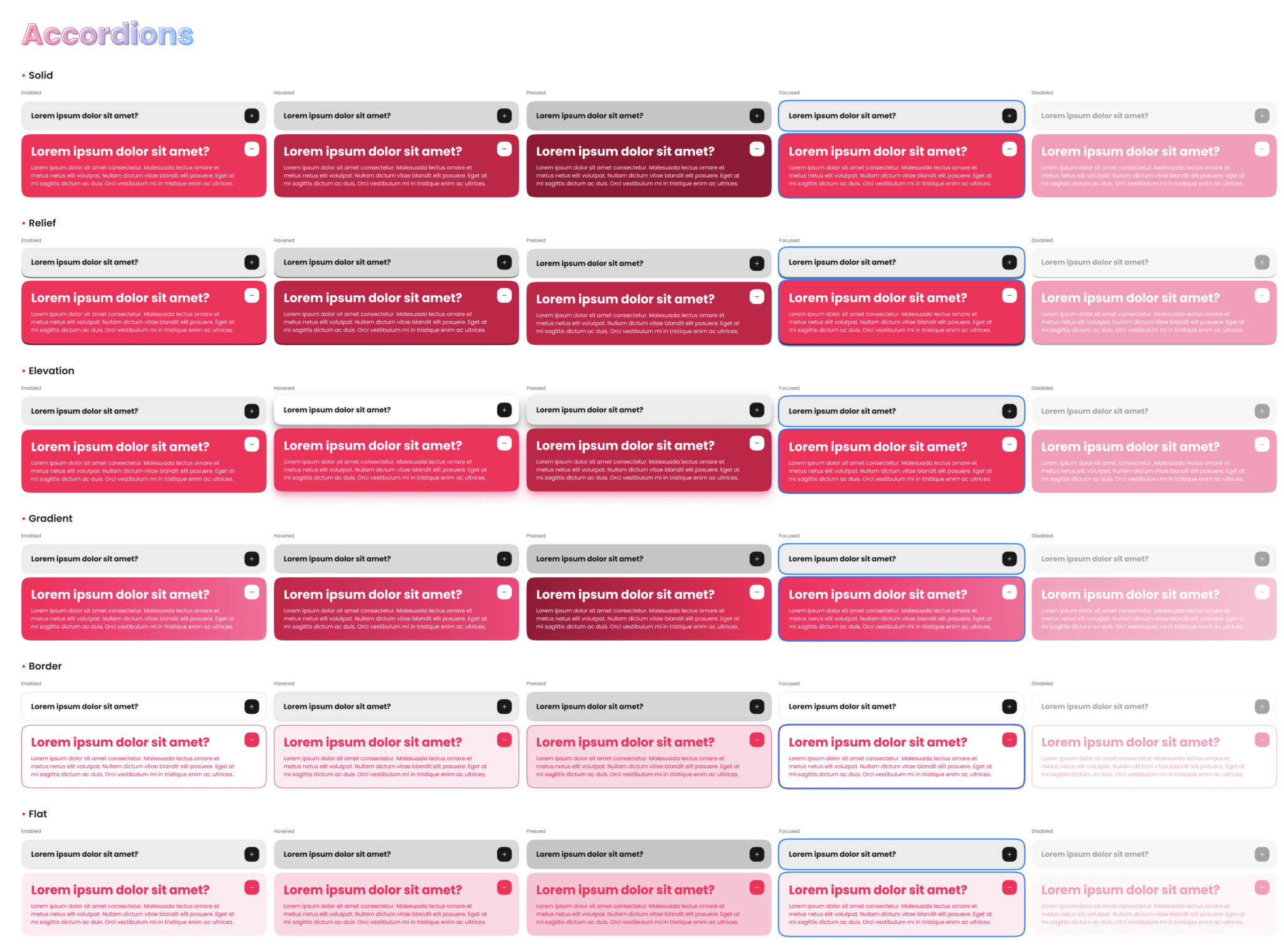
Accordions in Design System
Accordions are a popular UI element used in design systems to improve the usability and organization of content. They allow users to view and interact with additional information without cluttering the interface. Accordions can be used for FAQs, product descriptions, and more. In a design system, accordions should have a consistent design and behavior across all applications to ensure a seamless user experience. It’s important to consider accessibility when designing accordions, such as providing keyboard navigation and clear labels. When used effectively, accordions can enhance the user experience and make complex information more manageable.
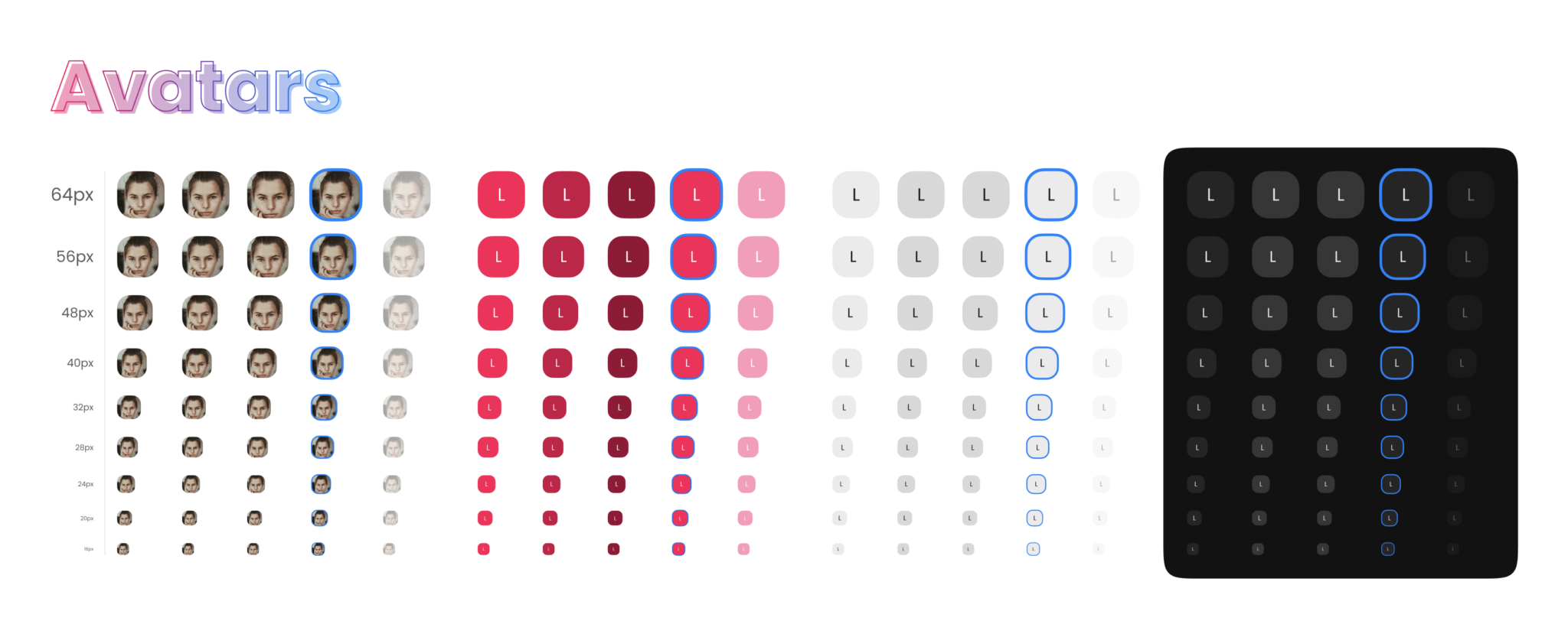
Avatars in Design System
Avatars are an important visual element in design systems that can help users easily identify individuals, teams, or groups. They are typically small, circular images that are used to represent a user’s profile picture or identity.
When designing avatars, it’s important to consider factors such as size, color, and style to ensure consistency and coherence within the design system. Designers can also incorporate various shapes, patterns, and gradients to add personality and differentiate between different types of avatars.
In addition to traditional static avatars, animated or dynamic avatars can also be used to provide more engaging and interactive experiences for users. However, designers should ensure that these animations are subtle and do not distract from the main content.
Overall, avatars are a crucial component of a design system and should be carefully considered to ensure that they effectively communicate identity and enhance the user experience.
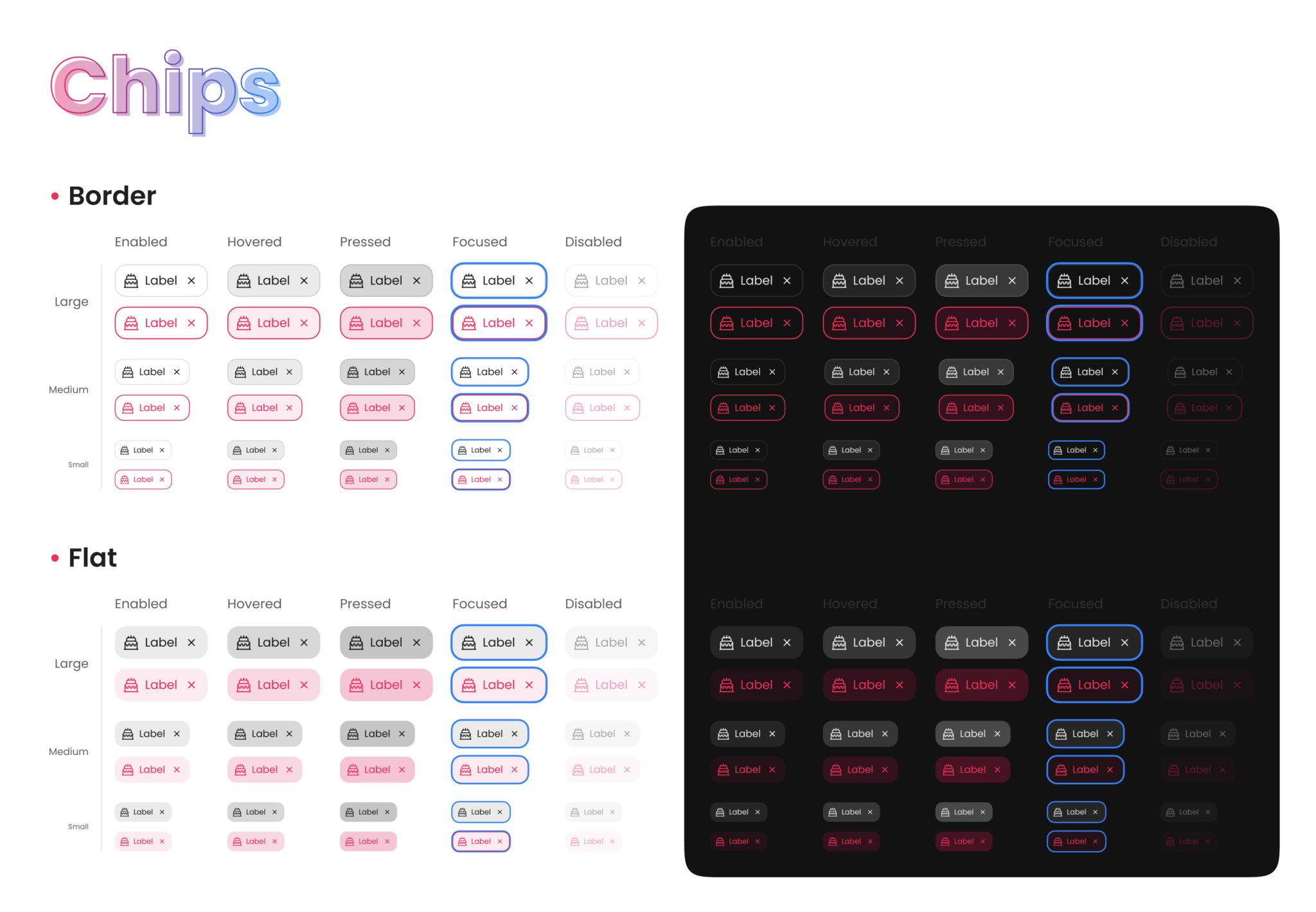
Chips in Design System
Chips are a popular UI component in design systems that can help to display information in a compact and visually appealing way. They are small, rectangular elements that contain a piece of information, such as a tag or a label, and can be used to represent various types of data.
When designing chips, it’s important to consider factors such as size, color, typography, and spacing to ensure consistency and alignment with the overall design system. Chips can also be customized with various styles, such as rounded corners or shadows, to add depth and dimensionality.
In addition to displaying static information, chips can also be interactive, allowing users to select or delete them. This can provide a more engaging and dynamic user experience, while also allowing users to manage their data more effectively.
Overall, chips are a versatile and useful component in design systems, and can be used in a variety of contexts, such as search bars, filter menus, or tag clouds. Careful consideration and attention to detail can help to ensure that chips effectively communicate information and enhance the user experience.
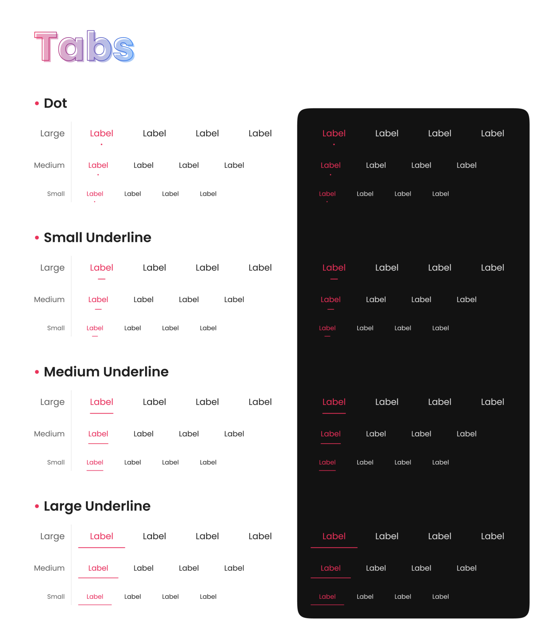
Tabs in Design System
Tabs are a common UI element in design systems that can help to organize content and improve navigation. They are typically rectangular or pill-shaped buttons that are used to switch between different views or sections of an interface.
When designing tabs, it’s important to consider factors such as size, color, typography, and spacing to ensure consistency and alignment with the overall design system. Tabs can also be customized with various styles, such as borders or gradients, to add depth and visual interest.
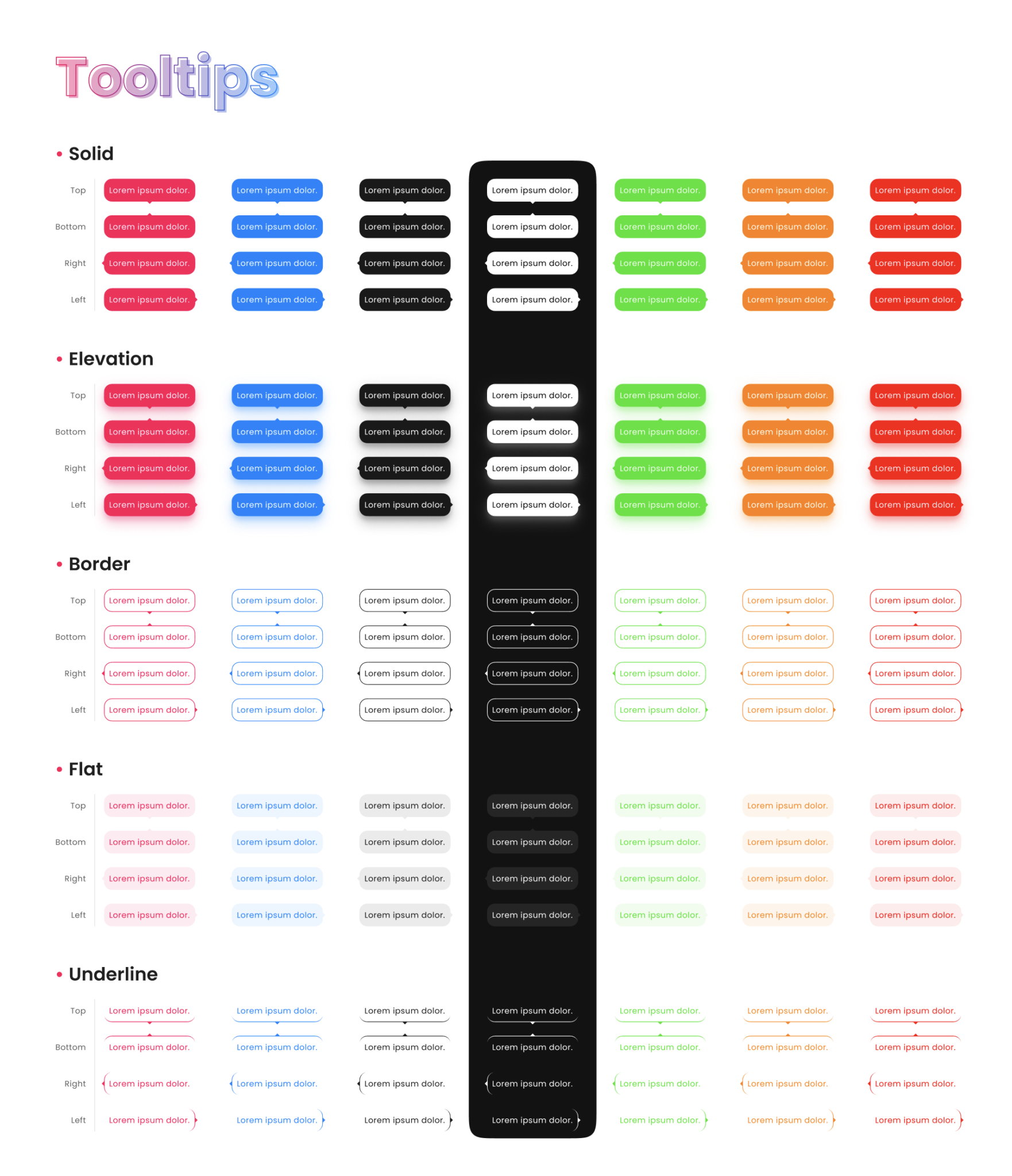
Tooltips in Design System
Tooltips are a popular UI component in design systems that can provide additional information or context for interface elements. They are typically small pop-up boxes that appear when a user hovers over or clicks on a particular element.
When designing tooltips, it’s important to consider factors such as size, color, typography, and placement to ensure consistency and alignment with the overall design system. Tooltips can also be customized with various styles, such as borders or shadows, to add visual interest and make them more distinct.
In addition to providing information, tooltips can also be interactive, allowing users to take action or access related content. This can help to provide a more seamless and efficient user experience, particularly for interfaces with complex or unfamiliar features.
Notifications in Design System
Notifications are an important UI component in design systems that can help to alert users to important events or updates. They are typically small, pop-up messages that appear on a user’s screen, either in response to an action or as a reminder.
When designing notifications, it’s important to consider factors such as size, color, typography, and placement to ensure consistency and alignment with the overall design system. Notifications can also be customized with various styles, such as animations or icons, to add visual interest and make them more noticeable.
In addition to providing alerts, notifications can also be interactive, allowing users to take action or dismiss them. This can help to provide a more efficient and streamlined user experience, particularly for interfaces with frequent updates or changes.