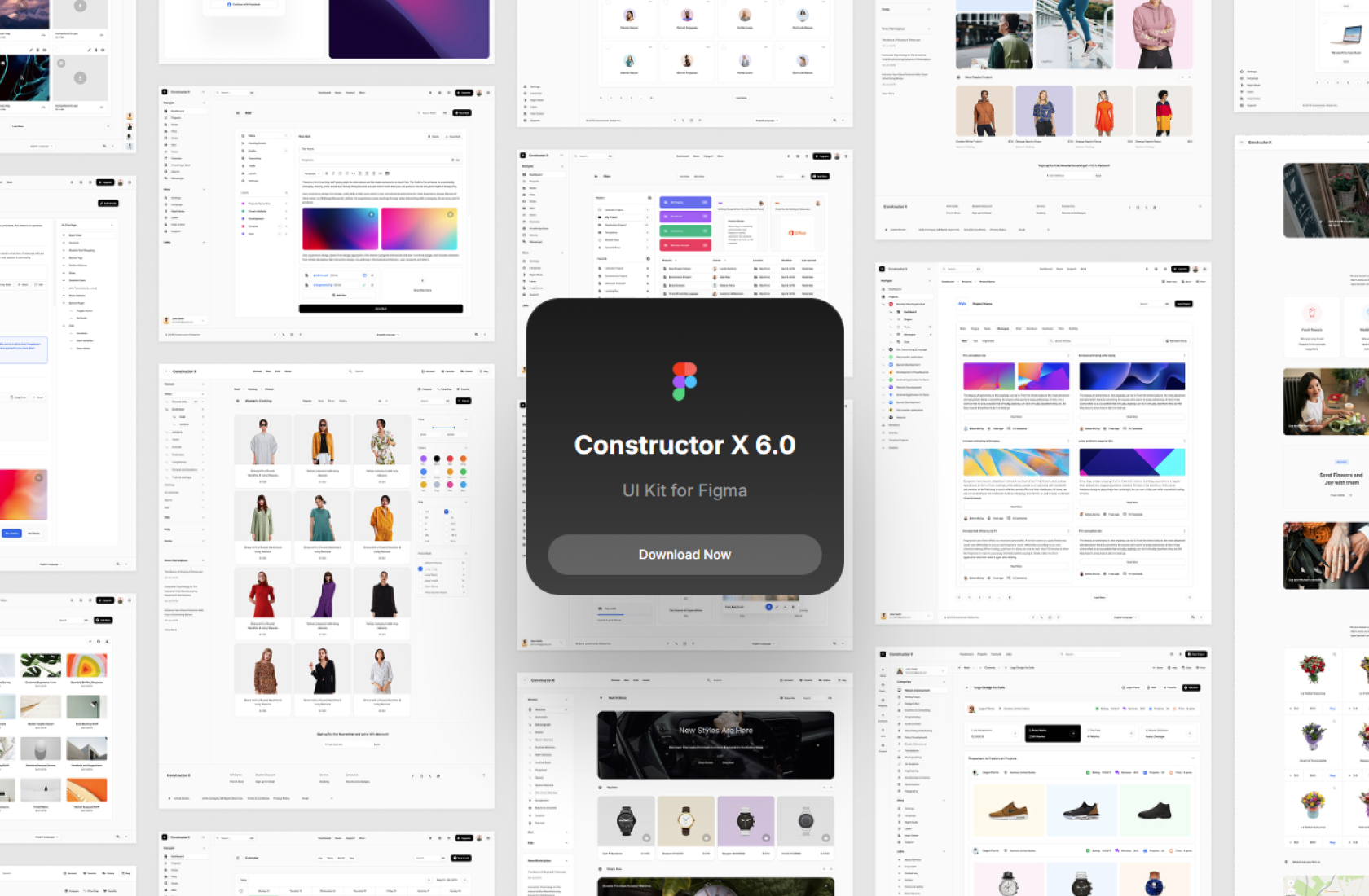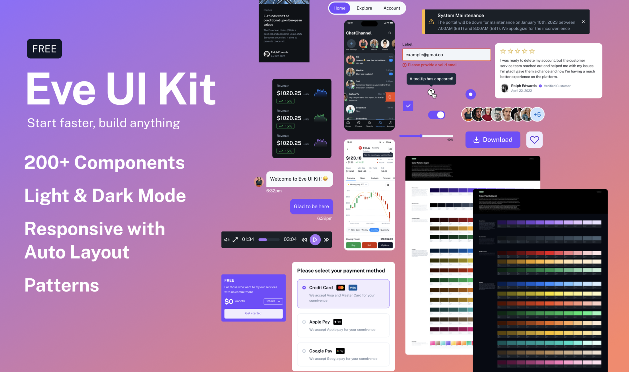
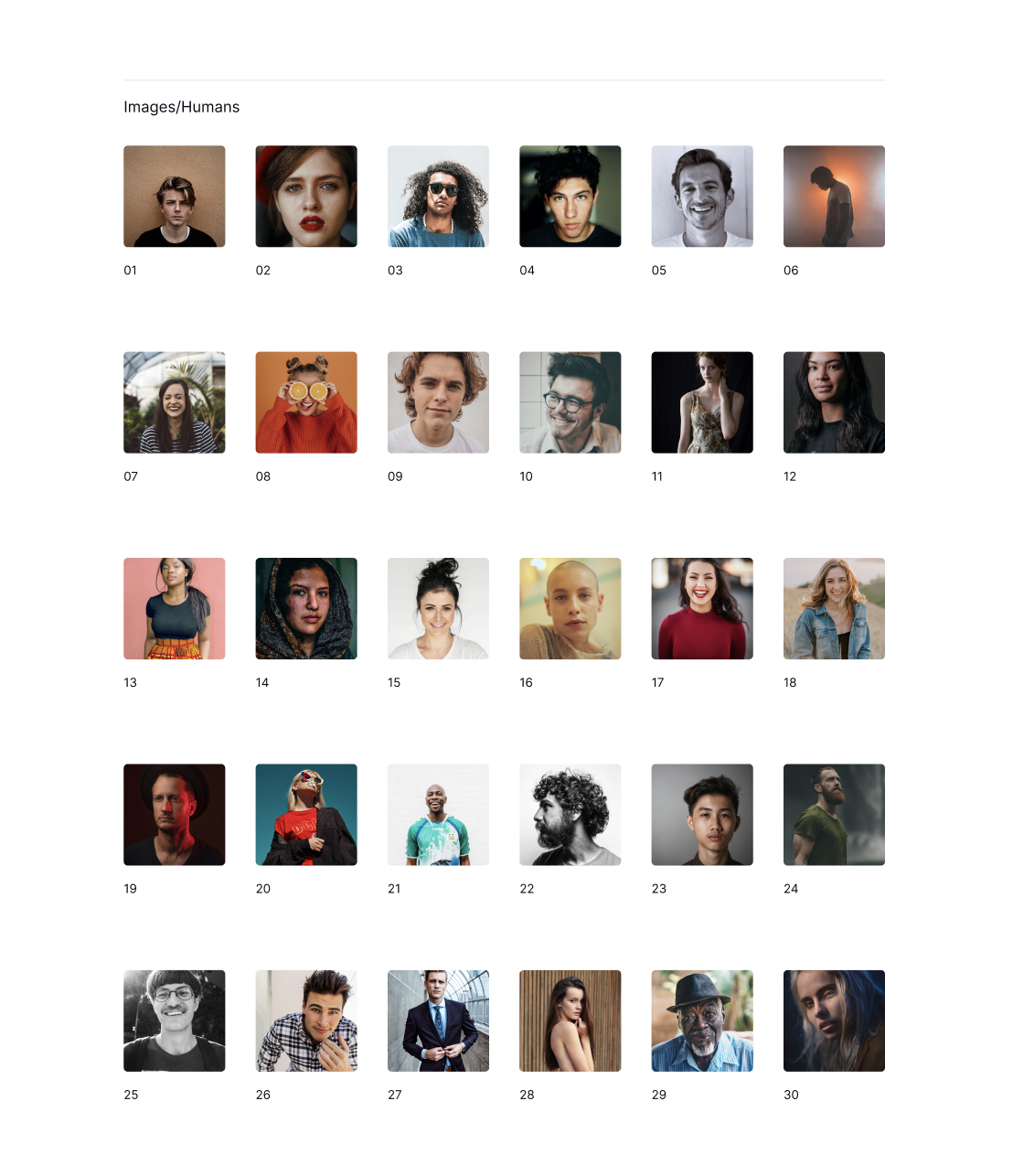
Designers should use their time efficiently by leveraging common components and layouts at the beginning of each project. Eve is a UI Kit/Design system that allows designers to quickly create functional, visually appealing layouts by using a range of customizable components. Eve was designed with a focus on accessibility and to be flexible to accommodate various products. The kit includes hundreds of component variants that can be used to build designs quickly using Figma’s powerful auto-layout, variant, and property features. Start faster, build anything.
Color Palette Eve UI Kit Figma Free
In UI design, color refers to the use of different hues, shades, and tints to create visual interest and convey information. Color can be used to create contrast, to draw attention to specific elements, and to convey meaning and emotion.
Color is a powerful tool in UI design, it can be used to create a sense of hierarchy, to group related information, and to create a visual identity for a website or application. The use of color can also affect the user’s emotional response to the interface, and can be used to create a specific mood or atmosphere.
In UI design, color can be used in several ways, for example, to indicate a state, for instance, to indicate errors, success, or warnings, to create contrast and make important elements stand out, to provide feedback and cues to users, like highlighting the selected item. The use of color in UI design can also be used to create a color scheme, which is a combination of colors used to create a consistent and cohesive look throughout the interface. Additionally, the use of color can also be used to promote accessibility, by creating a sufficient color contrast between text and backgrounds, and providing alternative ways to convey information, like text-alternatives or symbols.
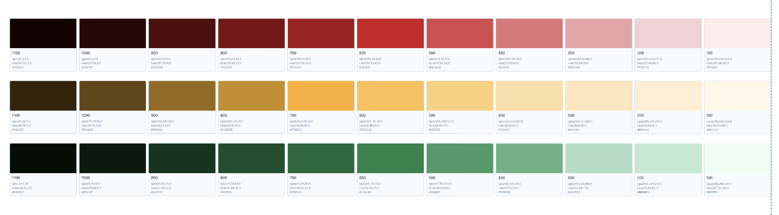
Primary Color Eve UI Kit Figma Free
A primary color is a dominant color that is used as the main color of the design. It is typically used for backgrounds, large areas, and other elements that form the foundation of the UI. Primary colors are typically chosen to set the overall tone and mood of the design, and are often used in combination with secondary and accent colors to create visual interest and balance.

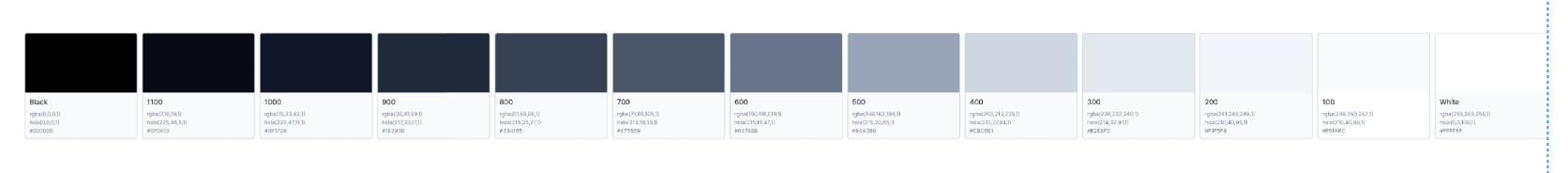
Neutral Colors Eve UI Kit Figma Free
Neutral colors are colors that are not bright or bold, and are often used as a background or base color. They can include shades of white, black, gray, and beige, and are often used to create a calming and professional look. Neutral colors can be used to balance out other, more vibrant colors in a UI, and can help to create a sense of stability and balance.
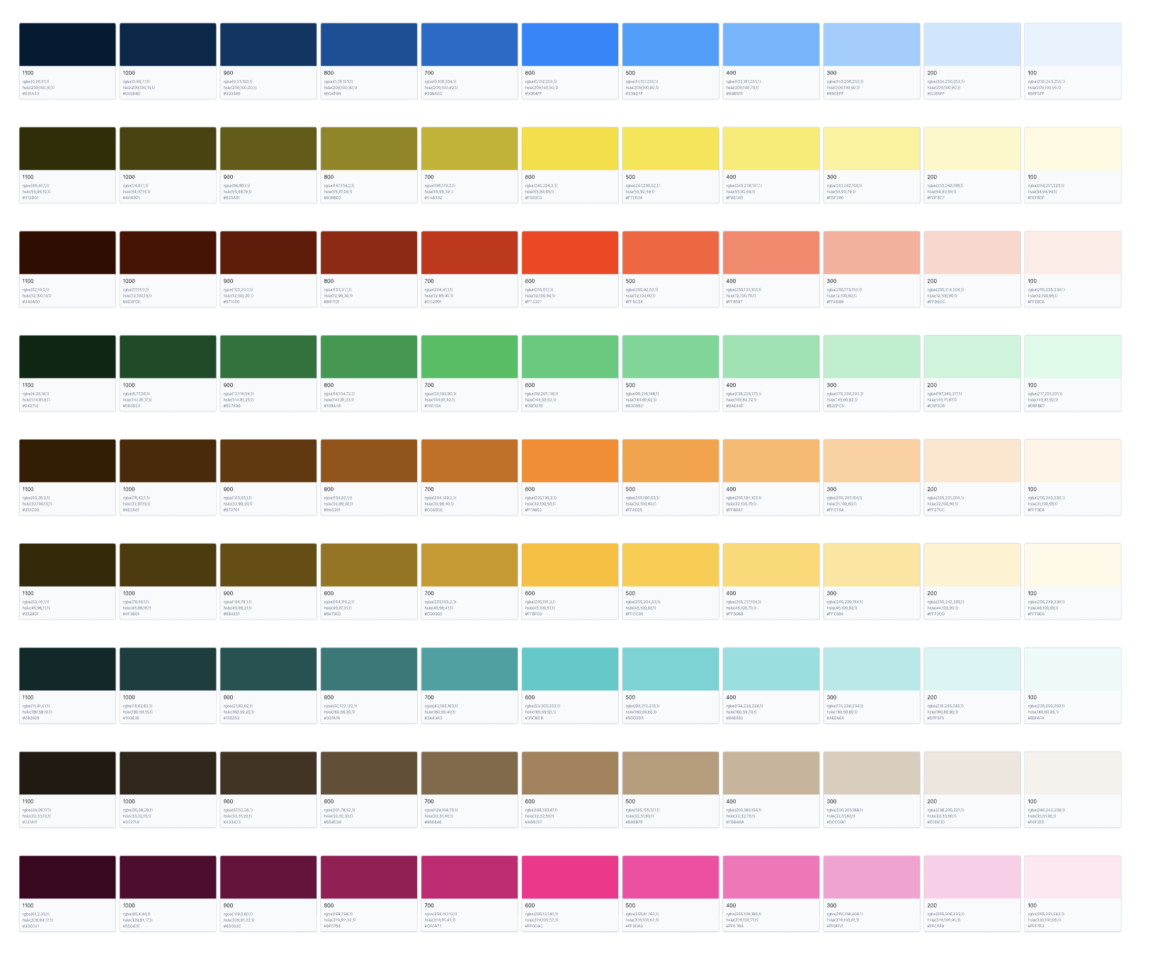
Feedback Colors Eve UI Kit Figma Free
These colors communicate system status to the user using clear messaging and comply with most user’s basic understanding of what certain colors represent.
Accents Colors Eve UI Kit Figma Free
Accent colors are colors used to highlight specific elements or areas, draw attention, and add visual interest. They are typically used sparingly and chosen to complement the main color scheme. Accent colors can be applied to text, buttons, and other UI elements, and are often used to indicate interactivity or guide the user’s attention.
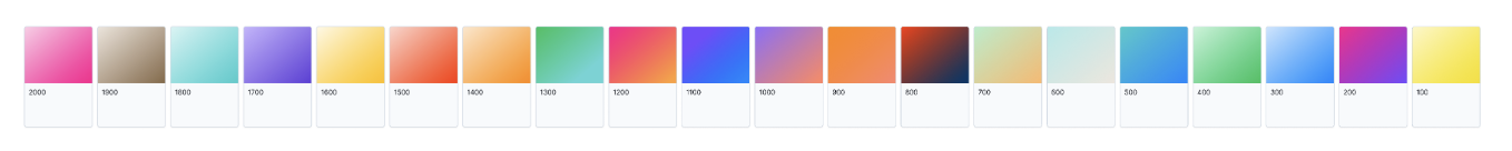
Gradients Eve UI Kit Figma Free
Gradients help your designs stand out and add dimension to layouts by adding realism to objects and creating a more diverse palette.
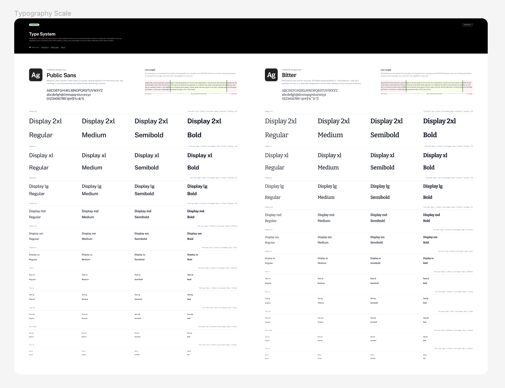
Type System Eve UI Kit Figma Free
Typography is a key part of the design system. It helps establish hierarchy and communicate important content by creating clear visual patterns. By tying typographic styles to specific functions in the interface, I create a clear visual pattern for users to follow while they interact with the product.
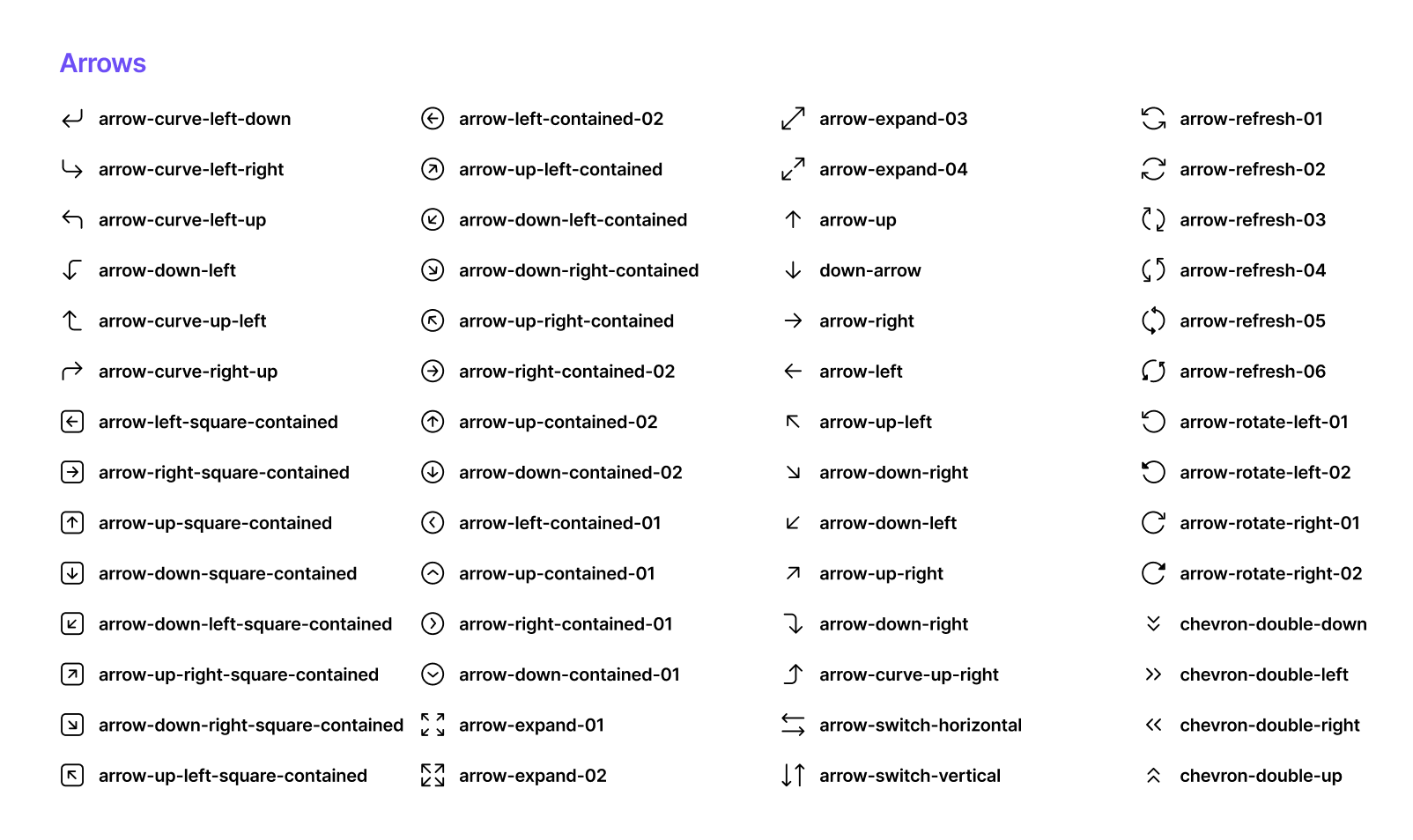
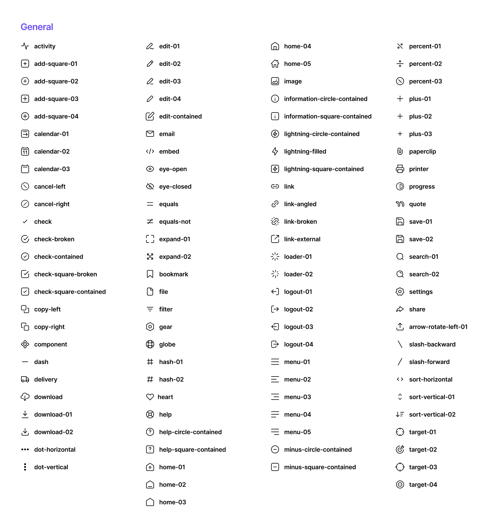
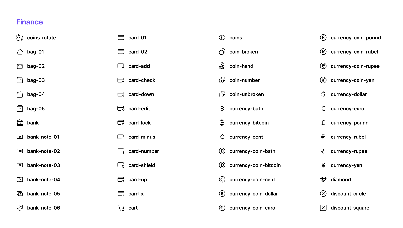
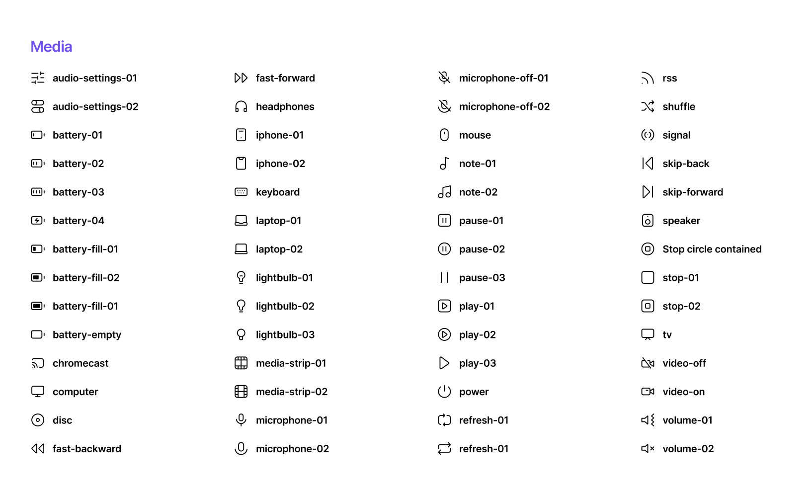
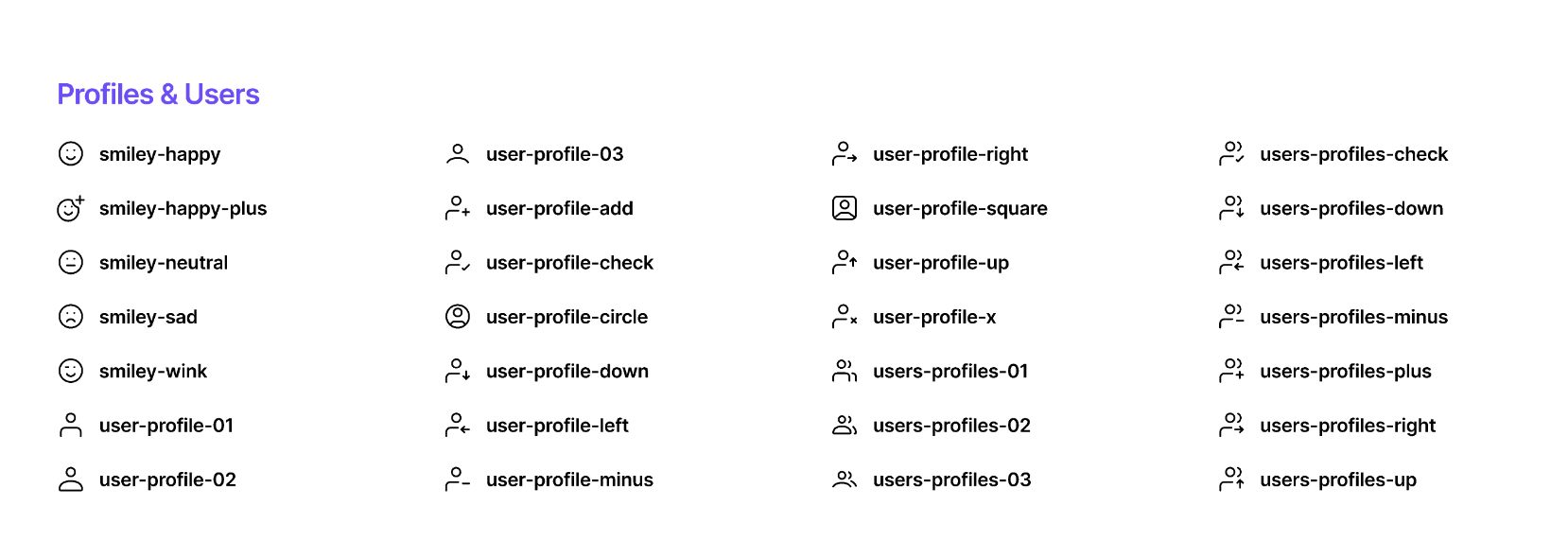
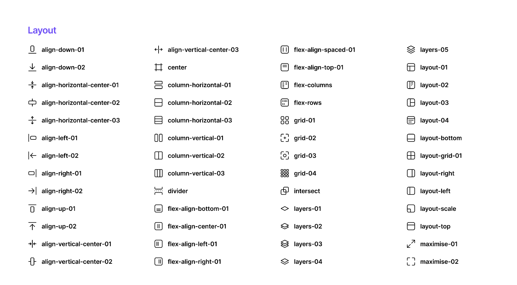
Iconography Eve UI Kit Figma Free
Icons enhance the usability of a UI by giving users more visual cues while enhancing the aesthetic appeal of your design. They are especially useful on mobile considering the small amount of screen real estate. Icons should communicate meaning, be consistent in style and meaning; across the design, and be simple.

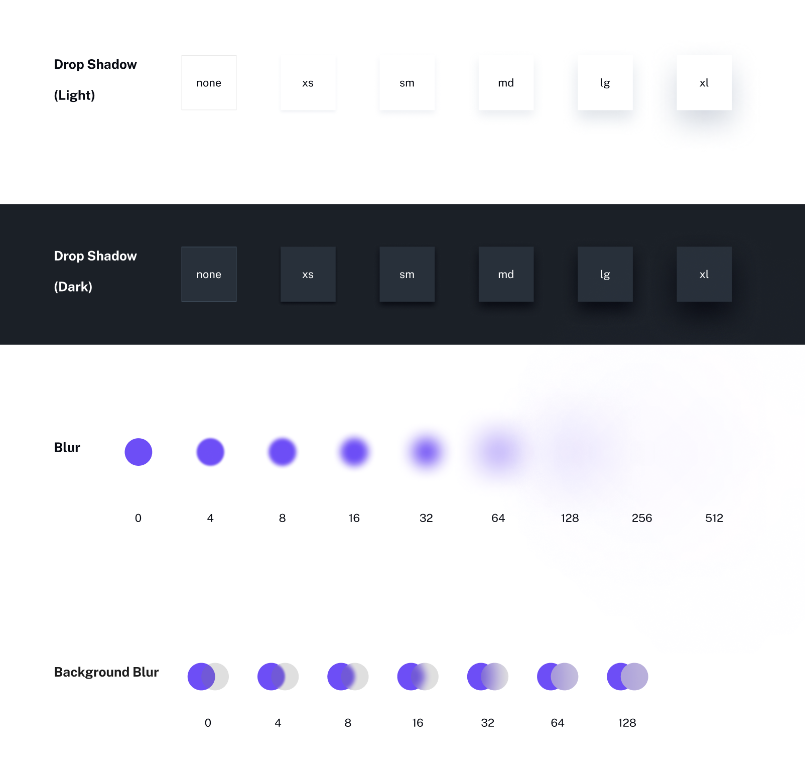
Shadows & Blur Eve UI Kit Figma Free
Shadows add depth to elements and are an important visual cue in design. It indicates to the user both visual hierarchy and that things may be interactive. Well-placed shadows will allow elements to stand out; they are commonly used with models, buttons, and tooltips. A more rounded corner radius gives elements a friendlier, more approachable look.
Grids & Spacing Eve UI Kit Figma Free
This system uses the 8pt gird for spacing between elements. Uniformity on a spatial level makes the product more consistent and allows for smoother communication between teams. There are many variations to the grid system and it is encouraged to experiment by changing the styles

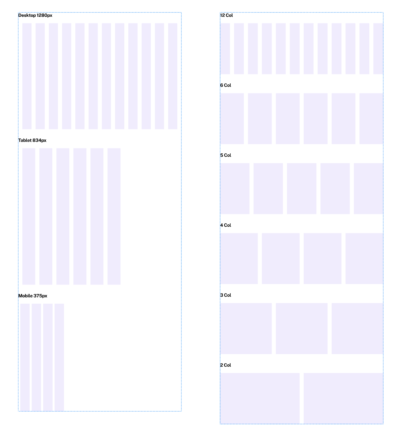
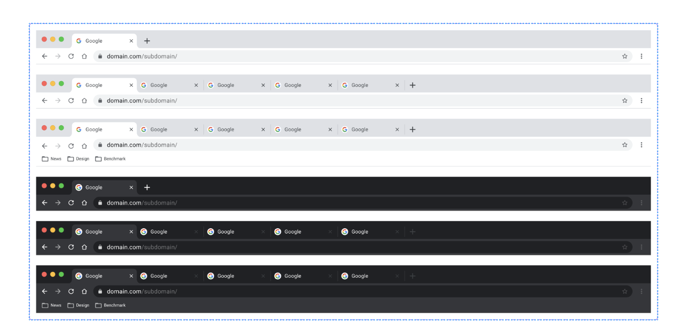
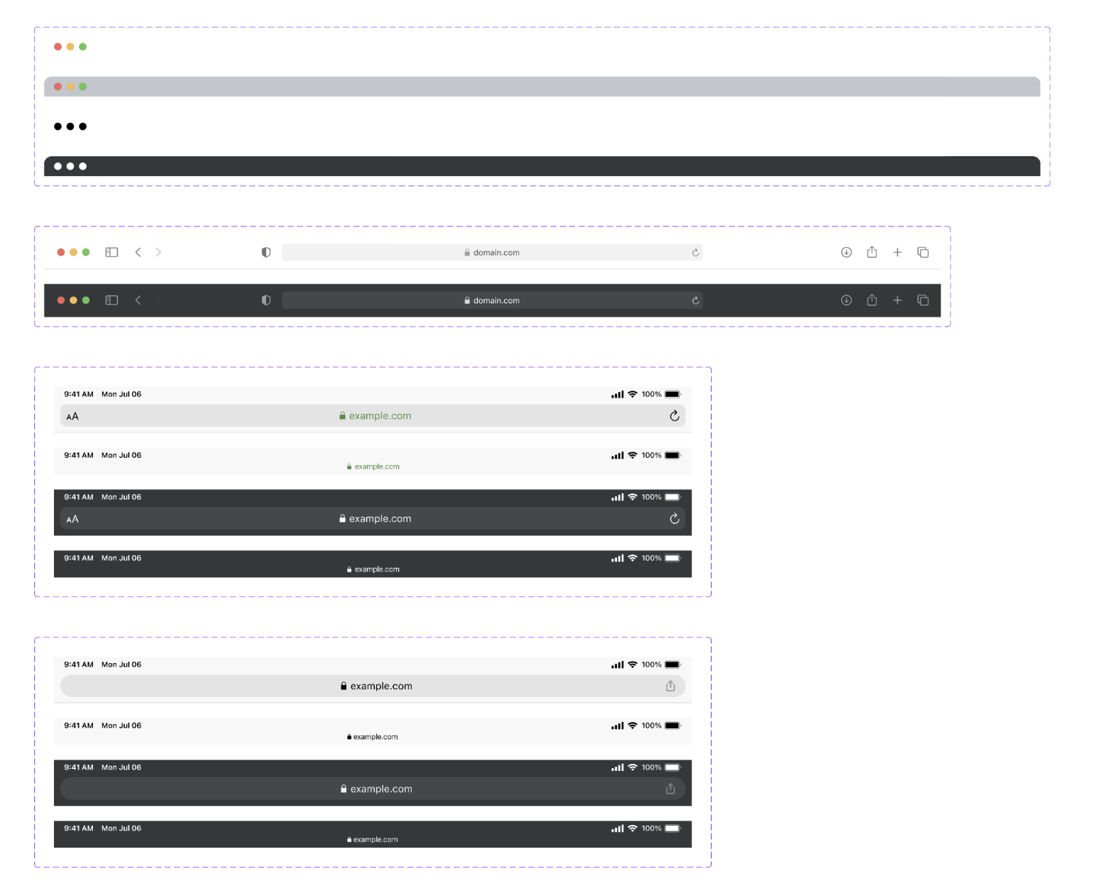
Desktop, tablet, mobile UI assets Eve UI Kit Figma Free
Put your designs in the context of the device they are being used on

Flags Eve UI Kit Figma Free
A collection of flags from around the world.
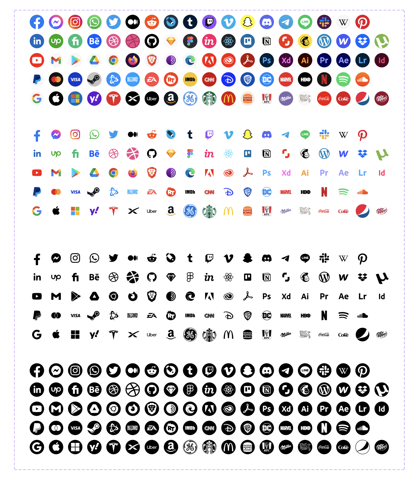
Logos Eve UI Kit Figma Free
All real company logos are the property of their respective owners.
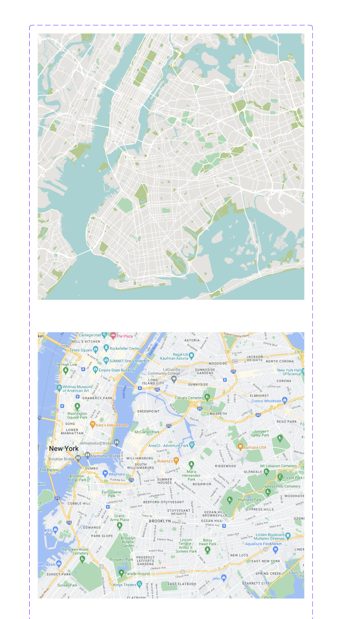
Maps Eve UI Kit Figma Free
Create custom maps at Snazzy Maps
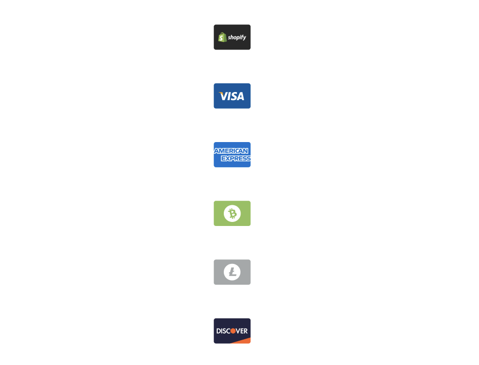
Payment Options Eve UI Kit Figma Free
A Collection of various payment options from some of the most popular vendors
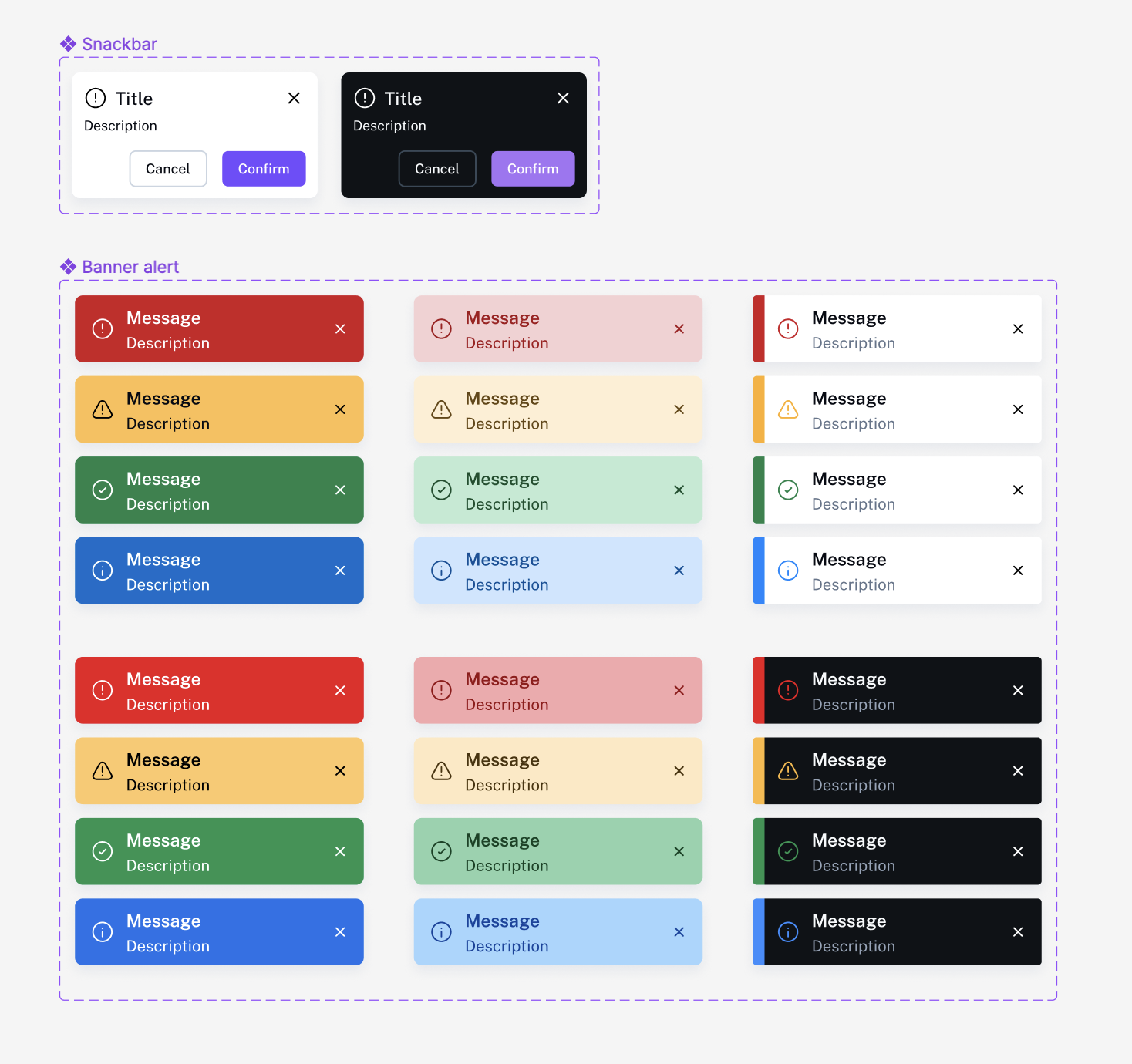
Alerts Eve UI Kit Figma Free
Alert components are elements that are used to inform users about important events, messages, or updates within a website or application. These notifications can take various forms, such as alert banners, pop-up messages, or badges, and may contain text, graphics, or other types of media. Notification components are often used to communicate important information to users, such as errors, warnings, or alerts, or to provide updates on the status of a task or process. They can be designed to be persistent or temporary, and may include actions or buttons that allow users to interact with them.
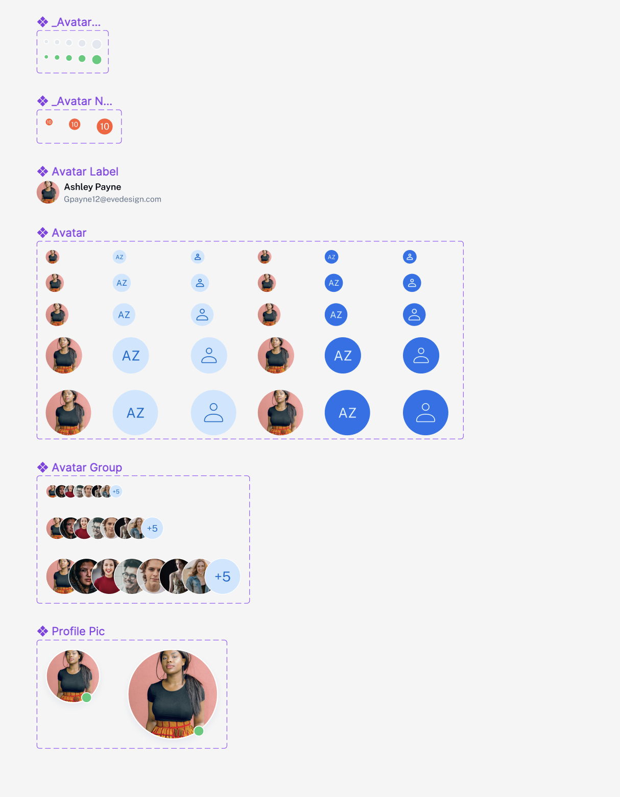
Avatar Eve UI Kit Figma Free
Avatar components are small graphic elements that represent a user or a character within a user interface. They are often used in social media or messaging applications to visually identify users and help differentiate them from one another. Avatar components may include a user’s profile picture, initials, or a customized graphic that represents their identity. In some cases, avatar components may also include additional information, such as the user’s name or status. These components are typically used to help create a sense of community and personalization within a user interface, and can be used in a variety of contexts, including online profiles, chat rooms, and forums.
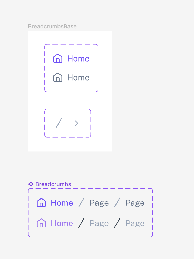
Breadcrumbs Eve UI Kit Figma Free
Breadcrumb components are a type of navigation element that provides users with a visual representation of their current location within a website or application. They typically consist of a series of links, each representing a different level of the site hierarchy, and allow users to easily navigate back to previous pages or higher levels of the site.
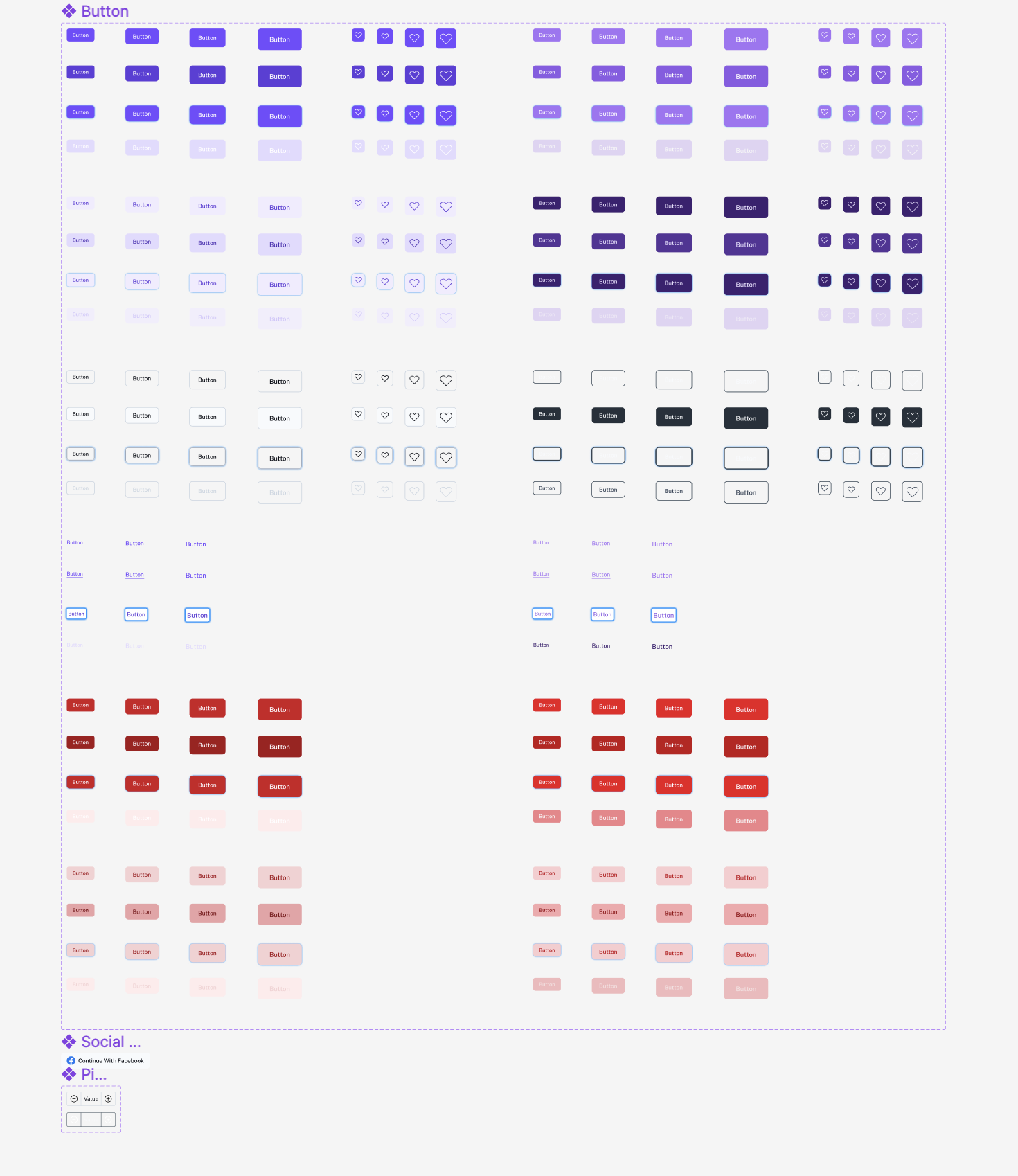
Button Eve UI Kit Figma Free
Button components are interactive elements that allow users to trigger an action or event, such as submitting a form, navigating to a new page, or initiating a process. They typically consist of a rectangular area with text or an icon that indicates the purpose of the button. Button components may be styled and customized in a variety of ways, such as with different colors, gradients, or border styles, to communicate different states or actions.
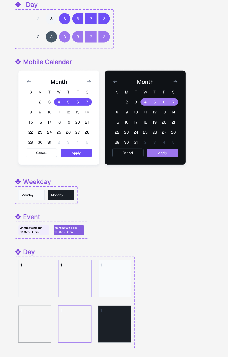
Calendar Eve UI Kit Figma Free
Calendar components are elements that allow users to interact with and view dates and events in a graphical format. They typically present a matrix of days and weeks, with each day represented by a cell, and may include additional elements such as navigation controls, month and year displays, and markers for events. Calendar components can be used to allow users to select a date, navigate to a specific month or year, and view events or schedules. They can also provide a way to visualize data that is organized by date, such as a project management tool or a schedule.
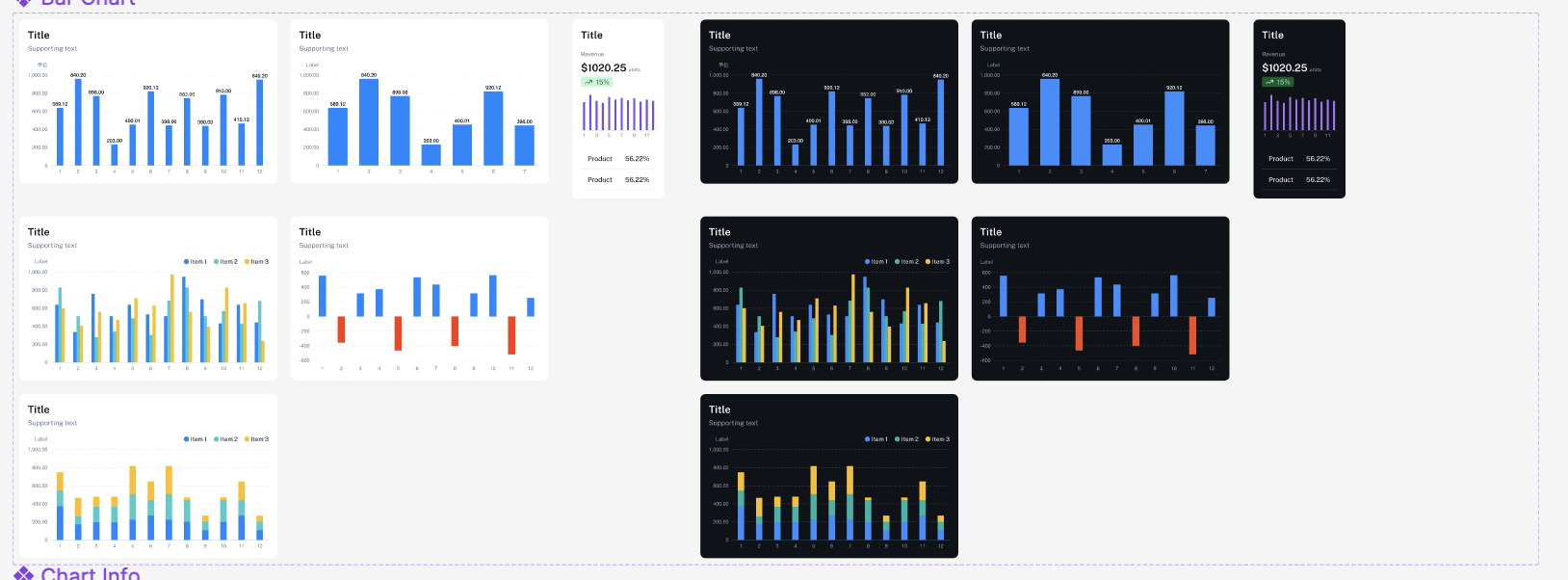
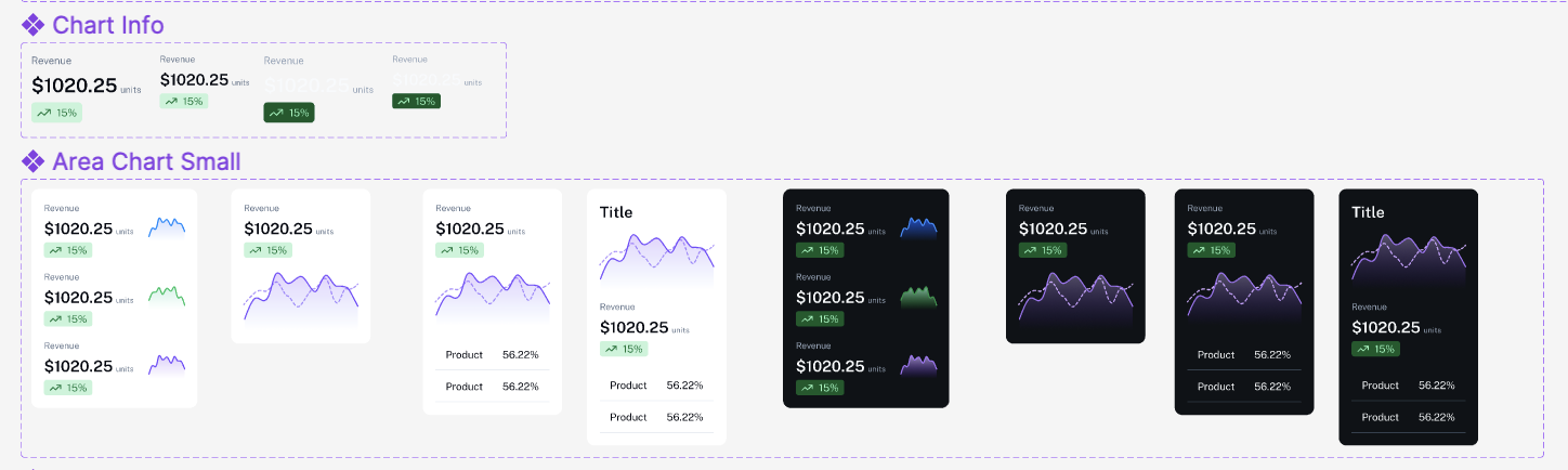
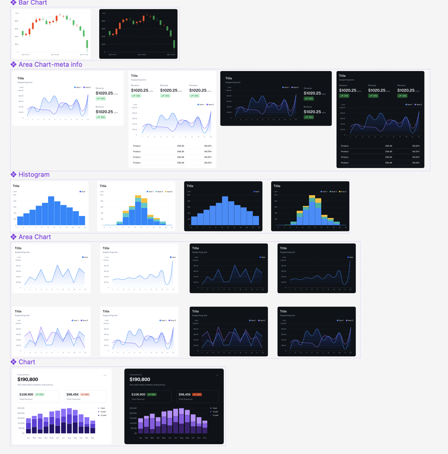
Charts Eve UI Kit Figma Free
Selectors Eve UI Kit Figma Free
Checkboxes allow users to select one or more items from a set, while radio buttons allow users to select just one option from a set. Both can also be used to turn an option on or off.
Toggles (also known as “switches”) is a UI control that has two mutually-exclusive states, such as ON and OFF. The design and functionality of this component is based on a physical switch that allows users to turn things ON or OFF. Toggles are a great visual cue for settings, especially on mobile, because they take less screen estate (in comparison with two radio buttons).
Radio buttons are controls that look like outlined circles. They allow users to select only one option. Once an option is picked, it can’t return to the unselected state.
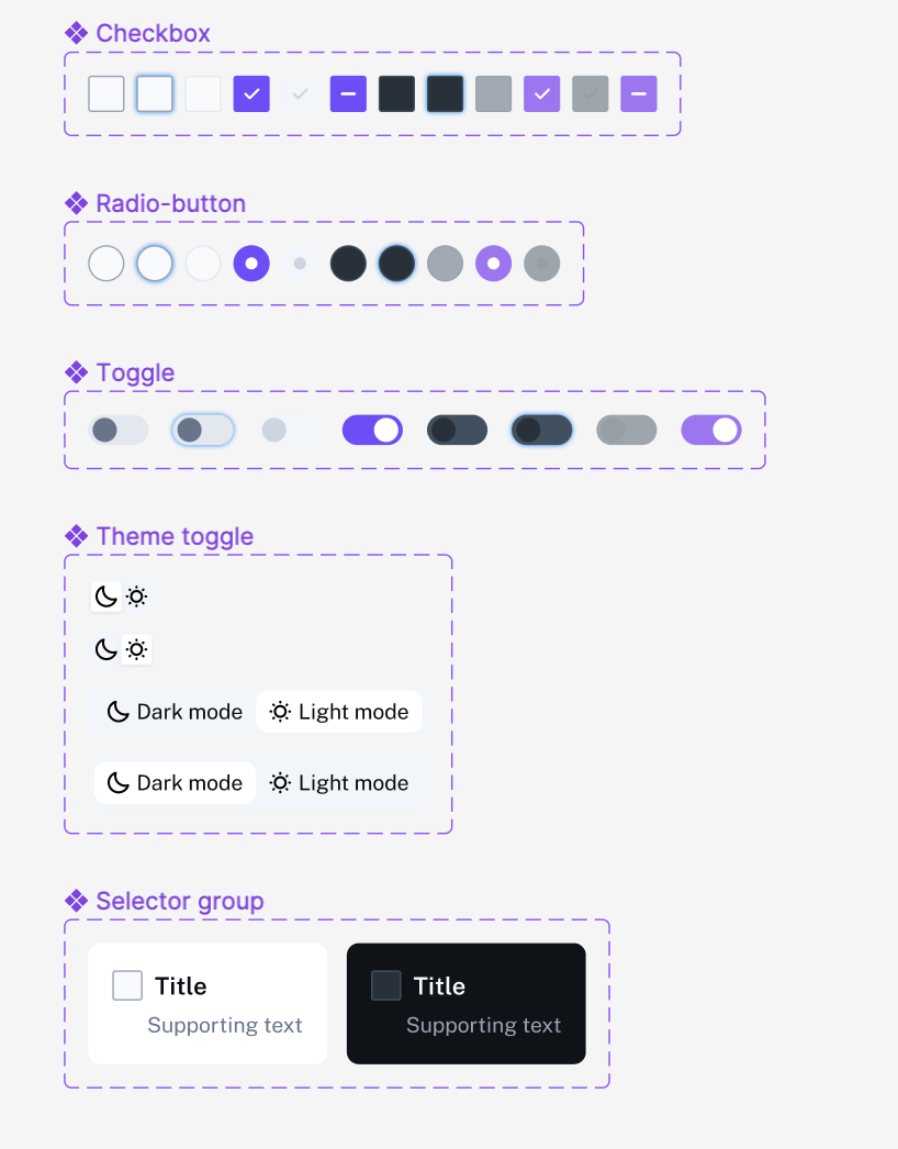
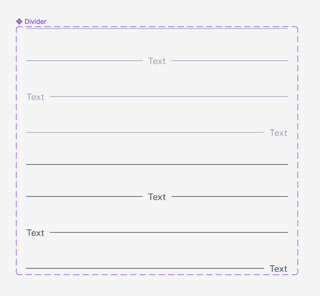
Divider Eve UI Kit Figma Free
A divider is a thin line that divides content into categories, sections, and page layouts.
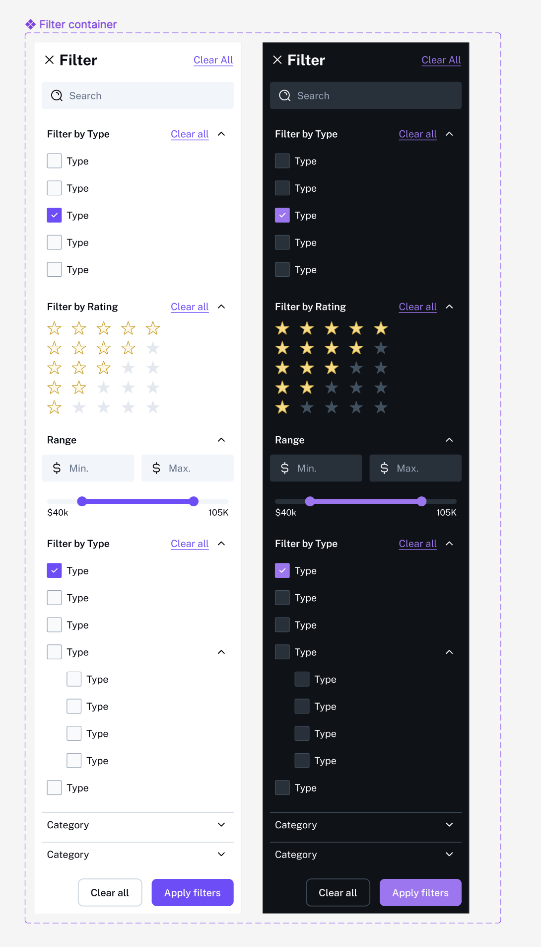
Filter Eve UI Kit Figma Free
Filter components are elements that allow users to narrow down and sort large sets of data by specific criteria. They can take various forms such as drop-down menus, search bars, checkboxes, or sliders, and are commonly used in conjunction with table or list components to help users find the specific information they need. These filters enable users to refine and sort the data based on criteria such as dates, keywords, categories, or numeric ranges.
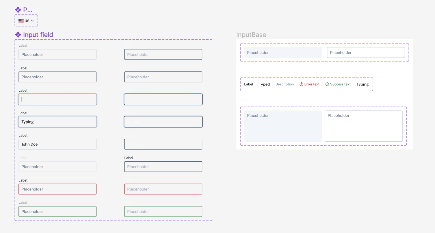
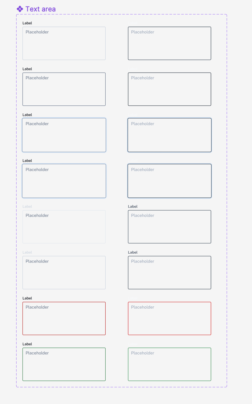
Input fields Eve UI Kit Figma Free
Input field components are elements that allow users to input data into a website or application. They typically consist of a rectangular box in which the user can type or select a value, and include a label or placeholder text that describes the purpose of the field. Input field components are used for many types of input, such as text, numbers, dates, and file uploads.
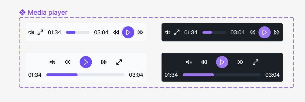
Media Player Eve UI Kit Figma Free
A media player component is a user interface element that allows users to play, pause, and control the playback of audio or video content. A media player component typically includes features such as play/pause buttons, volume controls, and a timeline display that shows the current position of the media being played. Some media players also include additional features such as subtitles and captions, playlists, and the ability to view content in full-screen mode.
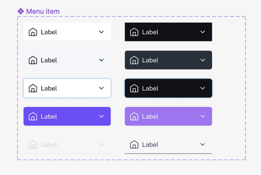
Menu Item Eve UI Kit Figma Free
Menu item components are elements that are used to organize and navigate within a website or application. They typically take the form of a list of items, each of which can be selected by the user to navigate to a different page or section of the website. These components are commonly used as a navigation element in a website or application, where they are often located in a menu bar or sidebar, and can be organized in various ways, such as by grouping related items together.
Menu items can take various forms, for example, drop-down menus, context menus, sliding menus, and more. Some menu items can also have sub-items, creating multi-level navigation.
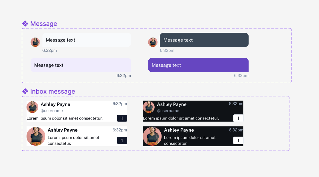
Messages Eve UI Kit Figma Free
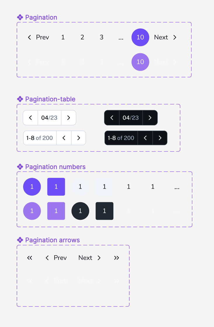
Pagination Eve UI Kit Figma Free
Pagination components are elements that allow users to navigate through large sets of data, such as search results, lists, or tables. These components are often used when there is a large amount of content to display, and it is not feasible to display all of it on a single page.
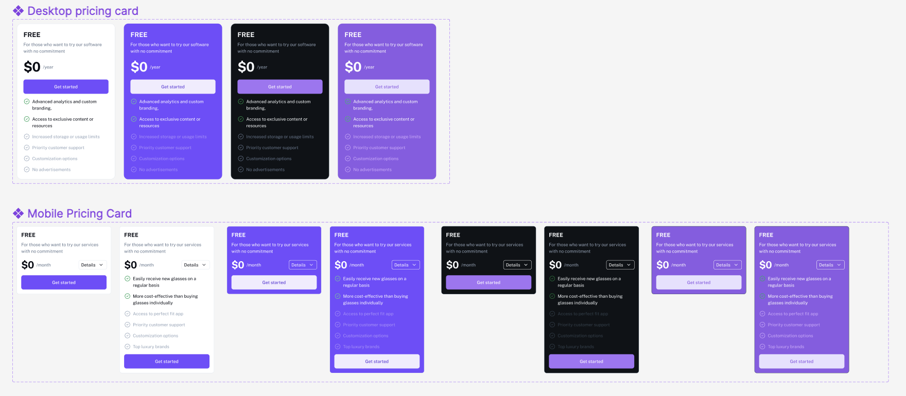
Pricing Card Eve UI Kit Figma Free
Pricing card components are elements that are used to present pricing options and plans for a product or service. They typically take the form of a card or a table, with each card or row representing a different pricing plan or package. Pricing card components often include the plan’s name, the cost, the features included, and any limitations or restrictions. They can also include elements such as calls to action, such as “sign up” or “learn more” buttons, or badges that indicate the most popular or recommended plan.
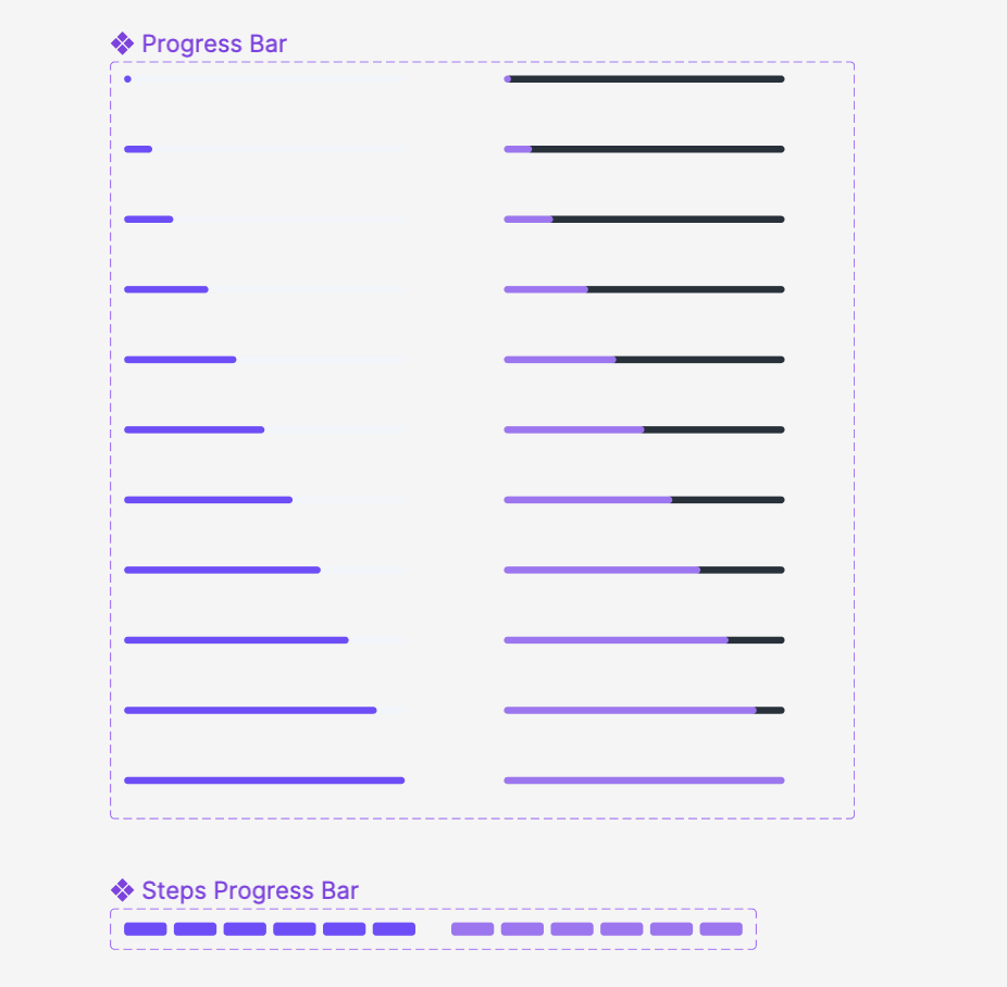
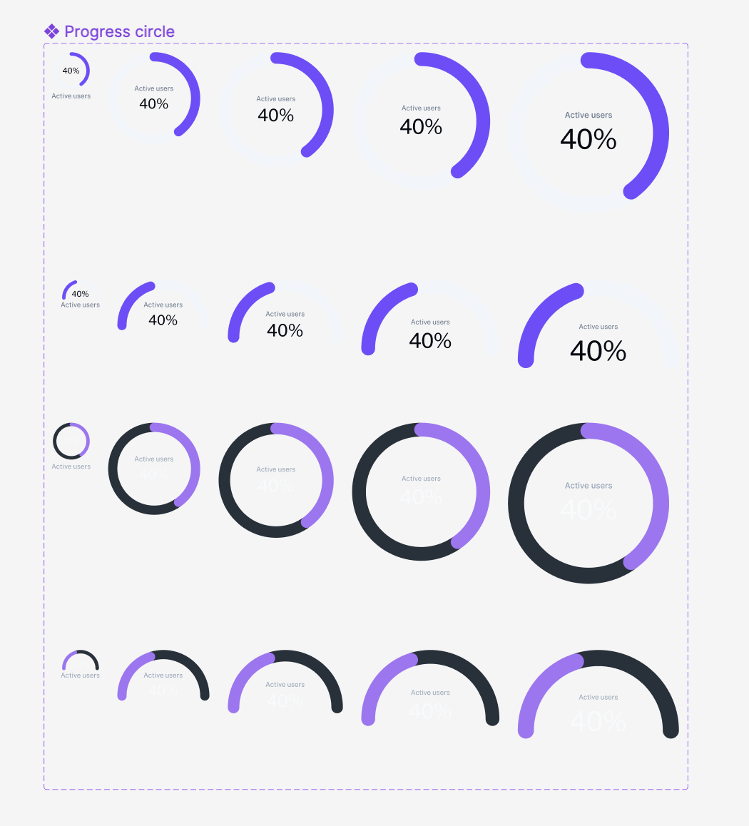
Progress Bar Eve UI Kit Figma Free
A progress bar is a visual element that shows the progress of a task. It is typically a horizontal bar that is partially filled with color to indicate the percentage of the task completed. Progress bars are used to give feedback to users about the progress of a task, such as uploading a file or loading a webpage. They can be customized to match the overall look of the user interface and may include additional elements like text labels or icons.
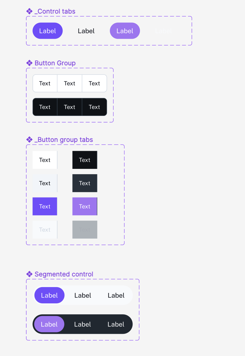
Segmented Control Eve UI Kit Figma Free
a segmented control component is a type of user interface element that allows users to select one option from a set of mutually exclusive options. It presents a series of buttons or labels, arranged horizontally or vertically, each representing a different option. Only one button can be selected at a time, and selecting one button deselects any previously selected button. This type of component is often used when there is a limited number of options and a user can only choose one of them.
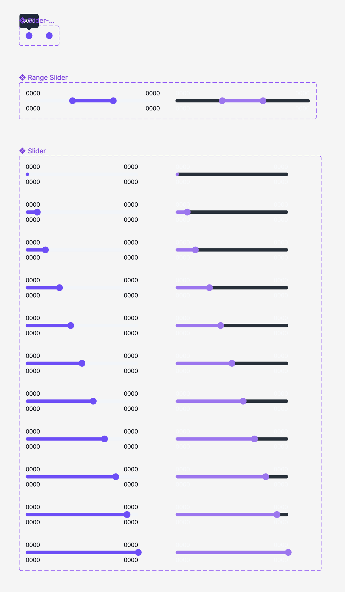
Slider Eve UI Kit Figma Free
Slider controls are the go-to solution for adjusting settings such as volume and brightness. They take immediate effect and allow users to fine-tune the value by moving the handle.
Stepper Eve UI Kit Figma Free
A stepper component is a type of user interface element that allows users to increment or decrement a numerical value in small steps. It typically consists of two buttons, one for increasing the value and the other for decreasing it, and a display of the current value. Stepper components are often used for situations where a user needs to select a number within a specific range, such as setting a quantity, adjusting a setting, or incrementing a value in a form field. They can also be used as an alternative to a number input field, providing a more intuitive and visual way of adjusting a value.
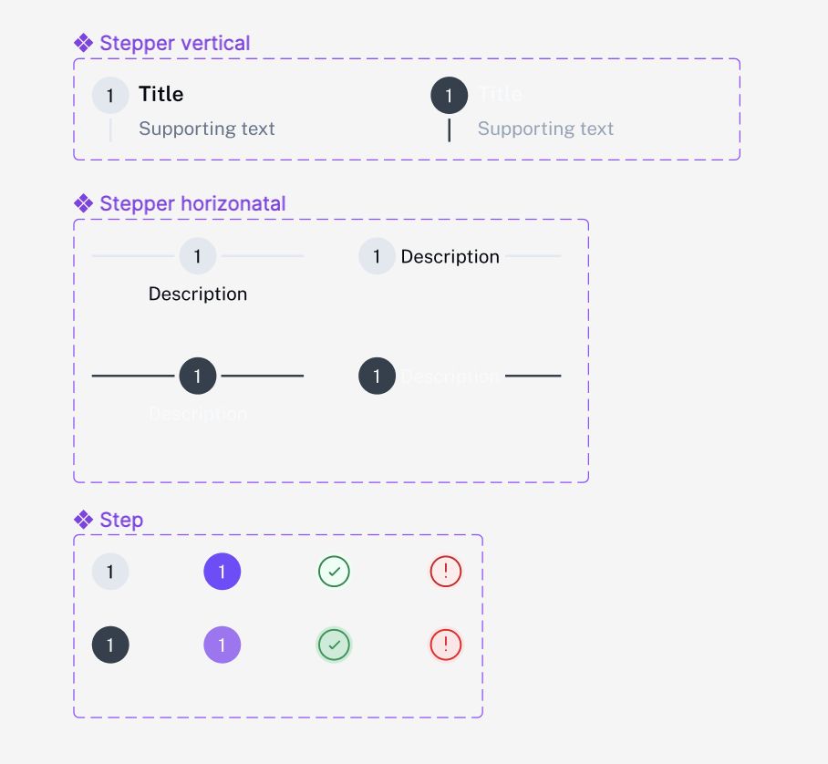
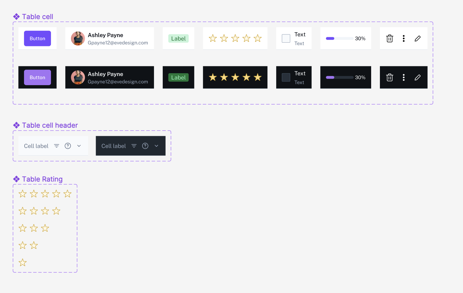
Table Eve UI Kit Figma Free
Table components are elements that present data in a tabular format, with rows and columns. They are used to organize and display large sets of data in a way that is easy to read and understand. Table components can include various features such as sortable columns, search or filter options, pagination and more. They can also have features such as expandable rows, or inline editing, to allow users to interact with and manipulate the data.
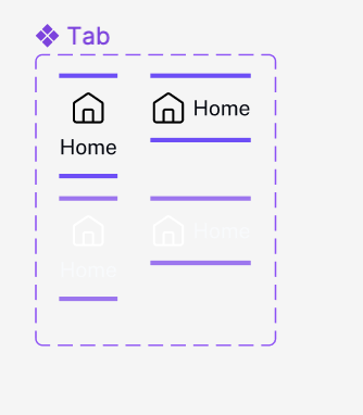
Tabs Eve UI Kit Figma Free
Tabs are a sub navigational element used to change what information is being shown on screen. They are organized by related content allowing users to navigate content between groups of information that appear within the same context.
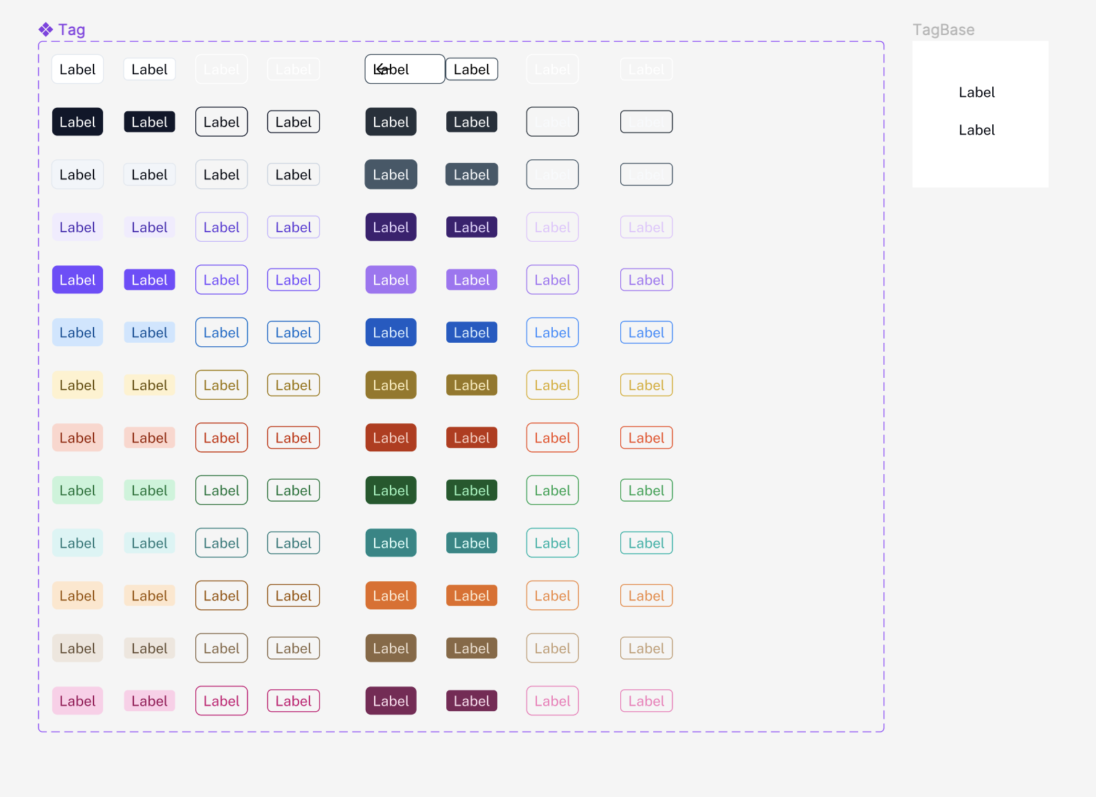
Tags Eve UI Kit Figma Free
Tag components are small, often clickable, elements that are used to categorize, label or add context to content on a website or application. These tags can be in the form of text, icons, or both and they often present a small amount of information that can provide more context or details about the element they are associated with.
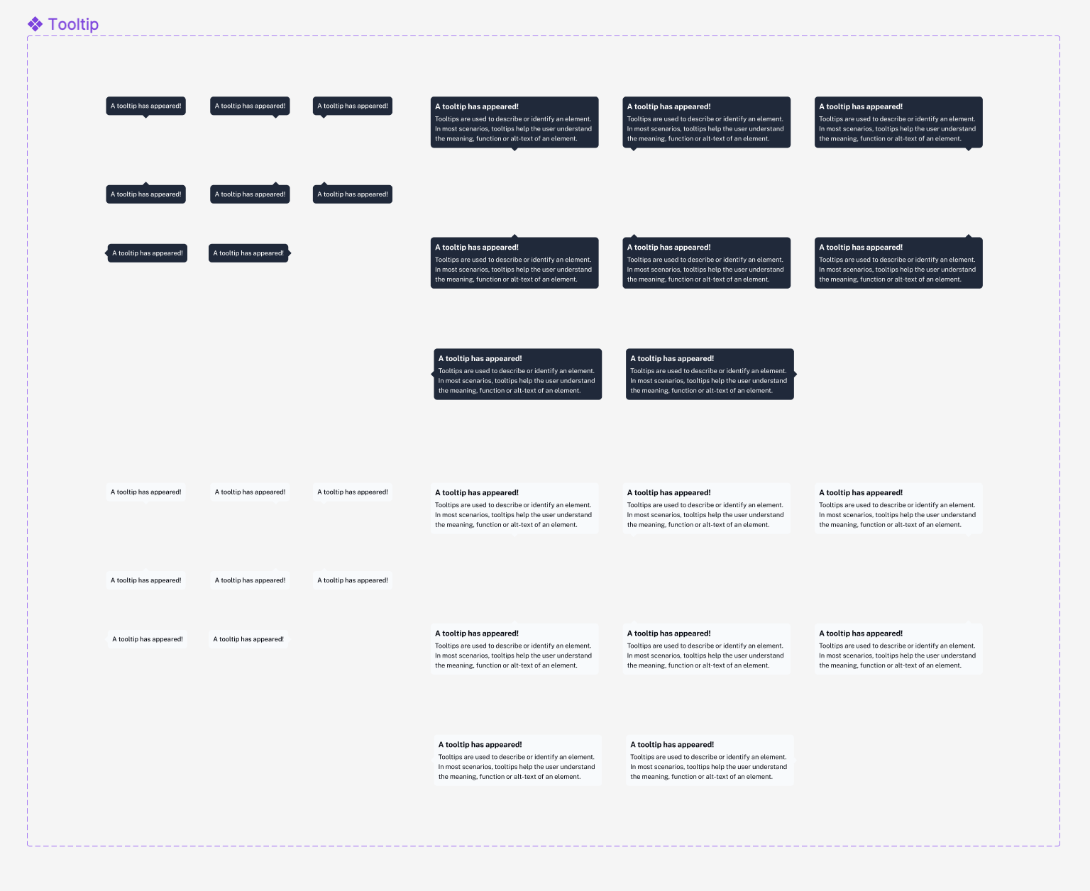
Tooltip Eve UI Kit Figma Free
A tooltip component is a small pop-up window that appears when a user hovers their mouse over a specific element in a user interface. It typically contains additional information or context related to the element that the user is interacting with. Tooltip components are often used to provide brief explanations or definitions for technical terms or unfamiliar concepts, or to provide additional details about a specific feature or function. They are designed to be unobtrusive and non-intrusive, and are typically triggered by a hover or click event. Tooltip components can be used in a variety of contexts, including web and mobile applications, and can be styled and customized to match the overall aesthetic of the user interface.
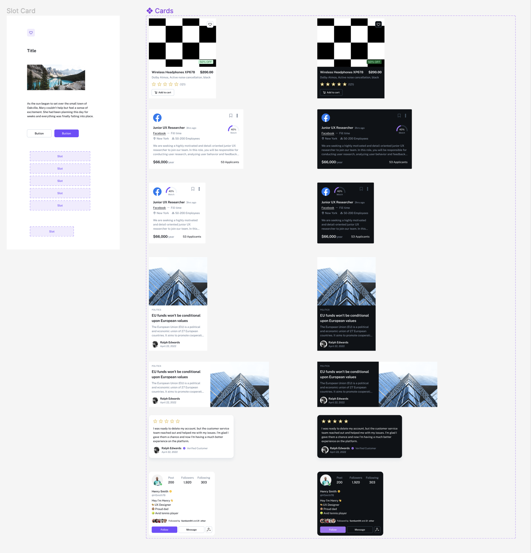
Cards Eve UI Kit Figma Free
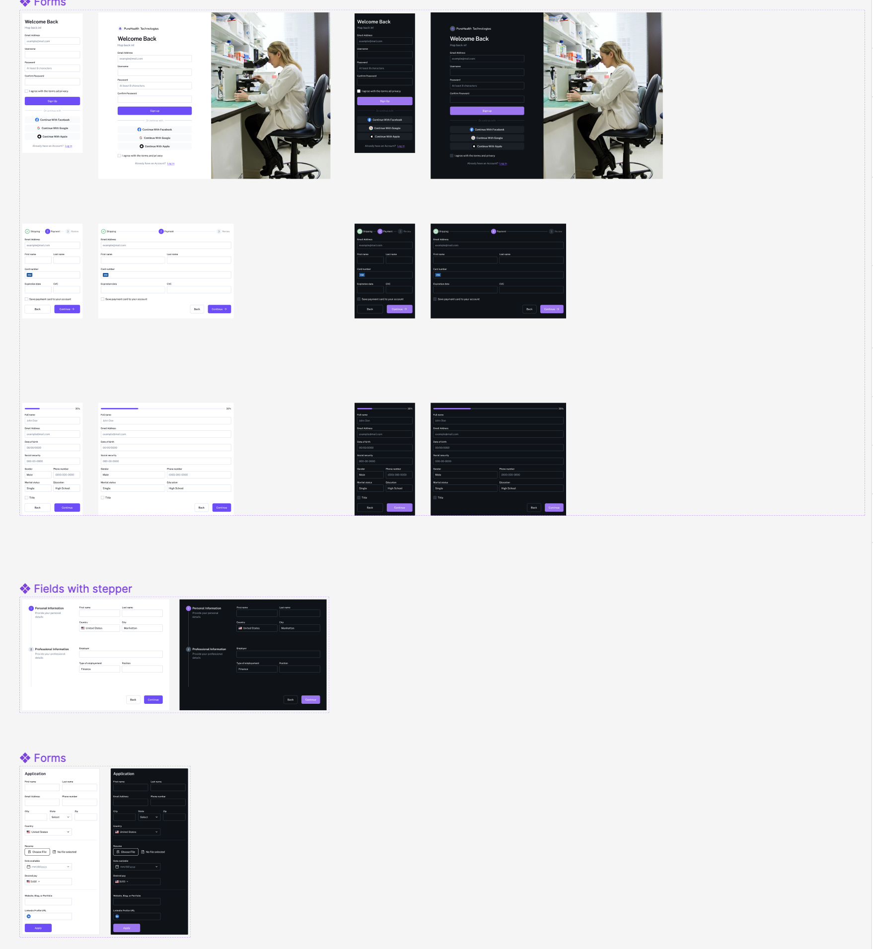
Forms Eve UI Kit Figma Free
Navigation Eve UI Kit Figma Free
Header components are elements that typically appear at the top of a webpage or screen, and are used to provide navigation, branding and other high-level information. They often include the website or application logo, a navigation menu, and other elements such as search bar, account settings, etc. They are a key component of a website or application’s overall layout and design, and can be used to create a consistent look and feel across different pages or screens.
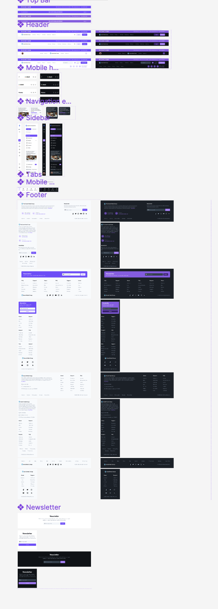
Footer components are elements that typically appear at the bottom of a webpage or screen, and are used to provide additional information or navigation options. They often include elements such as a sitemap, links to important pages, legal information, and contact details. They are a key component of a website or application’s overall layout and design, and can be used to create a consistent look and feel across different pages or screens.